This Chart Shows How Poorly Most Stocks Are Performing
Let’s take a look at an indicator that I don’t normally follow, but which is giving a powerful signal right now.
You've reached your free article limit
You've read 0 of 1 free Pro articles.

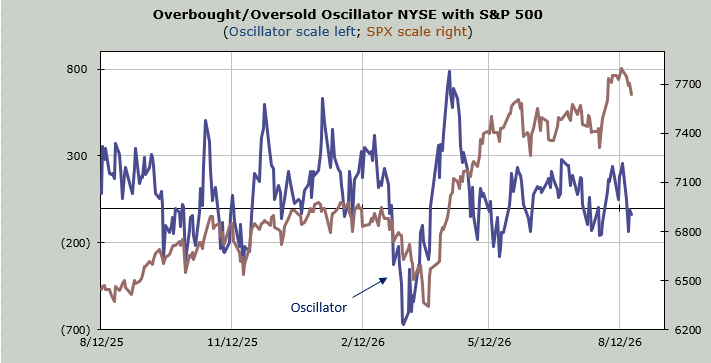
The S&P has now lost just over 150 points in a week. On a percentage basis, it’s not very much. Perhaps that is why it seems there is so much complacency out there.
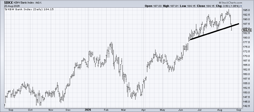
But I’d like you to take a look at an indicator I rarely look at but decided to check in on today. You see, today the Bank Index broke that short-term line I drew in yesterday, and it closed under its 50-day moving average for the first time since April, so I thought about all those folks who quote how great the number of stocks trading over their 50-day moving average lines is. I figured I should check in on this statistic. It’s not great.
First of all, you already know I don’t think the market is broadening out as everyone else seems to believe. I have cited the number of stocks making new highs and the now downtrending McClellan Summation Index among other indicators.
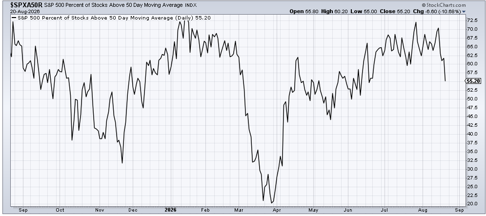
Take a look at this chart that shows the percentage of S&P stocks over their 50-day moving average. Aside from the fact that it peaked back in January (as I have already demonstrated, that move from November until February looked to me like a real broadening: higher highs, higher lows. )
The rally in this indicator this summer, which peaked back in the final week of July (semis were down), left room for the others to rally. Last week’s big rally (Thursday) saw a lower high. So the peak was around 72%, then last week was 70%, and now it’s at 55%.
So, the S&P might only be less than two percent off its high, but this chart says a lot of stocks are down a lot more than that.
Here is the chart of the Bank Index, which is coming into a bit of support, so perhaps a bounce is possible, but I am still not a fan. Especially since I see no one fussing (more complacency)
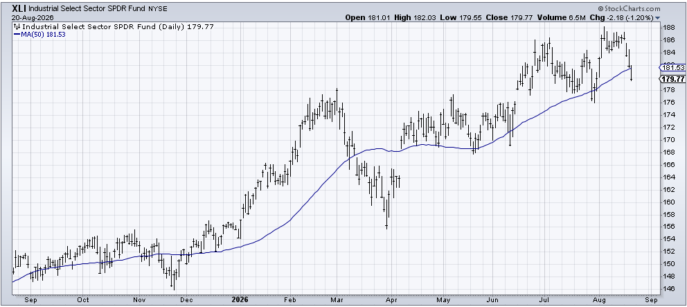
But it’s not just the banks. Take a look at the Industrials (XLI). They are down five percent from their high. XLI has peeked below its 50 DMA several times, so I wouldn’t fuss so much over that, but I would note, here is another group that does not scream ‘broadening out’.
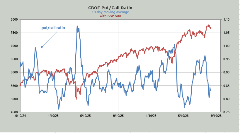
Even the put/call ratio shows very little angst. It showed more angst earlier in the week when it pushed up to .92 and .95 on Monday and Tuesday. But on Thursday it was .84. The ten-day moving average remains at the bottom of the page, which again, shows complacency.
Sticking with the options ratios, the ISEE equity call/put ratio jumped—no soared—to 2.89 on Thursday. That’s a lot of calls. The ratio is the highest since June 2nd. Prior to that, we saw a high reading in mid-May (arrows on the chart). And prior to that, it was late January (another arrow). The only difference is that those all occurred when the market was rising, not falling. But as you can see, it wasn’t a great time to be loading up on calls.
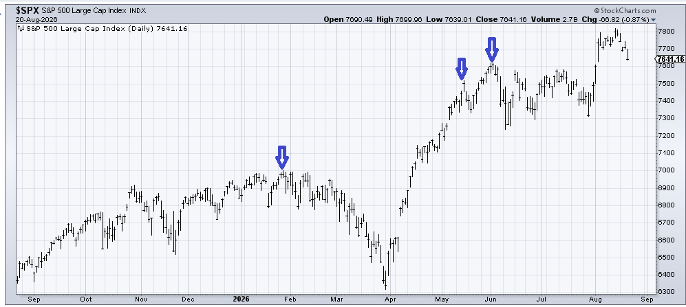
The major indexes are all hovering just over their 50-day moving averages, which ought to provide a little short-term support, but I still believe the August correction is not yet over.