Today’s SOX Chart Looks a Lot Like It Did in 2024. That May Not Be a Good Thing.
Plus, where on the sentiment cycle is the software sector?
You've reached your free article limit
You've read 0 of 1 free Pro articles.

I found myself staring at the chart of the SOX this weekend, wondering why it felt so familiar. I want to say from the start that I hate analogues on charts because they always seem to end up in a 1929 (or 1987 or 2008) type crash, but I do find patterns interesting.
One thing I found so interesting was how many times the SOX has had a slide of approximately 30%. The answer is a lot.
But as I was staring at the chart of the SOX, I noticed that it did not have a spectacular week. It had that big rally coming off the low, and then it stalled. And it basically stalled right where it should have: at resistance. I knew I had seen that before. And sure enough, it was in the summer of 2024.
The SOX had a big run (not as big as this spring’s) from mid-April until mid July, and then it swooned 30% that summer of 2024. This time it had a big run from late March through early June, and then it swooned approximately 30%. In both cases (blue line) it stalled out—and yes, this time it is still unknown if this stall-out is the prelude to a move higher or some sort of retest.
But what interested me is that I have been assuming that whatever pullback in the SOX we get, it is likely to be a retest (as 2024’s was) and then it ought to improve over time. But the chart of 2024 says maybe that’s incorrect.
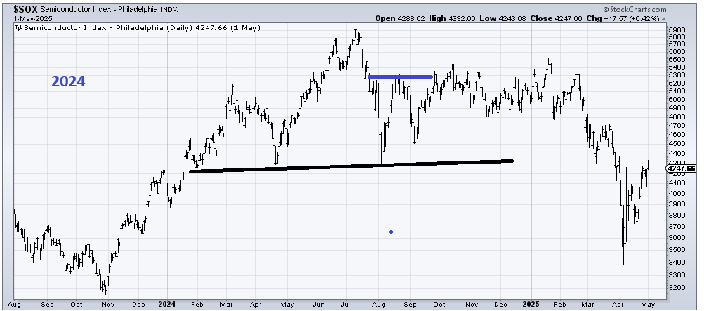
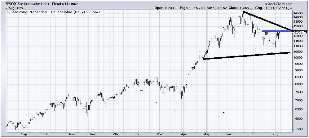
What struck me was how the SOX went sideways for six or seven months before it fell again (the Tariff Tantrum). That is not my basic assumption (my assumption is that if we get a retest, the SOX will improve thereafter), but I now have this in the back of my mind, and I felt the need to share it. Like, what if the semis become ordinary?
Away from that, I was asked to update where I thought software, using the IGV ETF, was on the Sentiment Cycle, having come out of Aversion. When we last checked in on IGV in late June, I thought IGV was heading into Aversion. If that’s the case, we ought to be in the ‘Denial” stage.
A few things to note. Notice Aversion wasn’t the exact same pattern as it is on the chart. This time, Aversion was a W and not a V. I would expect some diverging in the Denial stage as well.
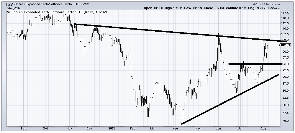
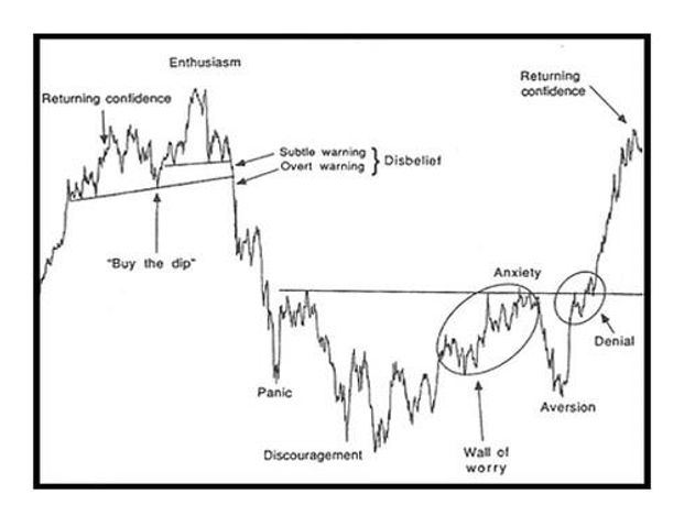
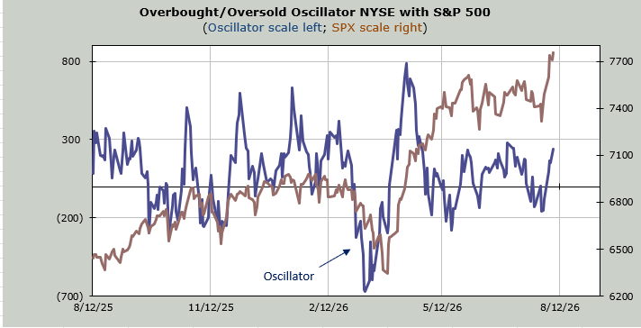
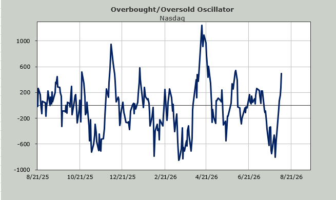
One of the main reasons I expect some diverging is that sentiment in the overall market is much more bullish—nearly euphoric—already. Just look at the ten-day moving average of the put/call ratio, which is well on its way toward the low 80s, having peaked in the mid 90s two weeks ago.
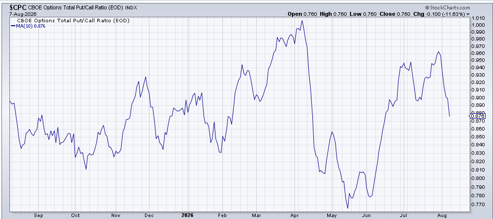
Or that the overall market is heading toward an overbought condition this coming week. So I don’t think it maps out perfectly, but I expect we are somewhere in that Denial stage.