Japanese Candlesticks Shed Some Light on the QQQ
Let's see how to avoid getting burnt with the Invesco QQQ Trust exchange-traded fund and what an old charting technique can teach us.
You've reached your free article limit
You've read 0 of 1 free Pro articles.
The technique of using Japanese candlesticks is very old and is thought to have been developed in the 18th century by Munehisa Homma, a Japanese rice trader. The technique was illuminated in the U.S. by my long time friend Steve Nison after I pestered him on the E train to write his first book on the subject.
The Invesco QQQ Trust ETF QQQ was started in 1999 and tracks the Nasdaq 100 Index.
Can a technical approach as old as candlesticks be useful to analyze an index an instrument so new as the QQQ?
Let's check and see.
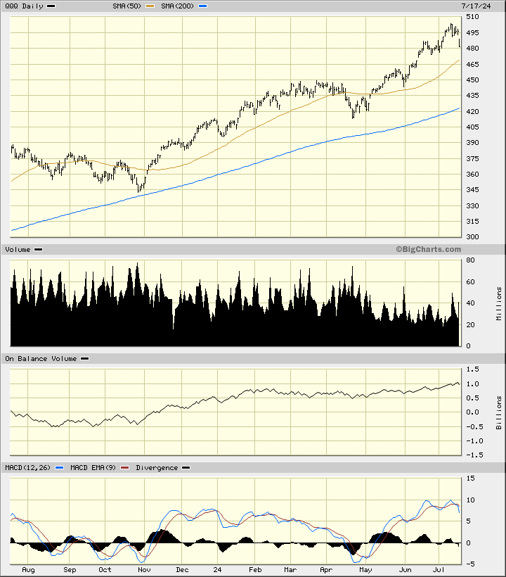
In the daily bar chart of QQQ, below, I can see some interesting developments. Prices have been in an uptrend and trade above the rising 50-day moving average line and above the rising 200-day moving average line. (Moving averages did not become a tool until the 1950s and 1960s.) The trading volume histogram makes me wonder why the volume has declined since early May when prices have gone up. Have the bulls become scale up sellers?
The math-driven On-Balance-Volume (OBV) line has been on an upward path since August and suggests that buyers of the QQQ have been more aggressive than the sellers. The trend-following Moving Average Convergence Divergence (MACD) oscillator is above the zero-line but has been "rolling over" the past four weeks.
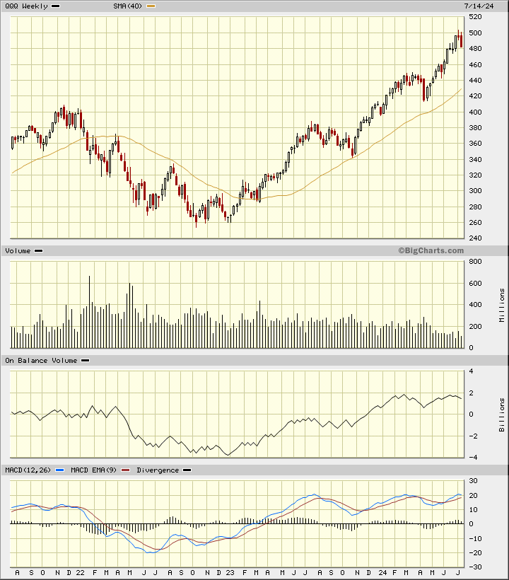
In this weekly Japanese candlestick chart of the QQQ, below, we get some bearish clues. Prices have made a top reversal pattern in the past three weeks. Top reversals when using candles can be either a change in the trend from up to sideways or from up to down. The jury is still out on this right now but we may know their decision fairly soon. When prices reached the round number of $500 they were pretty extended (overbought) vs. the 40-week moving average line. The weekly volume pattern shows shrinking turnover the past three months.
Was someone quietly getting out? The weekly OBV line shows twin peaks despite prices making higher highs. This is a bearish divergence with the indicator not confirming the price action. The MACD oscillator has been narrowing and could make its third peak in the past 12 months.
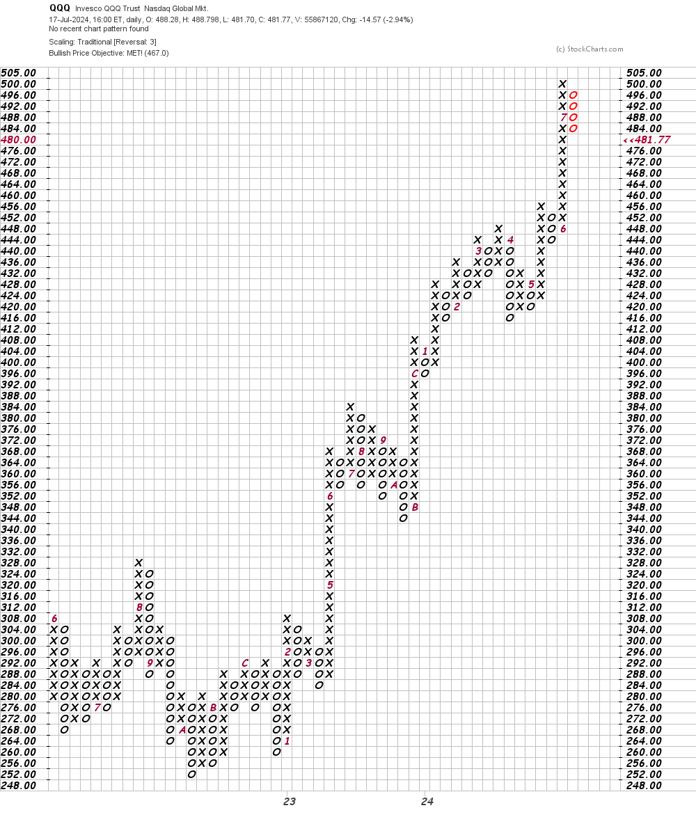
In this daily Point and Figure chart of QQQ, below, I can see that prices reached and exceeded a price target in the $467 area. Technically oriented traders who use Point and Figure charts may have been motivated to take profits.
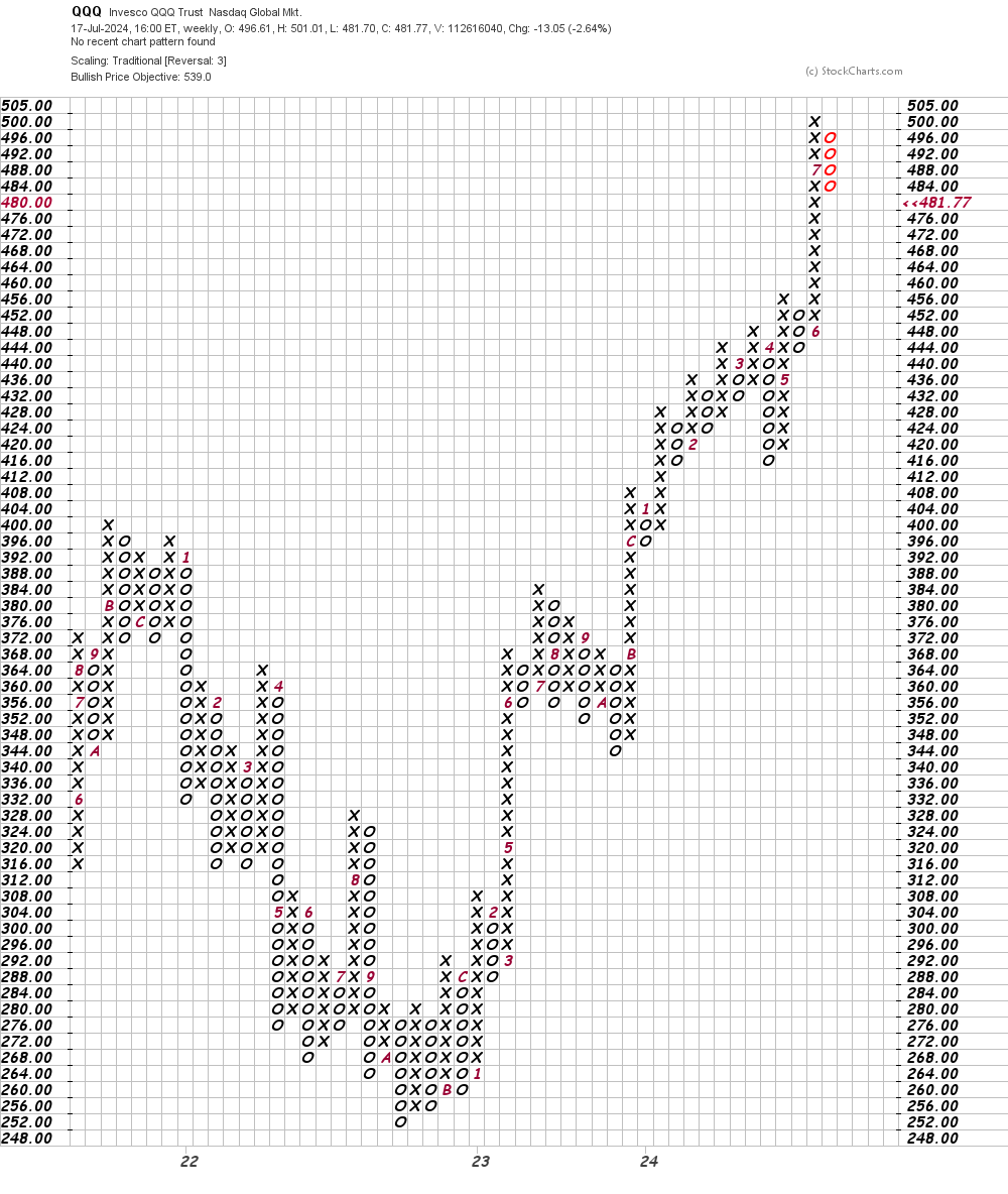
In this weekly Point and Figure chart of QQQ, below, I can see a potential price target in the $539 area. Maybe. I consider it a sign of weakness when a security stops short of a price target as it suggests that traders are being anxious sellers. What do you think?
Bottom line strategy: On July 11 we got a quick turning sell signal on the QQQ when it closed below the low of the high day (July 10). Now the weekly candles have made a reversal pattern.
The clock is ticking.
Employees of TheStreet are prohibited from trading individual securities.