Is Enbridge Poised for a Rally?
Let's see what the charts say.
You've reached your free article limit
You've read 0 of 1 free Pro articles.
Enbridge ENB operates the world's longest and most complex crude oil and liquids transportation system. They move approximately 65% of all U.S.-bound Canadian exports. Who knew?
Let's check out the charts and indicators.
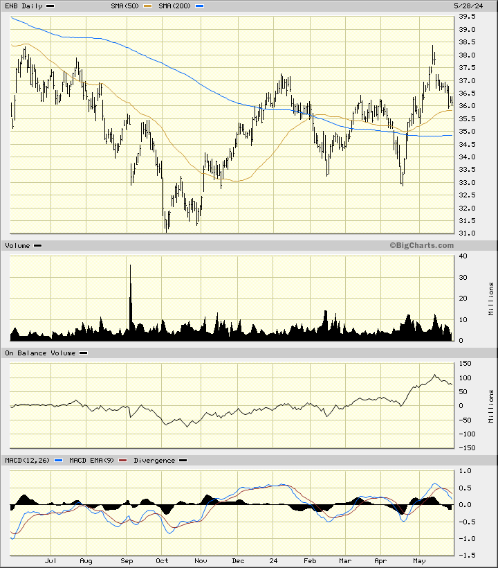
In this daily bar chart of ENB, below, I can see a choppy sideways trading pattern playing out over the past twelve months. ENB is trading above the rising 50-day moving average line and above the bottoming 200-day line. The trading volume has been increasing since the beginning of the new year.
The On-Balance-Volume (OBV) line has been improving since October and tells me that buyers of ENB have been more aggressive than sellers. The trend-following Moving Average Convergence Divergence (MACD) oscillator is above the zero line but correcting.
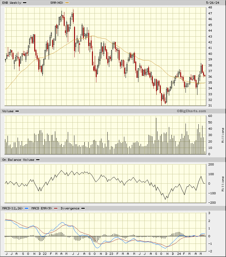
In this weekly Japanese candlestick chart of ENB, below, I can see a shift in trend from a low made in October. Prices trade above the now rising 40-week moving average line. The weekly volume histogram shows increased activity since August.
The weekly OBV line shows us an up and down pattern since October. The MACD oscillator is slightly above the zero line in buy territory.
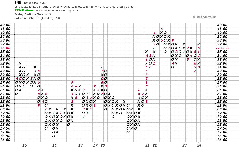
In this daily Point and Figure chart of ENB, below, I can see a lot of price history. The software is projecting a potential upside price target in the $51 area.
In this weekly Point and Figure chart of ENB, below, I can see price action going back to 2010. Here, too, the software is projecting a price target in the $51 area.
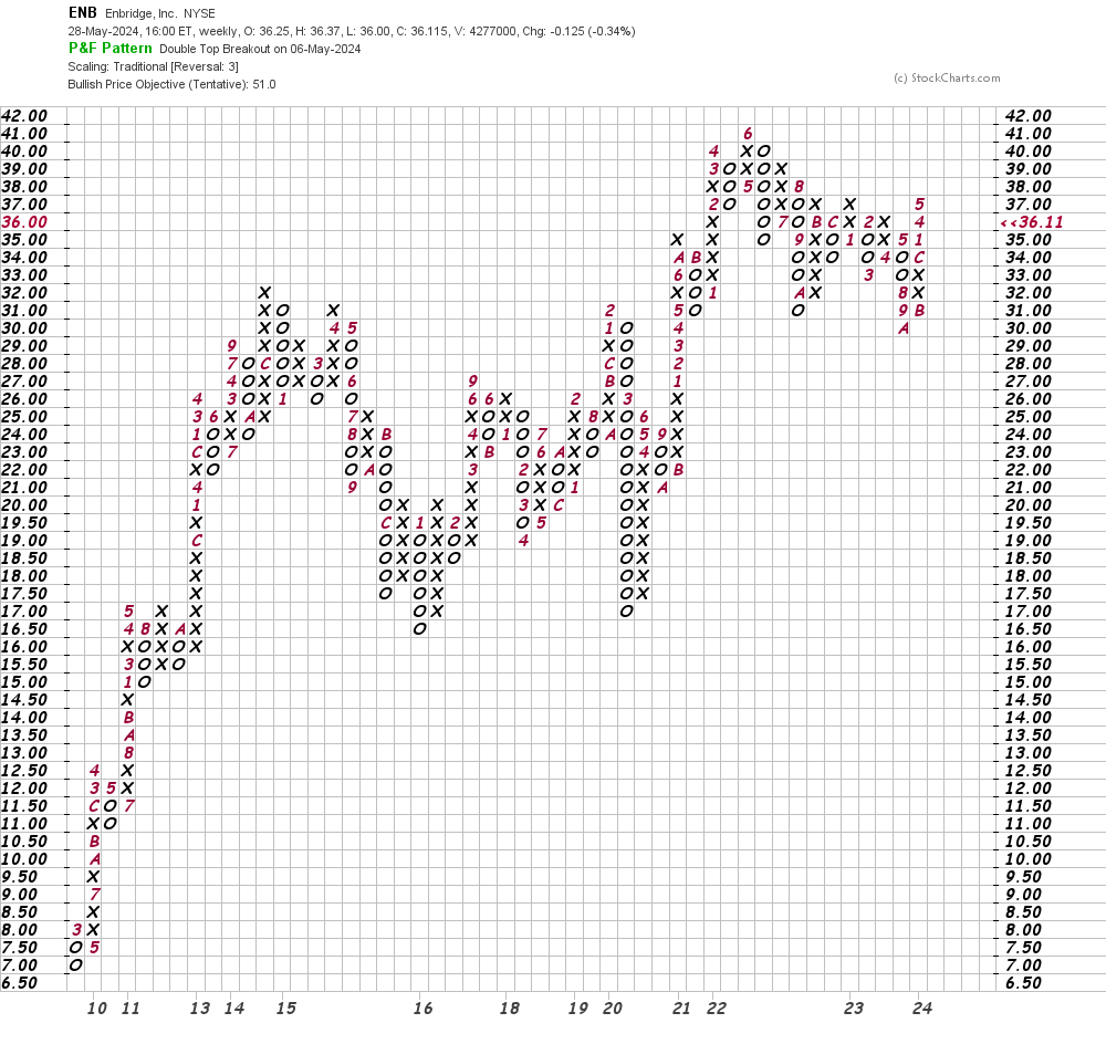
Bottom line strategy: Patient traders could go long ENB on available weakness. Risk to $33. The $51 area is my price target.
Employees of TheStreet are prohibited from trading individual securities.