Charting the Markets: Bullish Things Ahead for the Nasdaq 100
Plus, the corn breakout was actually a fakeout.
You've reached your free article limit
You've read 0 of 1 free Pro articles.
The 'Daq Is Back
The big story this week is the growing relative strength of the Nasdaq 100. The tech-laden index hasn’t reached an all-time high since mid-July, but it’s beginning to outpace the benchmark S&P 500 index, as well as the Dow Jones Industrial Average and the Russell 2000.
How to demonstrate the relative strength of the Nasdaq versus the S&P 500? The charts state this more eloquently than I ever could.
Notice that, over the past three weeks, the S&P 500 (left chart) has formed a series of lower highs and a series of higher lows (converging black lines). While the overall trend for the large-cap index favors a breakout to the upside, the pattern itself is fairly neutral.
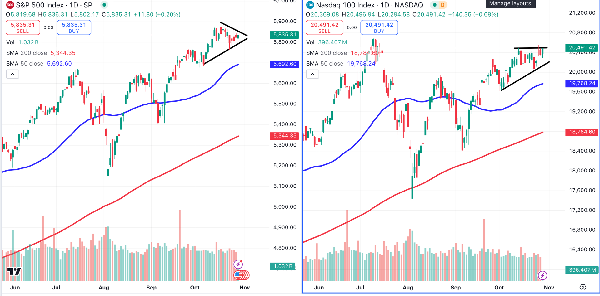
On the right, the Nasdaq 100 has formed an ascending triangle (black lines). This pattern consists of higher lows and relatively equal highs, as opposed to the S&P 500’s lower highs. The pattern has a bullish bias and appears within a bullish trend.
Some may take issue with the fact that I sometimes draw lines through wicks, as I did on the Nasdaq 100 chart. This was done intentionally.
There is a school of thought that places more emphasis on the bodies of the candles, which contain the opening and closing prices, and less emphasis on the wicks, which demonstrate high and low prices for a given period of time.
When it comes to technical analysis, I encourage you to keep an open mind. When we become too dogmatic, we risk missing the message embedded in the chart.
The First Three Letters in 'Down'
…are "D.O.W.," as in the Dow Jones Industrial Average (left chart). Less than two weeks ago, this venerable index reached an all-time high. Since then, we’re seeing rotation into select Nasdaq stocks, like Nvidia NVDA, and away from the more stable, less exciting names — particularly in the consumer staples sector, as mentioned here.
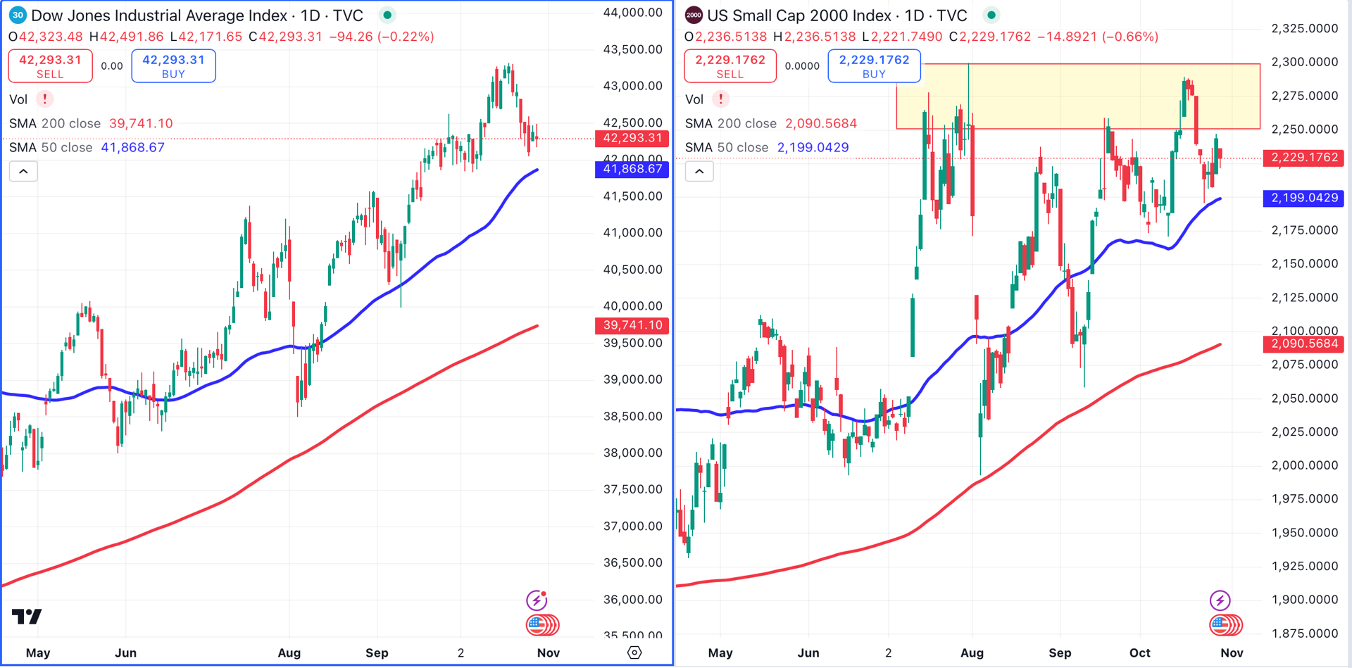
Even the lowly Russell 2000 (right chart) outperformed the Dow this week.
Unfortunately for the small-cap Russell 2K, it hasn’t had the muscle to break through a thick area of resistance between 2250 and 2300 (shaded yellow). If the Russell does manage to navigate that area, the likely cause will be the S&P and Nasdaq dragging it higher.
Charts of the Week: 10-Year Treasury vs. Trump Media and Technology
The yield on the 10-year U.S. Treasury (left chart) has climbed from 3.62% on September 16 (point A) to 4.32% on October 29 (point B). This gain of 70 basis points occurred in the midst of a rate cutting cycle by the Fed.
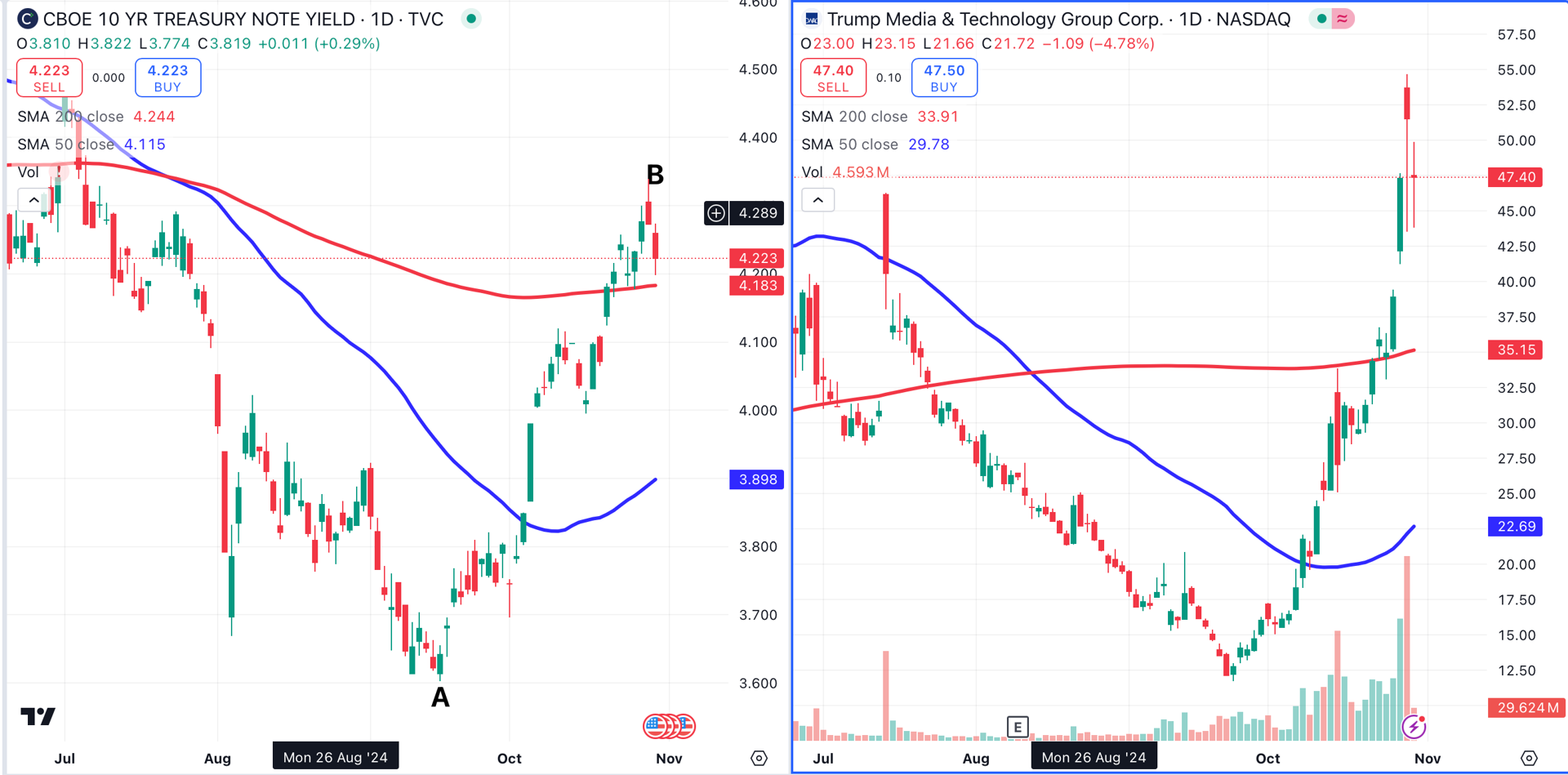
Why are treasury yields rising as the fed funds target rate is falling? Contrary to popular belief, the Fed doesn’t "control interest rates."
The Fed controls the fed funds target rate. This is a short-term interest rate, and it has little to do with the rate on a 10-year treasury note.
This also explains why mortgage rates are rising as the fed cuts rates.
The 30-year fixed mortgage rate is heavily influenced by the 10-year t-note rate, and has no connection to a short-term rate like the fed funds target rate. The average American homeowner spends 12.3 years in a house, a time frame that corresponds closely to a 10-year treasury note.
Rising treasury rates could be an indication that growth and/or inflation are likely to gain momentum in the future. With that in mind, is it strange that the chart of Trump Media and Technology DJT has some correlation to the 10 year t-note yield chart?
A wide variety of opinions are being expressed on social media right now about this correlation. Is this a coincidence, is it noise, or are the markets trying to tell us something? There is plenty of room for interpretation.
Hard Commodities: Gold and Silver
Gold (left chart) continues to rally. I’ve added the relative strength index (RSI) to gold’s chart, as well as that of silver (right chart).
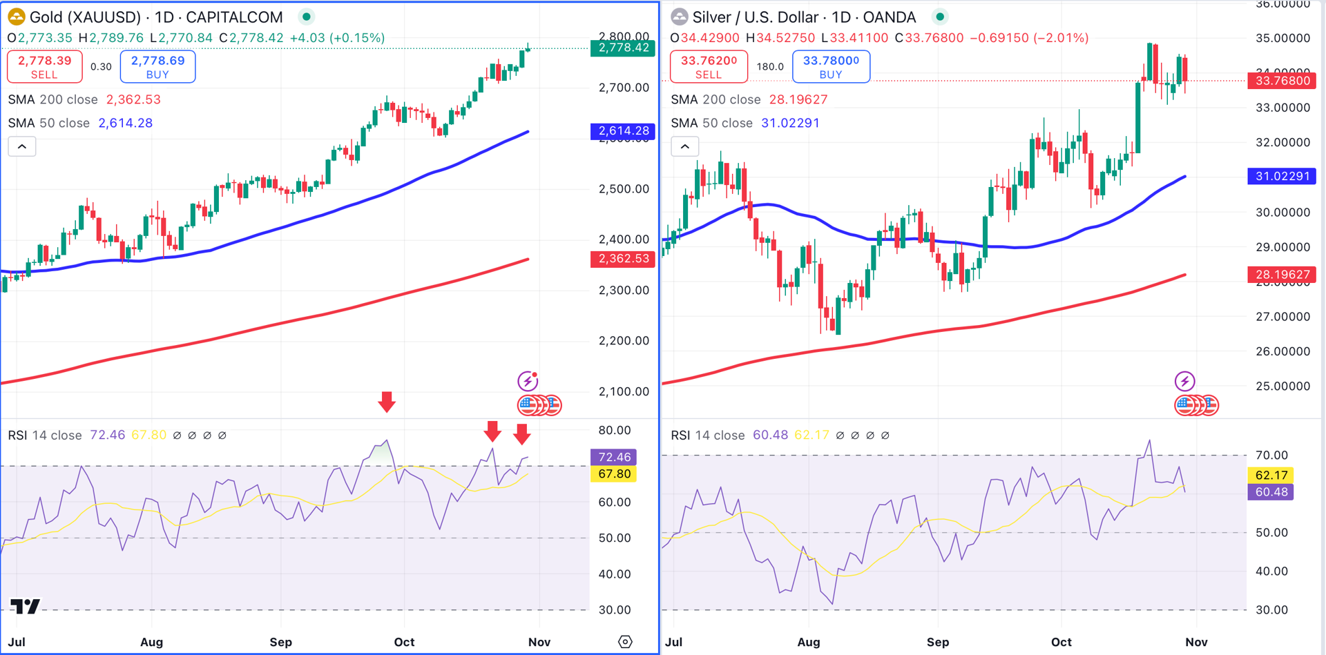
According to the RSI indicator, gold has been overbought (red arrows) for much of the past month. This hasn’t prevented gold from moving higher. This is what I mean when I say, "overbought can always become more overbought."
I don’t use RSI for buy and sell signals on a daily or weekly chart. In fact, an overbought daily or weekly chart could be considered a sign of relative strength.
I’m more likely to use RSI as an entry/exit tool when using a multiple time frame trading technique.
For example, if the weekly trend is bullish, I might look for pullbacks on the hourly chart using RSI. When RSI enters oversold territory on the hourly, get ready to buy. When it rises out of oversold territory, that would be the entry signal.
Regarding silver, we just missed our entry by 8 cents. I plan to remain patient.
Soft Commodities: Corn and Wheat
Good news for consumers! A rally in corn, wheat and other agricultural commodities that started in late August has fizzled out.
Corn (left chart) gained 18% in just over a month, culminating with a breakout (point A) above its 200-day moving average (red).
That breakout was actually a fakeout, as corn fell below its 200-MA. A second attempt to cross above that moving average failed last week (point B).
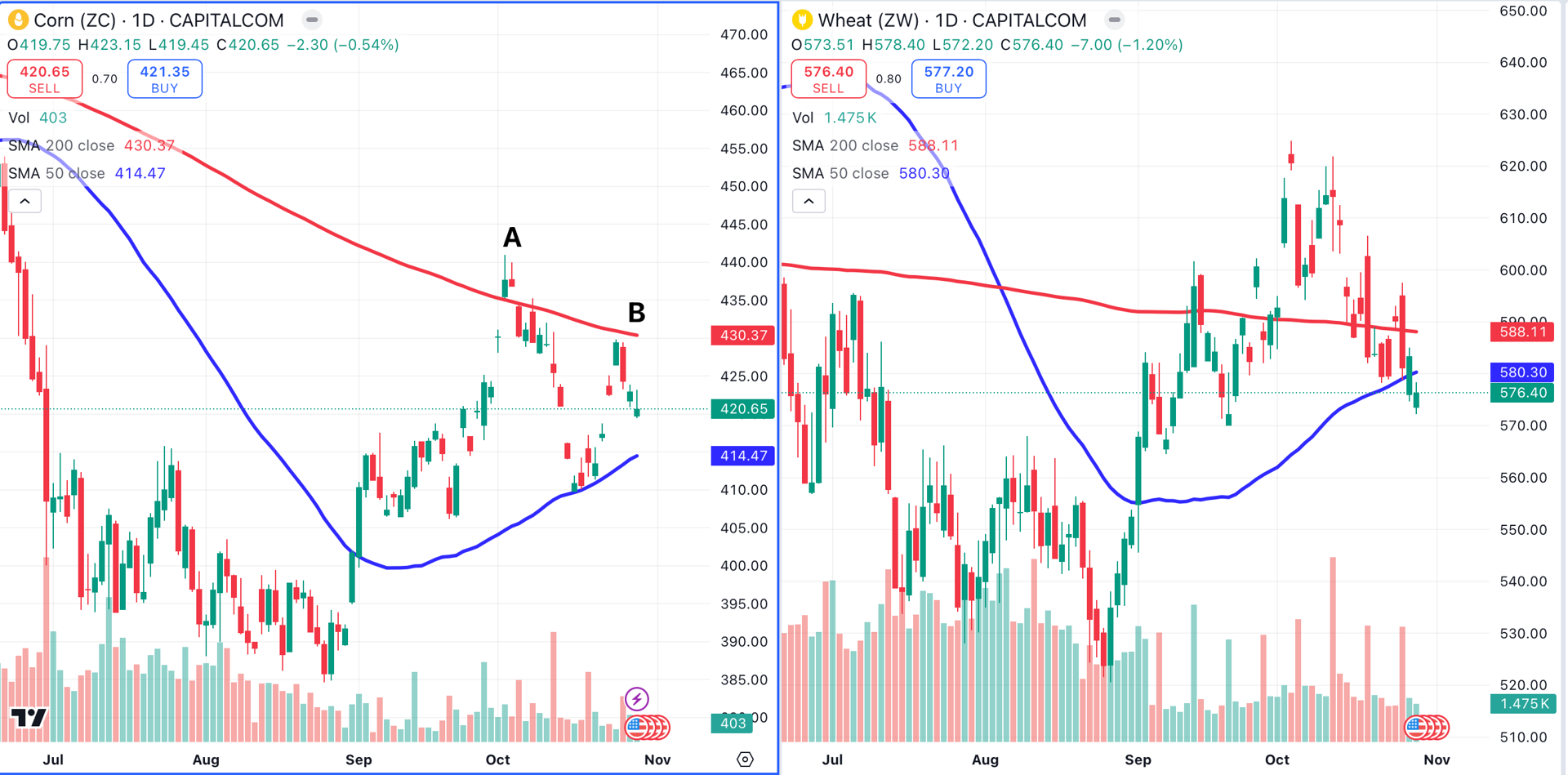
Wheat (right chart) began to rally at about the same time as corn, and that rally also appears to have failed. Wheat is trading below both its 50-day MA (blue) and its 200-day MA (red).
Where's The Bull?
Where’s the bull? For now, the bull resides on the Nasdaq. Tomorrow, we’ll look at specific sectors and stocks with a focus on the tech sector.
At the time of publication, Ponsi had no positions in any securities mentioned.
