What's the State of the Market? We'll Let the Charts Do the Talking
Charting four key indexes, six sectors and stocks to watch in each.
You've reached your free article limit
You've read 0 of 1 free Pro articles.
How are key indexes, stocks, and sectors stacking up? We have a ton of charts to get to this week, so let’s get started.
S&P 500 vs. Nasdaq 100
We’ll begin with a big-picture comparison of the S&P 500 (left) and the Nasdaq 100 (right) weekly charts. The S&P 500 is the clear winner here, as it continues to break to new heights.
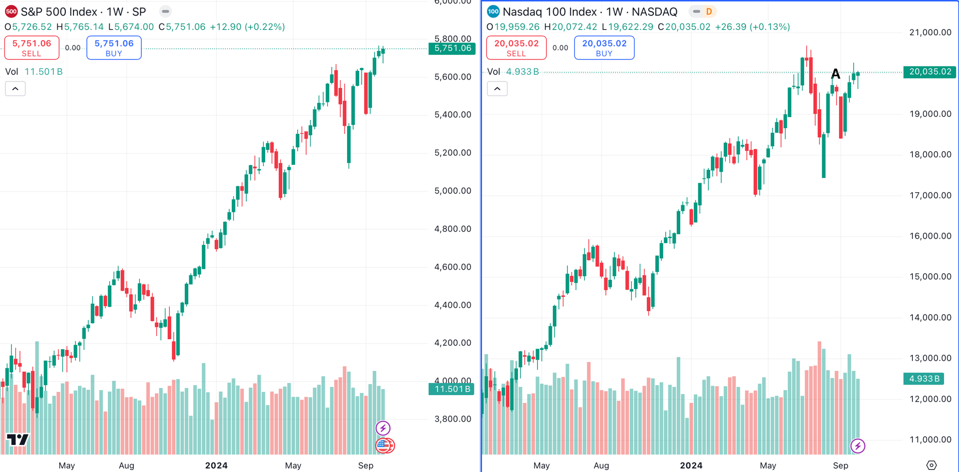
The Nasdaq 100 has struggled in comparison, and has failed to reach a new high since July. However, give the Nasdaq credit for breaking above its August highs (point A).
Zooming in to the daily charts, we'll add 50-day (blue) and 200-day (red) moving averages. While the discrepancy in performance is more visible in this time frame, both indexes remain well above their key moving averages.
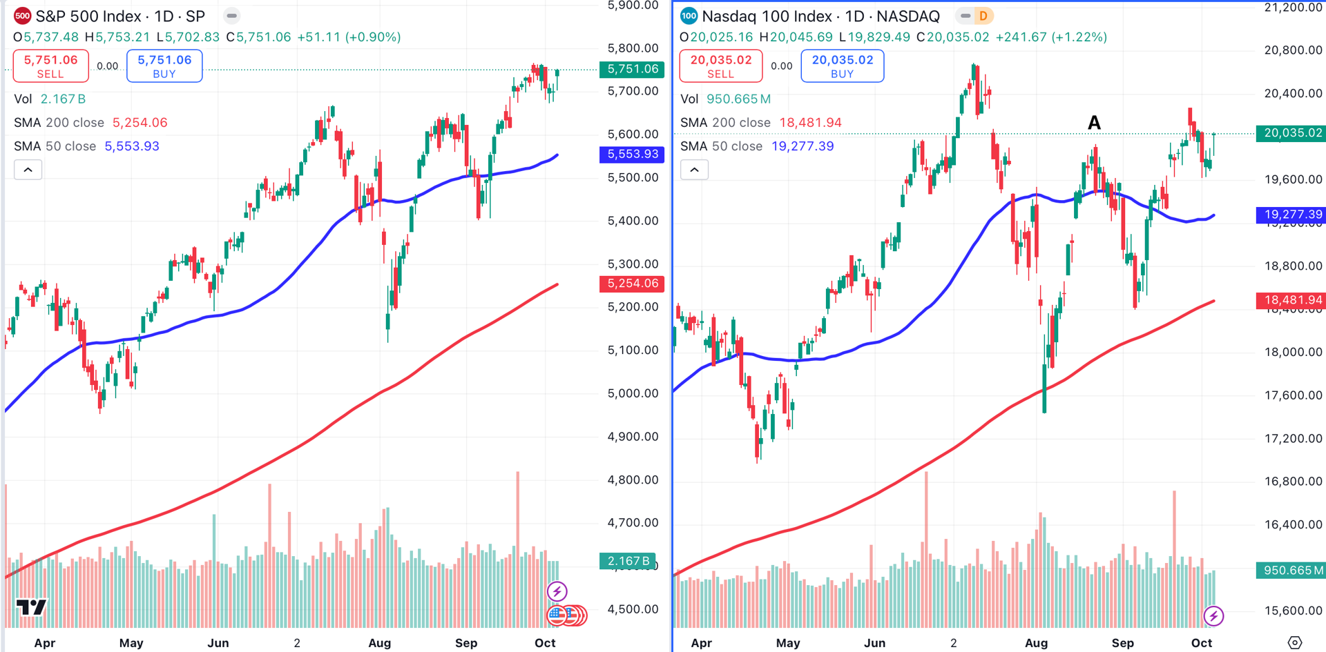
A potential triple top is forming on the Nasdaq. If the tech-heavy index falls below its 50-day MA, this becomes a more pressing concern.
Dow Jones Industrial Average vs. Russell 2000
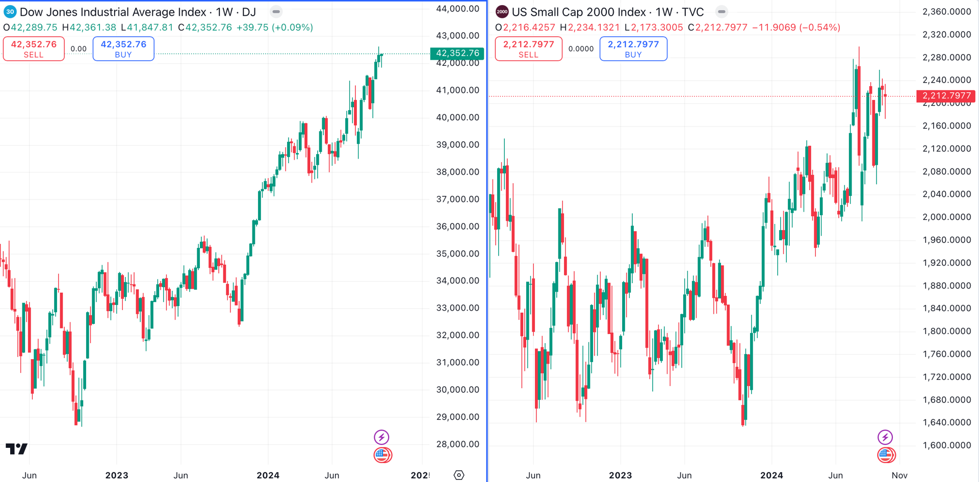
Next, let’s compare the Dow Jones Industrial Average (left) to the Russell 2000 (right) using the weekly charts. The Dow was the best-performing of the major indexes during the third quarter, while the Russell 2K was the worst.
The respective daily charts of these two indexes demonstrate the DJIA’s (left) relative strength, while the Russell 2000 (right) forms a potential topping pattern.
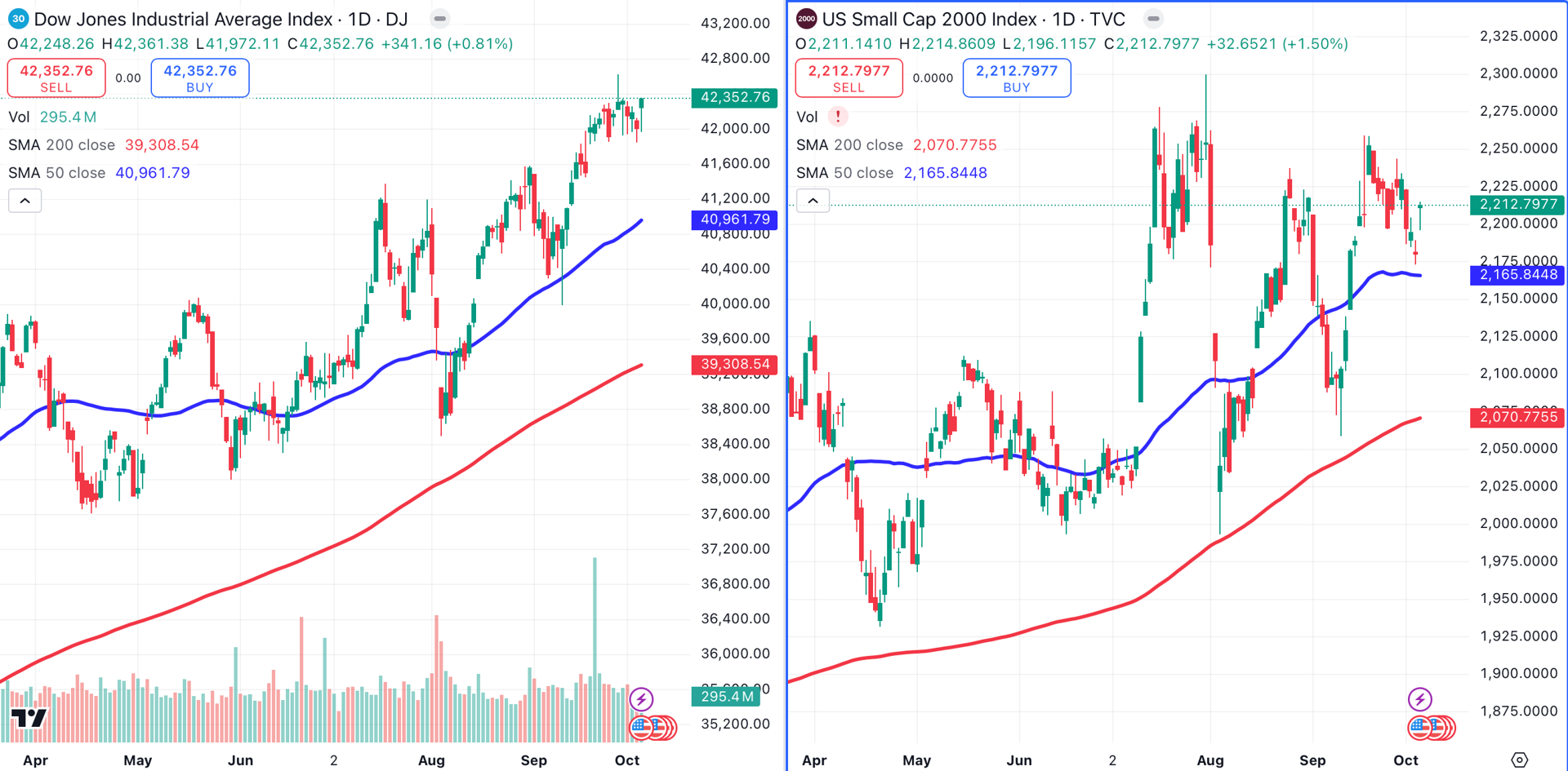
The Russell is leaning heavily on its 200-day moving average (red), and appears to have formed an ugly triple top. The R2K needs to maintain its current position above its 50-day MA to keep sellers at bay.
Communications Sector
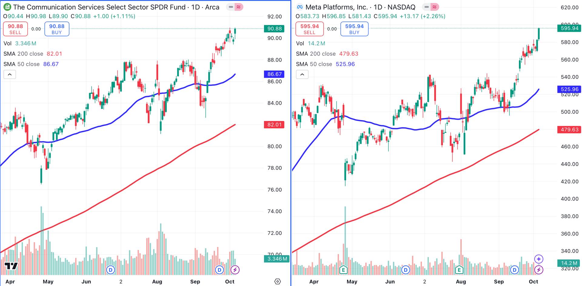
Communications remains a top-performing sector, represented on the left by the Communication Services Select SPDR XLC. On the right, we see the largest holding in that ETF, Meta Platforms META. Meta recently reached a series of all-time highs.
Utilities Sector
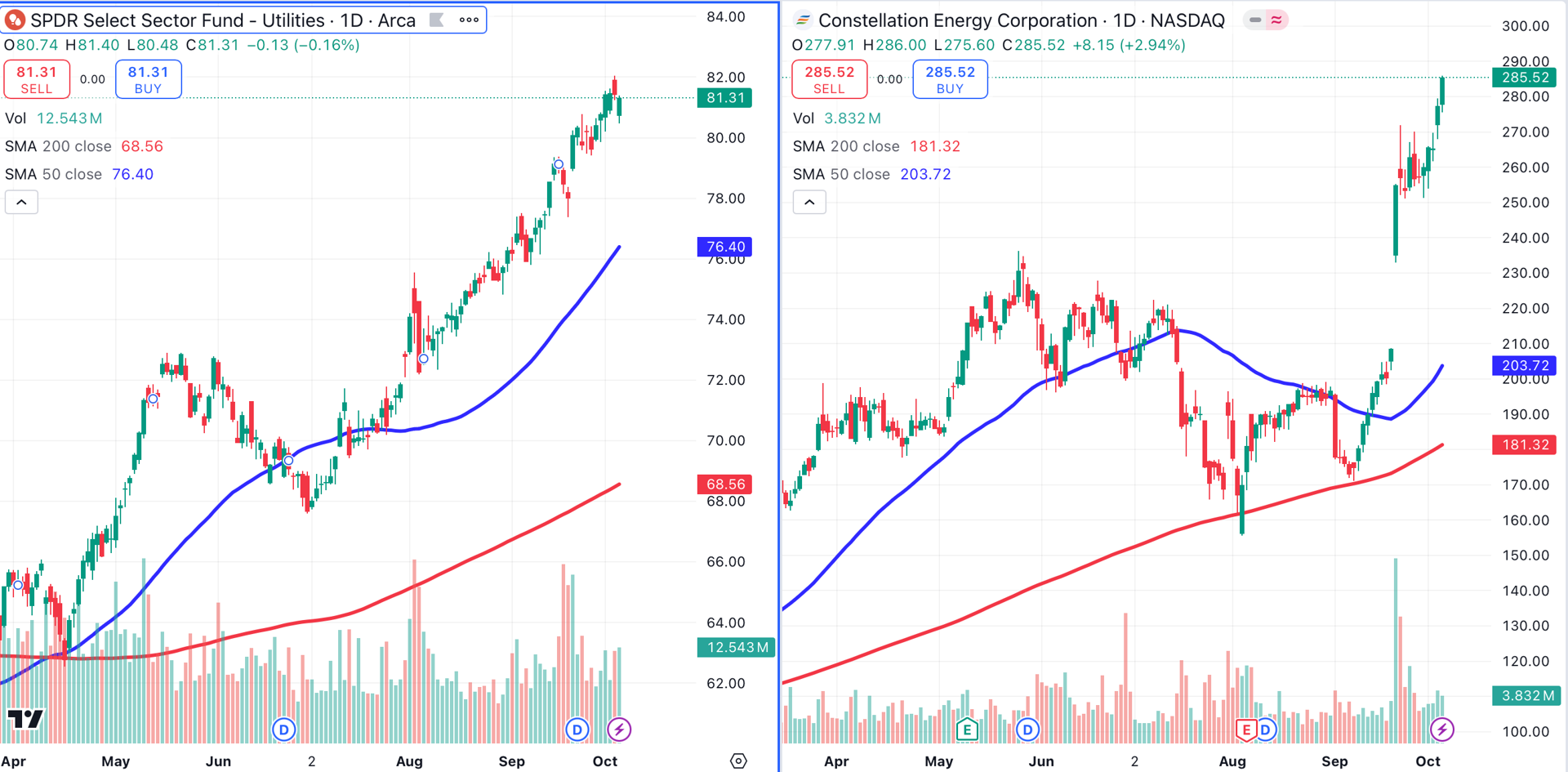
Utilities, represented on the left by the Utilities SPDR Select Sector Fund XLU, remain bullish, as XLU ended the week just off its highs. On the right, Constellation Energy Corp. CEG, which recently announced a massive energy deal with Microsoft MSFT, continues to power higher.
Energy Sector
The energy sector, represented here by the SPDR Energy Select ETF XLE, had a big week. XLE, on the left, broke above a bearish trend line (green dotted line) that has contained the sector for the past six months.
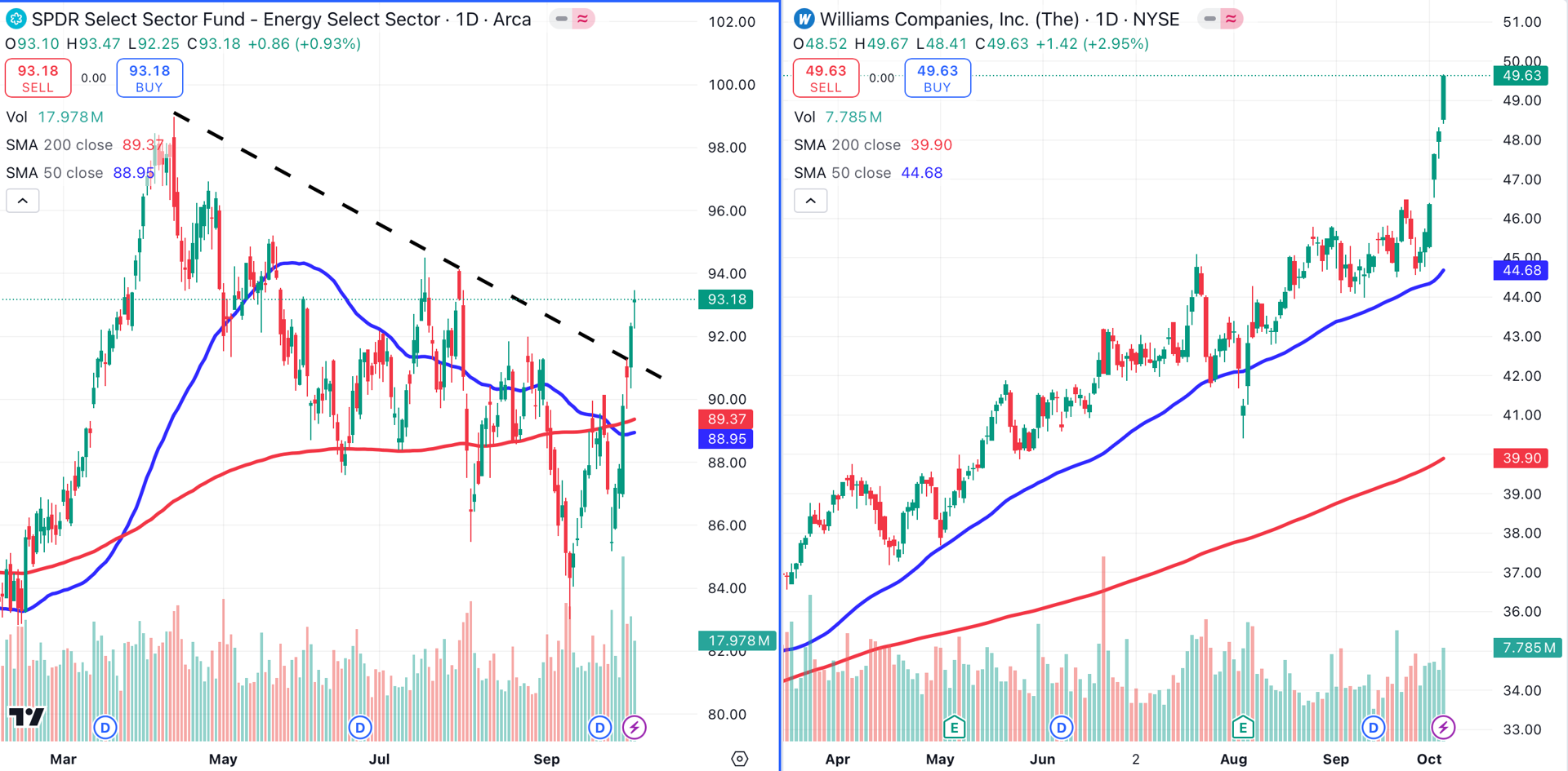
Shares of Tulsa, Oklahoma-based Williams Companies WMB gained nearly 10% last week. The natural gas processing and transportation company (right) has now gained over 39% year-to-date.
Materials Sector
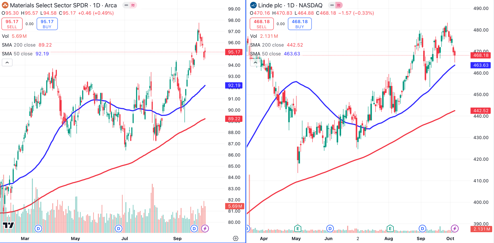
The materials sector had a rough week. The Material Sector SPDR XLB (left) lost ground as key components like Sherwin-Williams SHW and Linde PLC LIN (right) pulled back.
Pharmaceuticals Sector
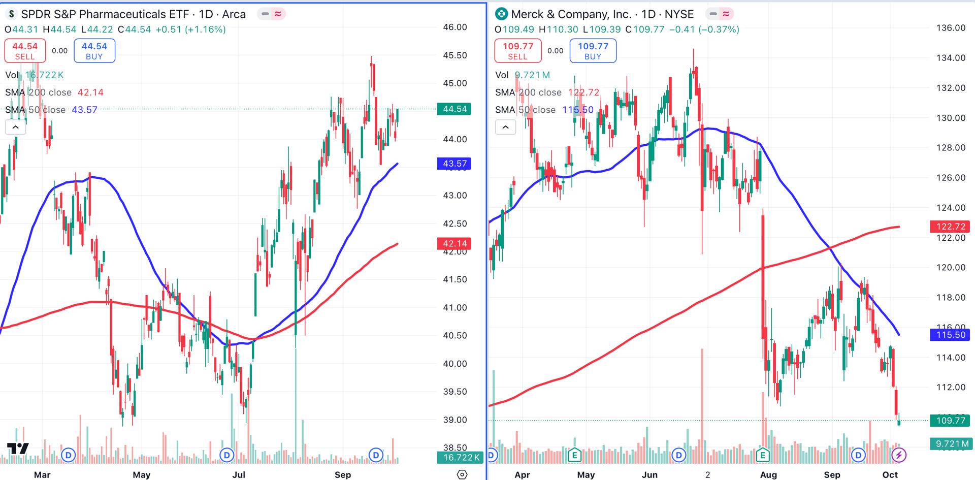
Pharmaceuticals, represented here by the SPDR Pharmaceuticals ETF XPH, continue to underperform. XPH (left) has gained less than 7% year-to-date, and is being dragged lower by holdings like Merck MRK (right), which has lost 3% year-to-date.
Consumer Staples Sector
Finally, the consumer staples sector (left) has stumbled badly in recent weeks. The sector, represented here by SPDR Select Consumer Staples XLP, has fallen beneath its 50-day moving average.
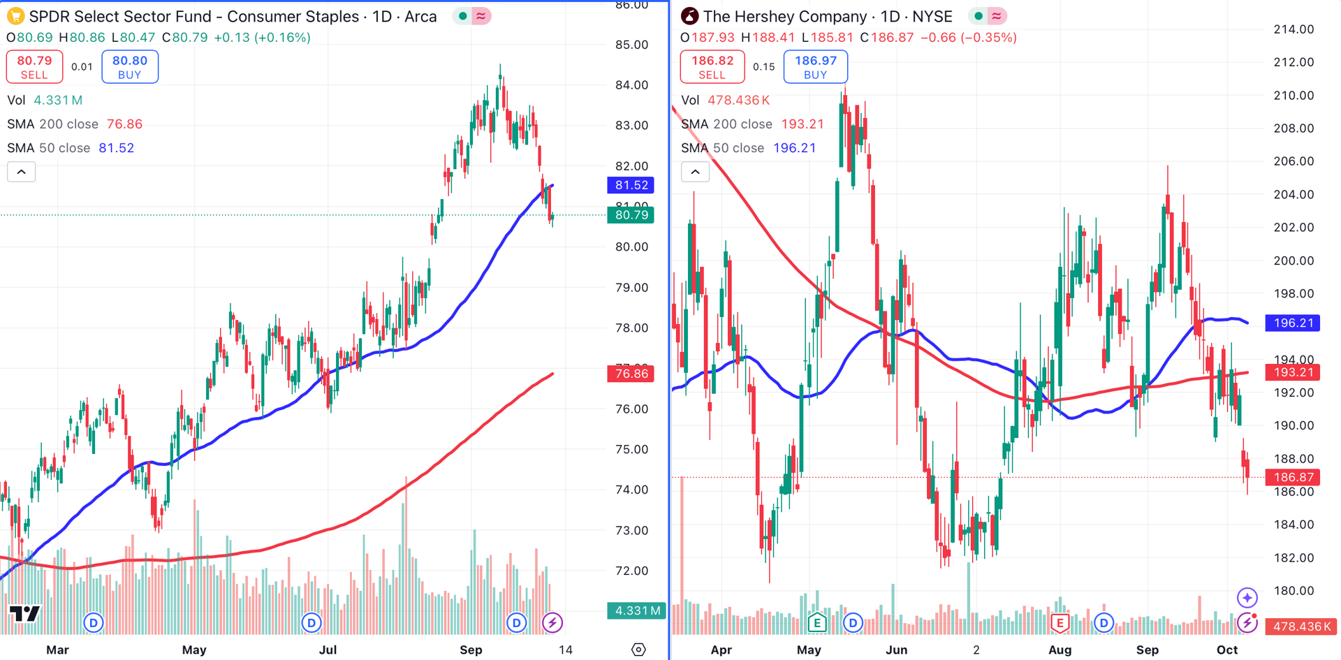
This sector has been hampered by poor performance in names like Hershey HSY, which has fallen below its 50-day (blue) and 200-day (red) moving averages.
At the time of publication, Ponsi was long WMB and CEG.