My Last Top-Down Look at the Markets
Taking a look at the broader market data for the last time at TheStreet Pro, I've got a forecast for the months ahead.
You've reached your free article limit
You've read 0 of 1 free Pro articles.
Most of my time working for TheStreet over the past nine years has been spent looking at individual stocks.
This was my job description from Jim Cramer, who hired me. I was expected to write six to eight updates per day, five days a week. By my calculations, I have penned some 18,000 updates on individual stocks and a few ETFs over the last nine years. Many of my forecasts have been successful thanks to a bull market, but a few I would rather forget.
I have ignored short-sale recommendations, penny stocks, most things in the world of crypto, options and anything I did not understand.
It is important to know what you know well and what you don't.
From time to time, I have worked on forecasts for the broad market averages, interest rates, the dollar and energy prices. These forecasts take a fair amount of time and thought. Some of my forecasts have been spot on and some have misjudged the strength of the markets.
Does that remind you of Yogi-ism?
I have tried to have a clear voice and not speak with two hands — "on the one hand... but on the other hand..." Apologies to any economists reading this.
How might the markets behave in the months ahead? Let's take one more (last) look.
Losing Dollar Hegemony
Let's start with a look at the Dollar Index. Most people believe that the U.S. dollar is the reserve currency. I don't believe that is the case anymore and it has, I believe, big implications going forward.
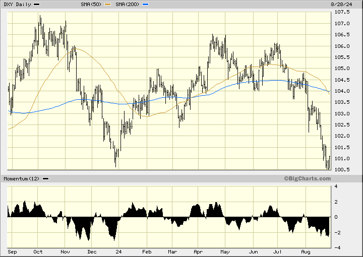
In this daily bar chart of the Dollar Index below, I can see a bearish setup. Prices have rolled over to the downside since early 2024. The Dollar Index is trading below the declining 50-day moving average line and below the declining 200-day moving average line. The 50-day line recently crossed below the 200-day line for a bearish dead or death cross. A dead cross is obviously a late-to-the-game signal. I don't see a bullish divergence from the 12-day momentum indicators, so I am not anticipating a counter-trend rally. If the dollar is embarking on a long-term decline, it can mean higher commodity prices (think crude oil) and maybe higher interest rates for our debt.
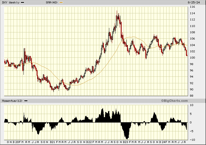
In this weekly Japanese candlestick chart of the Dollar Index below, I can see the last five years of price movement. The dollar had a huge rally in 2021 and 2022. Then prices made a peak — call it an inverted V-top pattern — and tumbled lower. Prices have trended sideways the past 18 months and the slope of the 40-week moving average line has turned negative. Positive price momentum has been weakening the past year and I think it is foreshadowing a coming decline.
A New Multi-Year Uptrend in Yields
Next on my check list is the yield on the 10-year treasury.
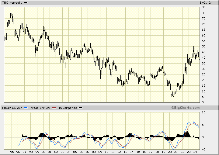
In this monthly bar chart of the 10-year treasury yield below, I can see a long-term downtrend going back to 1994. The declining trend in yield actually goes back to 1981 but this chart service could only display the last 30 years. The long-term downtrend in yields was broken in 2022 and now we have launched into a longer-term trend of higher yields. In the next few months we could see yields decline, but I view that as a counter-trend move. The big picture is: I look for higher yields for many years to come. The U.S. saw yields rise steadily from 1951 to 1981. A new multi-year uptrend in yields is underway.
Winds in the Sails for Gold
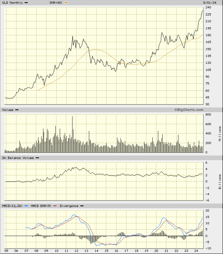
In this monthly line chart of the gold ETF GLD, I can see the long-term trend higher. Gold has broken out to a new all-time high and public participation, I suspect, is very low. Financial advisors today are more likely to suggest some exposure to bitcoin than to precious metals. Precious metals, in my opinion, have a long way to go before they are "over owned" by the retail public. Weakness in the U.S. dollar is going to be one of the winds in the sails of higher gold prices.
Crude Outlook
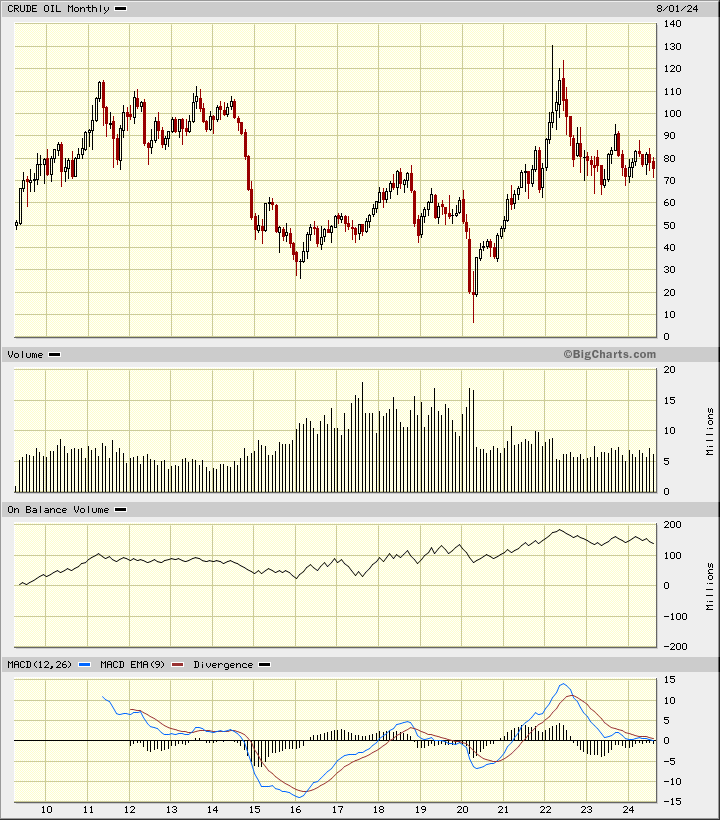
Crude oil futures have made some big up and down moves over the years. In the past 18 months or so, the price of crude oil has formed a large triangle on the chart below. We could have an upside breakout from this triangle or we could have a downside breakout. Notice that I did not say "on the other hand."
What About the S&P 500?
What about the S&P 500? Let's check.
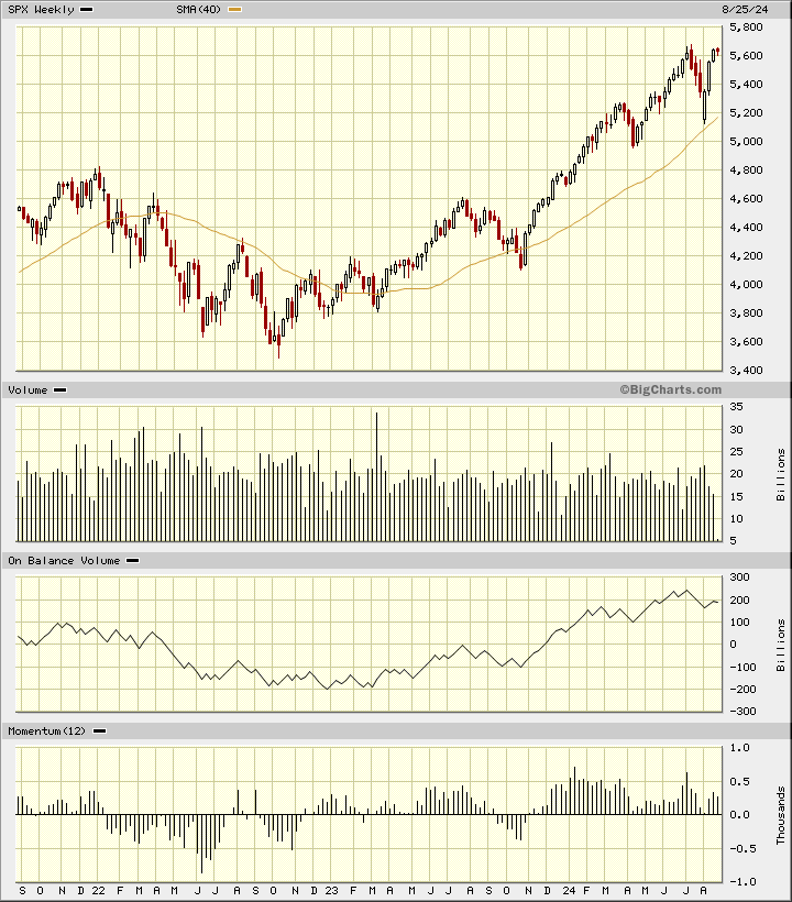
In this weekly Japanese candlestick chart of the S&P 500 below, I can see that prices bottomed out in 2021 during the pandemic. The S&P has been trading above the rising 40-week moving average line for close to two years. The most recent weekly candle pattern looks like a spinning top right at the prior high around 5,600. A bearish candle this week could give us a top reversal.
The weekly OBV line has turned lower in the past two months. The 12-week momentum study shows a pattern of weakening momentum since the beginning of 2024. This is a significant bearish divergence and could be foreshadowing a serious decline in price.
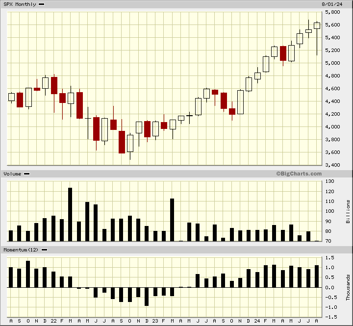
Long-time readers of "Kamich's Korner" may remember me using a candlestick pattern called "eight to ten record highs (or lows)." Back in the 1990s, Steve Nison and I were learning about Japanese candlesticks. Nison did the hard work and shared his revelations with me. One pattern that he discussed in his books is this eight to ten record highs.
In this monthly Japanese candlestick chart of the S&P 500 below, I can see nine record highs from last October. The most recent monthly candle is a very large hanging man pattern. A bearish candle (red) will give us confirmation of a top reversal. Also, you can see that trading volume has declined on the rally of the past year and that price momentum has been flat to down. A bearish divergence.
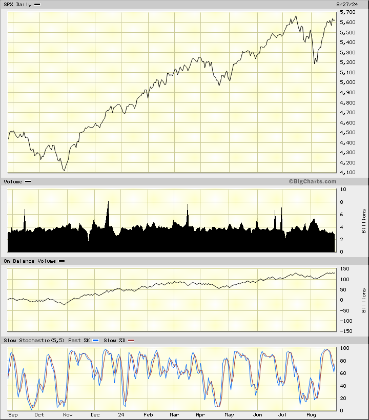
Is the market overbought? Check this daily line chart of the S&P 500 below. Prices have made roughly equal highs in the past two months. Look at the slow stochastic indicator which made a higher high on the second price peak. The market is going to correct this overbought condition either by moving sideways or by declining.
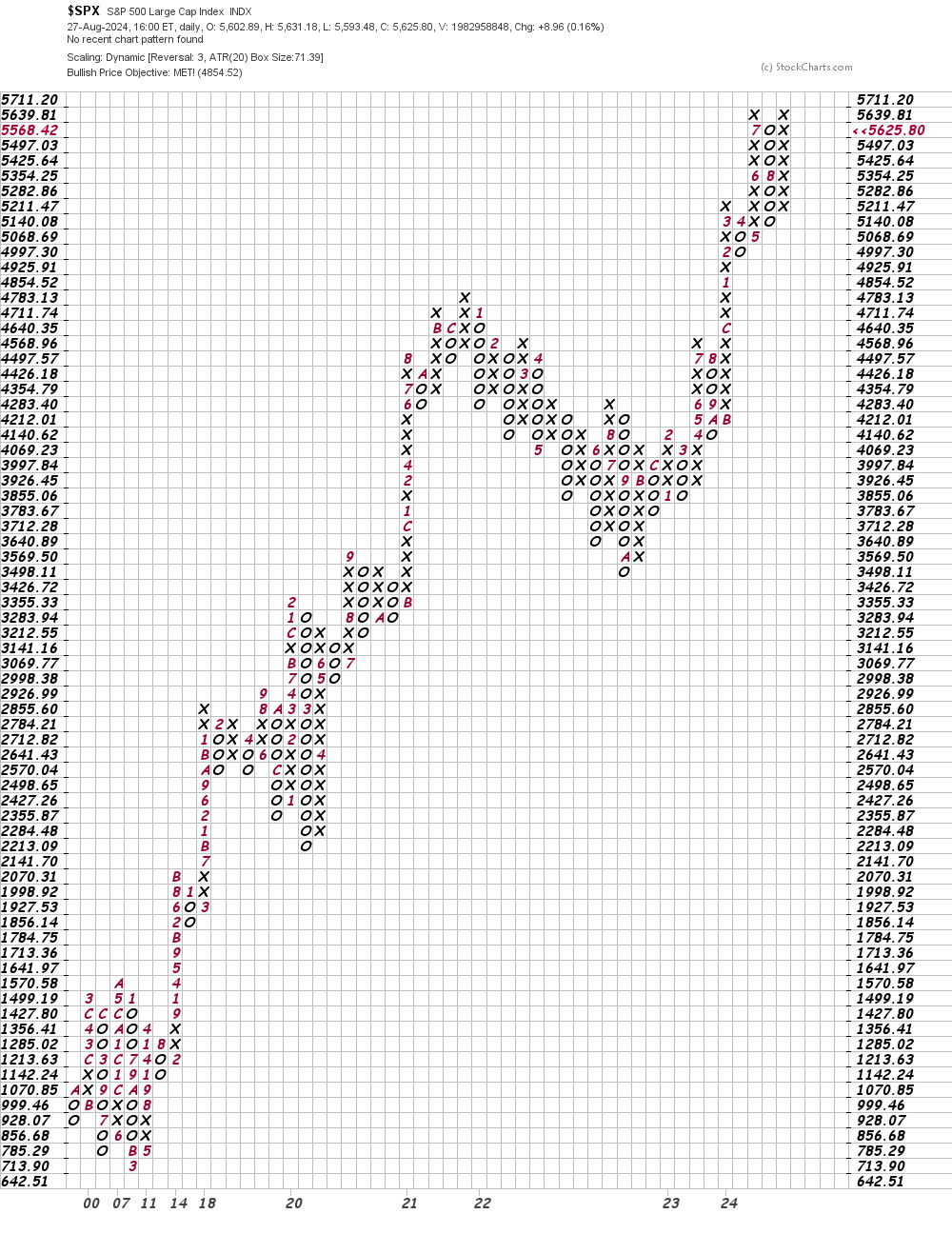
In this daily point and figure chart of the S&P 500 below, I used the average true range to organize the price action. Here, the software shows that prices have reached and exceeded the price target of 4,854. Reaching a point and figure price target is not enough of a reason to sell, but it can be a good reason to look at the technical situation closer.
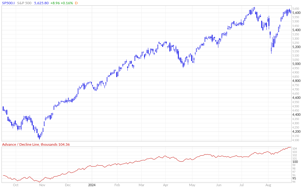
Let's consider some of the advance-decline lines.
In this daily advance-decline (AD) line of the S&P 500 below, I can see that the line has gone up to a new high. Prices have made a potential double-top pattern. I don't know all the answers, but one question comes to mind: Why is the AD so strong and prices have not surged to a new high? Chime in with ideas please.
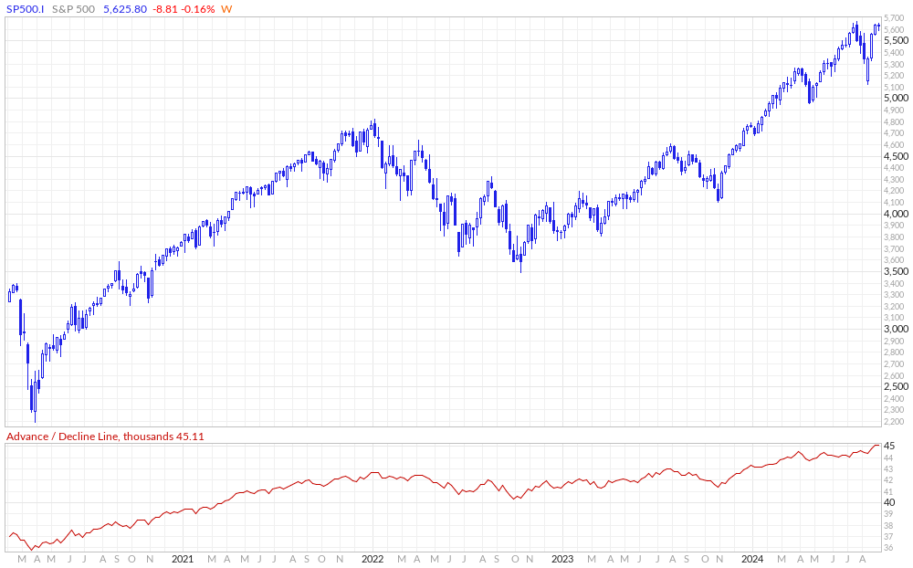
In this weekly AD line of the S&P 500 below, I can see no bearish divergence... yet.
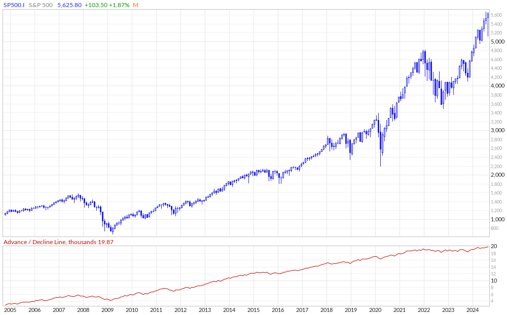
How about a monthly AD line? We have the data, so why not? Here I can see a secular bull market from March 2009. The AD line has moved higher and higher but has not kept pace with the price action in the past year or so. What is going on? The S&P 500 being pushed higher but a narrow list of names? You have heard this refrain before.
Bottom-Line Strategy
Some market technicians say that secular bull markets last for 10 to 20 years. Ned Davis Research (NDR) says the average is 1,105 days, but they also suggest that the current secular bull could last until 2027. The debate will continue but remember that averages are just averages. I think this is a time to be cautious and not be bold with your money.
Employees of TheStreet are prohibited from trading individual securities.