The Fed’s Decision Crushed Stocks... But There Is a Bright Side
Amid the carnage in stocks, let's step back and look at the overall economic and market picture.
You've reached your free article limit
You've read 0 of 1 free Pro articles.
Fed Chair Powell and the Federal Open Market Committee cut the Fed funds rate by 25 basis points on Wednesday, as expected. What was not expected was the hawkish tone of Powell’s remarks, which were delivered in a press conference in the wake of the decision.
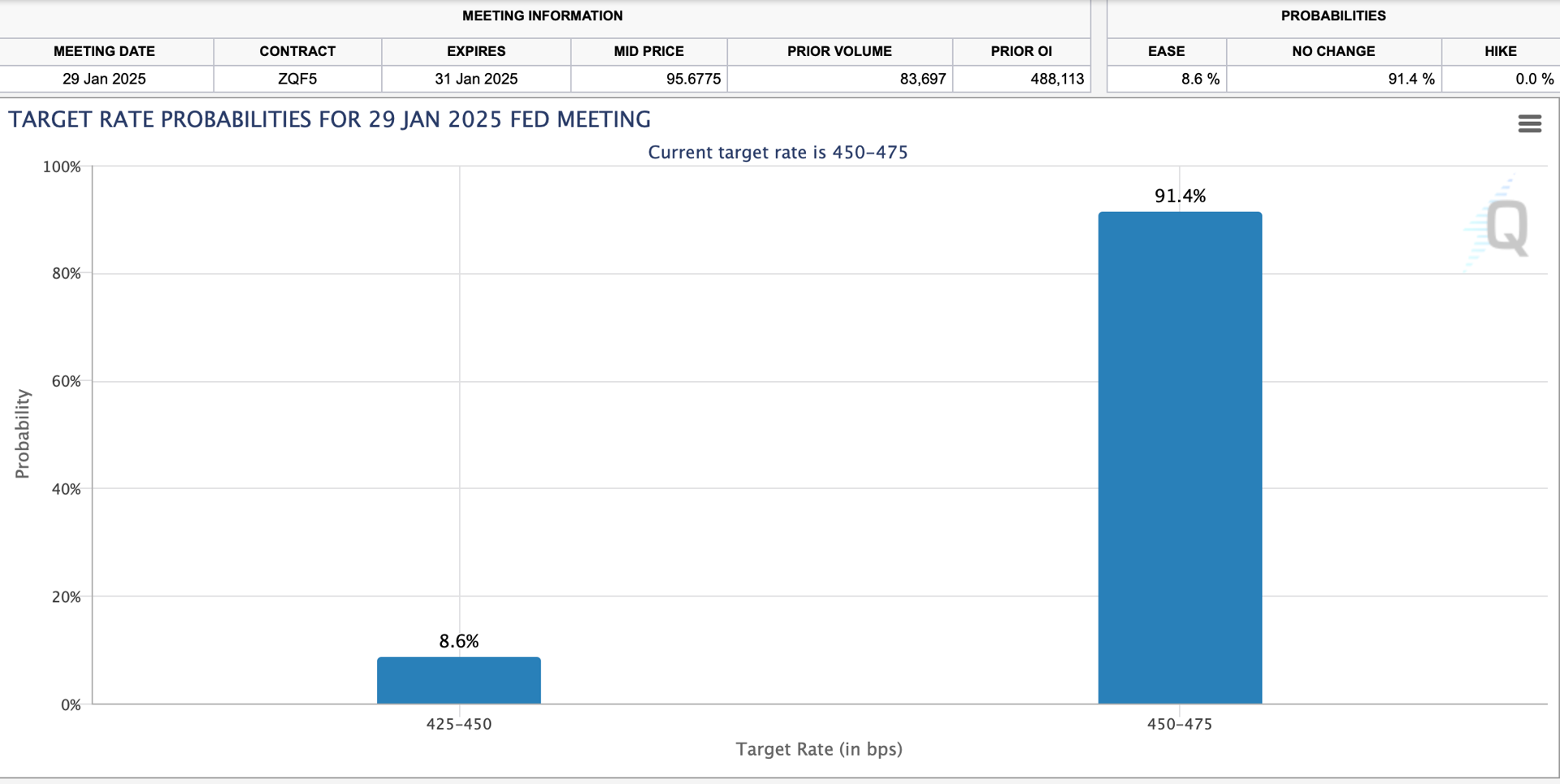
Stocks tanked as Powell signaled a cautious approach to future rate reductions. According to the CME’s FedWatch Tool, chances for a January 29 Fed rate cut now stand at just 8.6%.
The news wasn’t all bad. At one point, Powell stated, “I think it’s pretty clear we have avoided a recession…the outlook is pretty bright for our economy”.
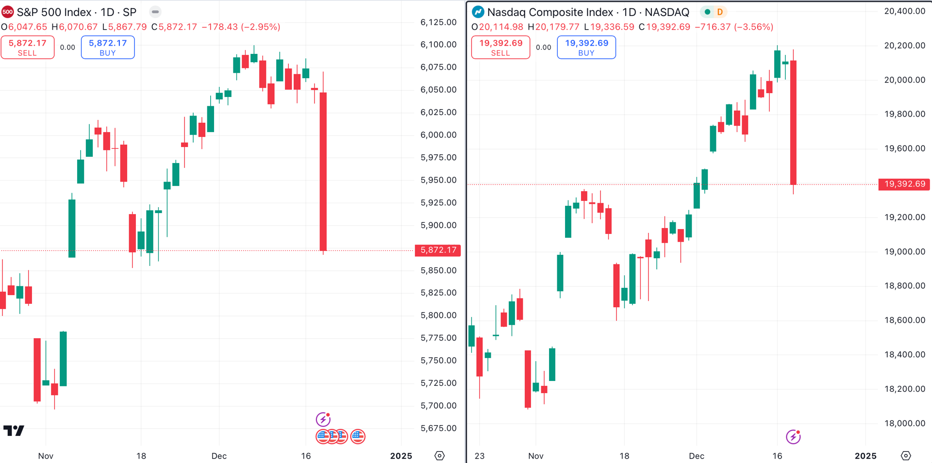
Powell's positivity sent stocks tumbling, as deeper rate cuts became less likely. The S&P 500 lost 2.95% (left chart, below), and the Nasdaq Composite fell 3.56% (right chart, below).
Both major indexes were cursed with a huge bear candle that in each case engulfed over a half-dozen smaller candles.
The charts of the Dow Jones Industrial Average (left, below) and Russell 2000 (right, below) look even worse. The Russell 2000, which lost 4.39% on Monday, is currently trading lower than it was prior to the November 5 U.S. presidential election. Meanwhile, the Dow Jones Industrial Average has nearly filled the election day gap.
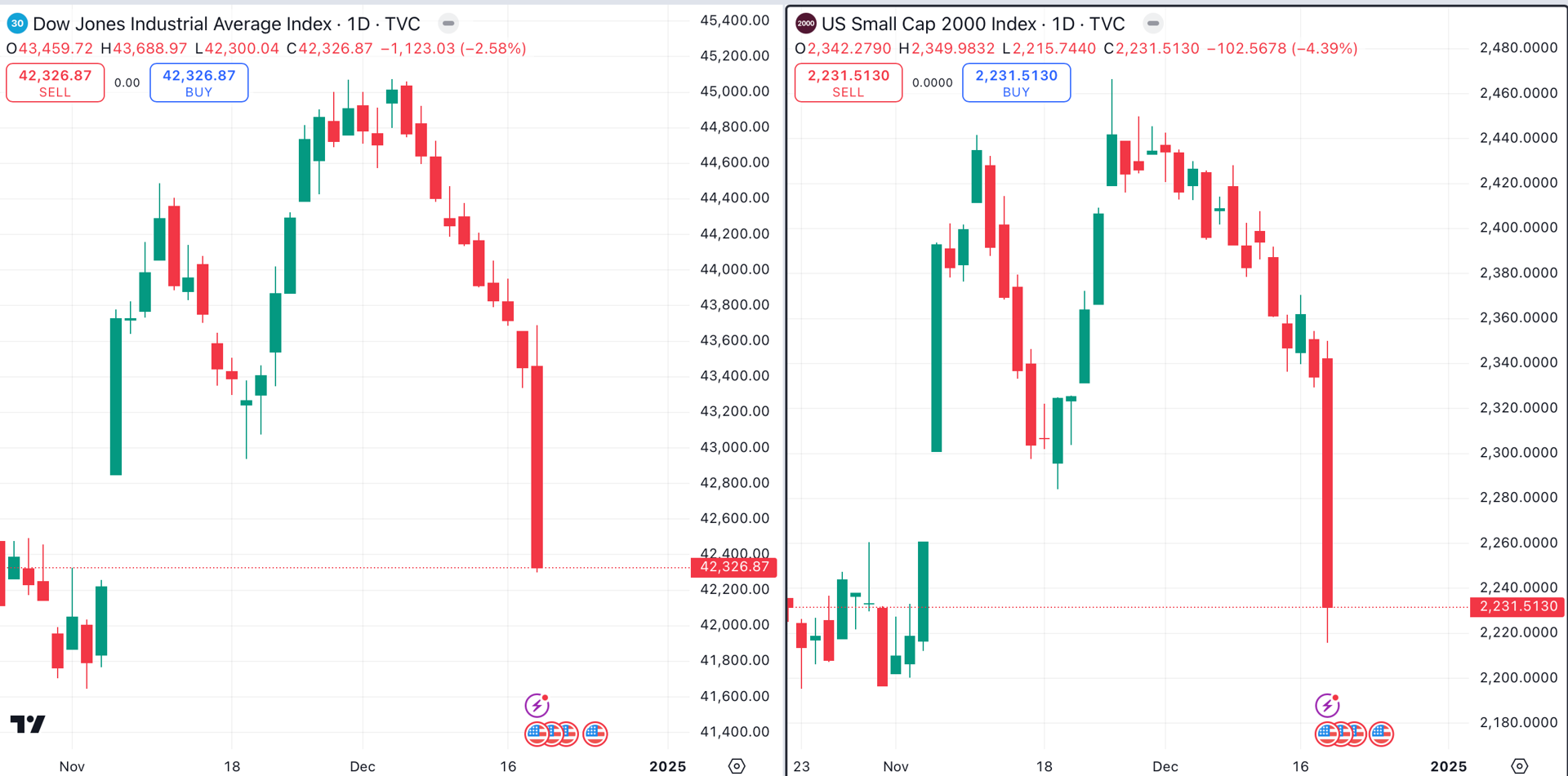
The Nasdaq is the strongest of the bunch, as the tech-laden index is still arguably in an uptrend. The other three major indexes have formed bearish double top patterns.
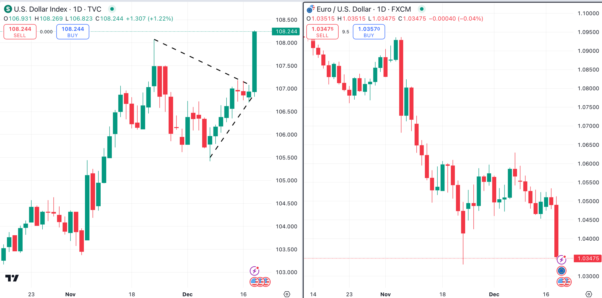
While stock traders dislike the idea of fewer rate cuts, the U.S. dollar (left chart, below) is responding positively. The greenback broke out of a symmetrical triangle pattern (black dotted lines) to close at a two-year high.
When the greenback wins, the euro (right chart, below) loses. It comes as no surprise that as the dollar hit a two-year high, the euro fell to a two-year low. Note the symmetry of the two charts, as the euro and the dollar have an inverse relationship.
Perhaps Wednesday’s most important chart belongs to the U.S. 10-Year Treasury note. The yield chart of the 10-Year note has formed a cup and handle pattern (shaded yellow) over the past six months.
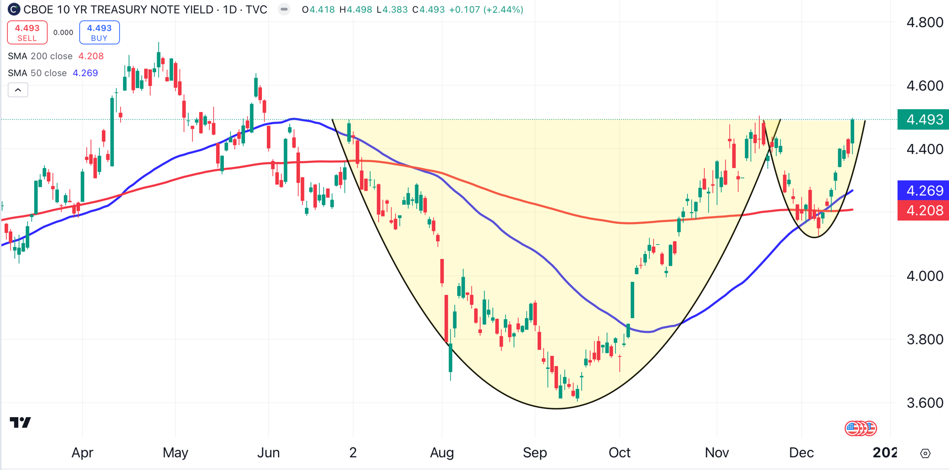
On December 9, the chart’s 50-day moving average (blue) crossed above its 200-day moving average (red), a bullish momentum signal.
As of this writing, the T-note’s yield is just a few ticks below 4.5%. If a breakout occurs, there could be major ramifications for stocks, bonds, and the housing market.
Despite the carnage in stocks, the takeaway here is positive. Powell and the Fed are more concerned about the recent uptick in inflation than they are about the spectre of a recession. After the worst bout of inflation in over 40 years, the last thing consumers need is an encore.
At the time of publication, Ponsi had no positions in any securities mentioned.