Back From Vacation and Looking at Which Way the Indicators Skew
Everybody’s talking about the Skew in the options market. But what does it mean? Let’s look at that, plus other indicators.
You've reached your free article limit
You've read 0 of 1 free Pro articles.

Note: I will be back to my regular schedule and stock charts beginning Monday evening.
There is a chart being shared by so many people that my inbox was full of so many questions late last week that I feel the need to begin by addressing it. It is the chart of the SKEW of the put/call ratio of the average stock of the S&P.
Let me state right now, I am not an expert on the SKEW. I can barely explain to you what it is, but I can read a chart. I also do not know who to credit for the chart, so my apologies in advance to whoever it is who has done the work. Here is the chart.
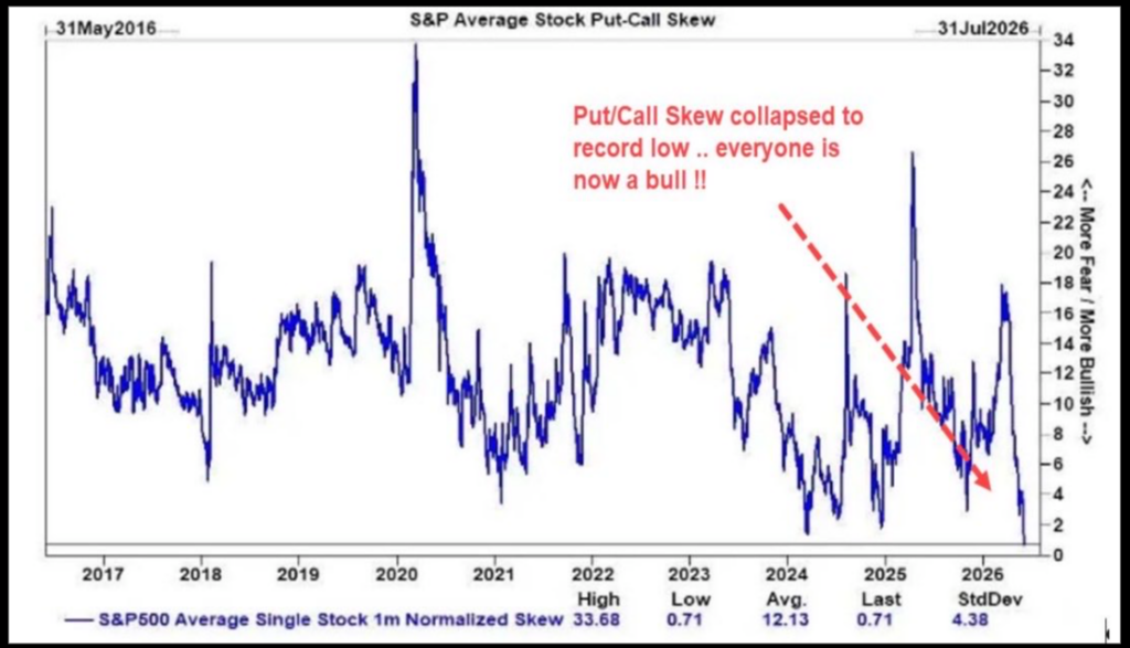
What you can see so readily is that the current reading is incredibly low. I am told it is a record low (says so on the chart!), so I will have to believe it. And if we look at the two recent lows, with one in what appears to be the first quarter of 2024 and the other in January of 2025, my initial thought is this is not a chart to ignore.
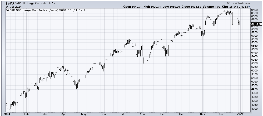
It’s tough to tell from the chart of SKEW, but let’s say that low skew arrived near the end of the first quarter, well then it did its job and captured a 5% pullback. I feel I need not show you 2025 since we all know it captured the Tariff Tantrum for a 20% decline in a matter of weeks. I’d say that’s a good track record even if it is only N=2.
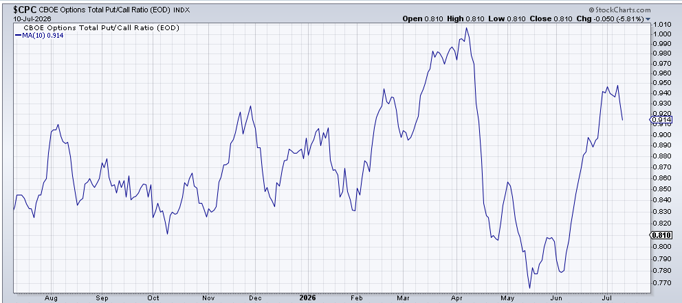
What is even more curious to me is that if we look at the 10-day moving average of the total put/call ratio from that 2024 time, it’s even more interesting because you can see the moving average is smack at the top of the page (arrow), which would mean the put buying was intense. And typically, that is quite bullish for stocks. Yet we can all see it wasn’t bullish until AFTER the 5% pullback.
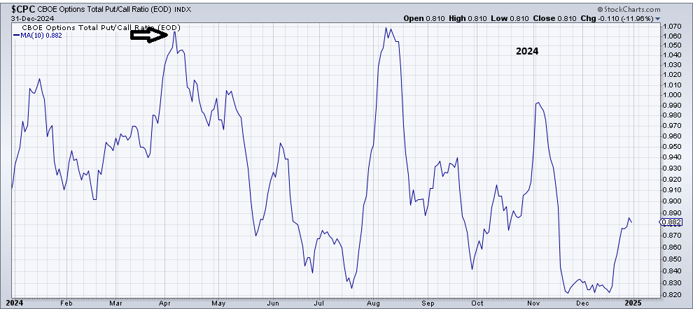
Typically, I would just put this chart in the ‘hmm, interesting’ pile, but you see, this weekend I see that the ten-day moving average of the put/call ratio is at the top of the page, just like it was in 2024. I would call this current chart of the put/call ratio bullish, but is it? Or is it like 2024?
Let me cycle back to that chart of the SKEW one more time to point out that the SKEW was low in January 2018, which was mere weeks before Volmagedden, followed later in the year by a 20% decline in the S&P. And in early 2021. Early 2021 was peak SPACs and Crypto and all other sorts of speculative nonsense. The S&P barely blinked, but the majority of stocks peaked then, with the S&P going up until November.
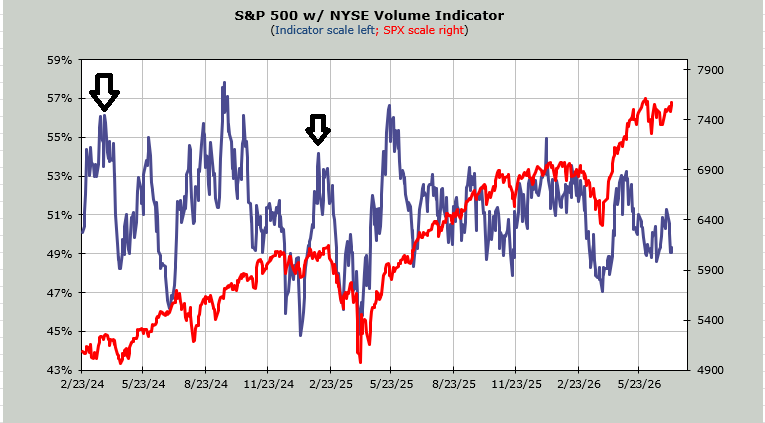
Finally, there is the chart of the Volume Indicator. It is shockingly low (49%) for a market at/near the highs. It peaked back in mid-May at just over 53%. At 47%, it gets oversold. So I looked back to see what this chart was doing at those 2024 and 2025 low points in the SKEW (arrows on the chart). Volume was leaning overbought, not oversold. Now it leans oversold.
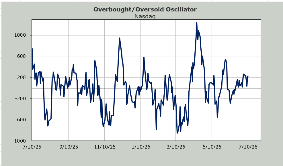
This brings me back to that chart of the Overbought/Oversold Oscillator I keep showing, noting that this period of time looks similar to that period last fall when every time the S&P looked like it was poised to fly, it pulled back, and every time it looked poised to break down, it rallied.
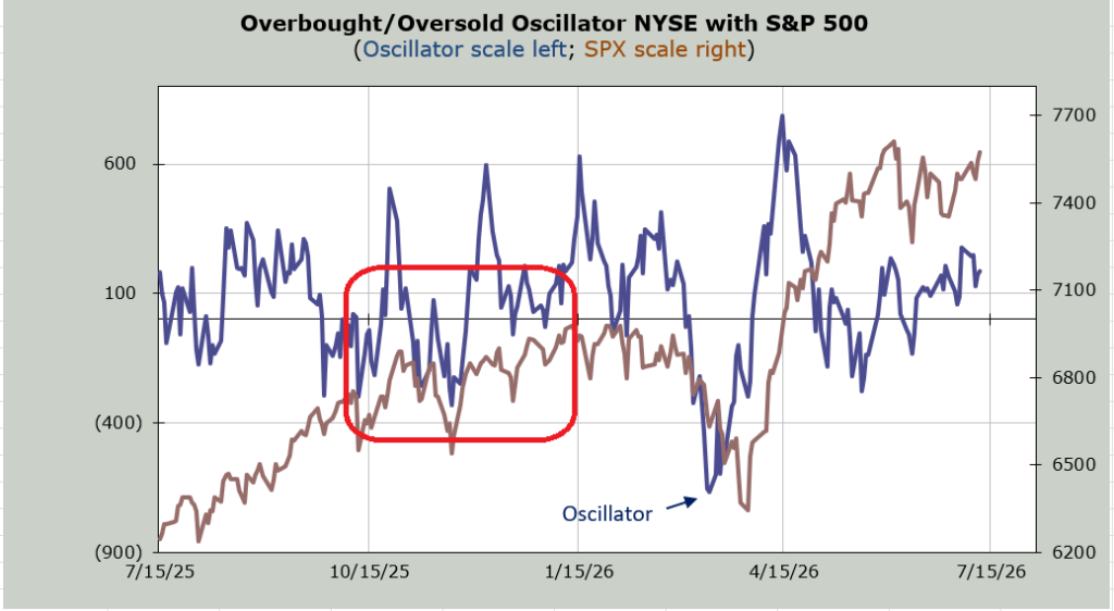
There are simply too many indicator charts that are sloppy, not extreme. We still have an Either/Or market, or a version of it. Perhaps we get a five percent pullback, and that Volume Indicator goes to 47% (intermediate term oversold), and that ten-day moving average of the put/call ratio gets extreme or gets more extreme (showing far too many puts being bought) and we end up with a market that we can sink our teeth into. For me, that would be welcome.