Which Way Is Robinhood's Arrow Pointed?
Let's check out the stock's band of merry charts and indicators.
You've reached your free article limit
You've read 0 of 1 free Pro articles.
Robinhood Markets HOOD was rated a new "outperform" (buy) at Bernstein with a $30 price target.
Let's check out Robinhood's band of merry charts and indicators.
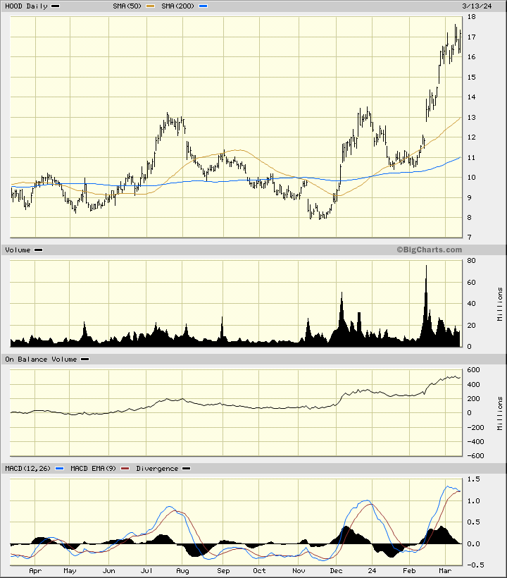
In the daily bar chart of HOOD, below, I can see that share prices have made lows in November and late January. The shares trade above the rising 50-day moving average line and above the rising 200-day line.
The daily trading volume shows two "surges" in December and February. The On-Balance-Volume (OBV) line shows us a positive pattern since November.
The Moving Average Convergence Divergence (MACD) oscillator is above the zero line but correcting to the downside.
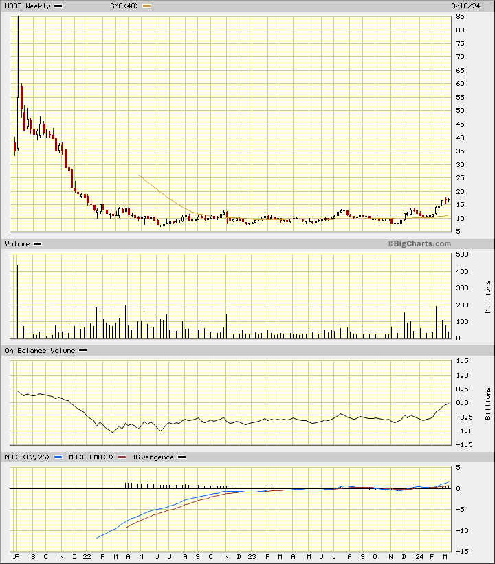
In the weekly Japanese candlestick chart of HOOD, below, I can see a two-year base pattern around $10. The shares have recently turned higher and now trade above the rising 40-week moving average line.
The weekly trading volume has increased in the past four months. The weekly OBV line has been moving sideways to higher the past two years. The MACD oscillator turned bullish in February.
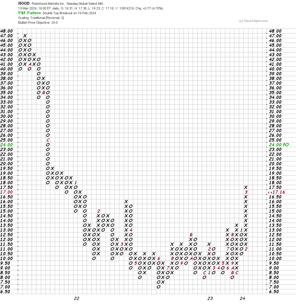
In this daily Point and Figure chart of HOOD, below, I can see an upside price target in the $24 area.
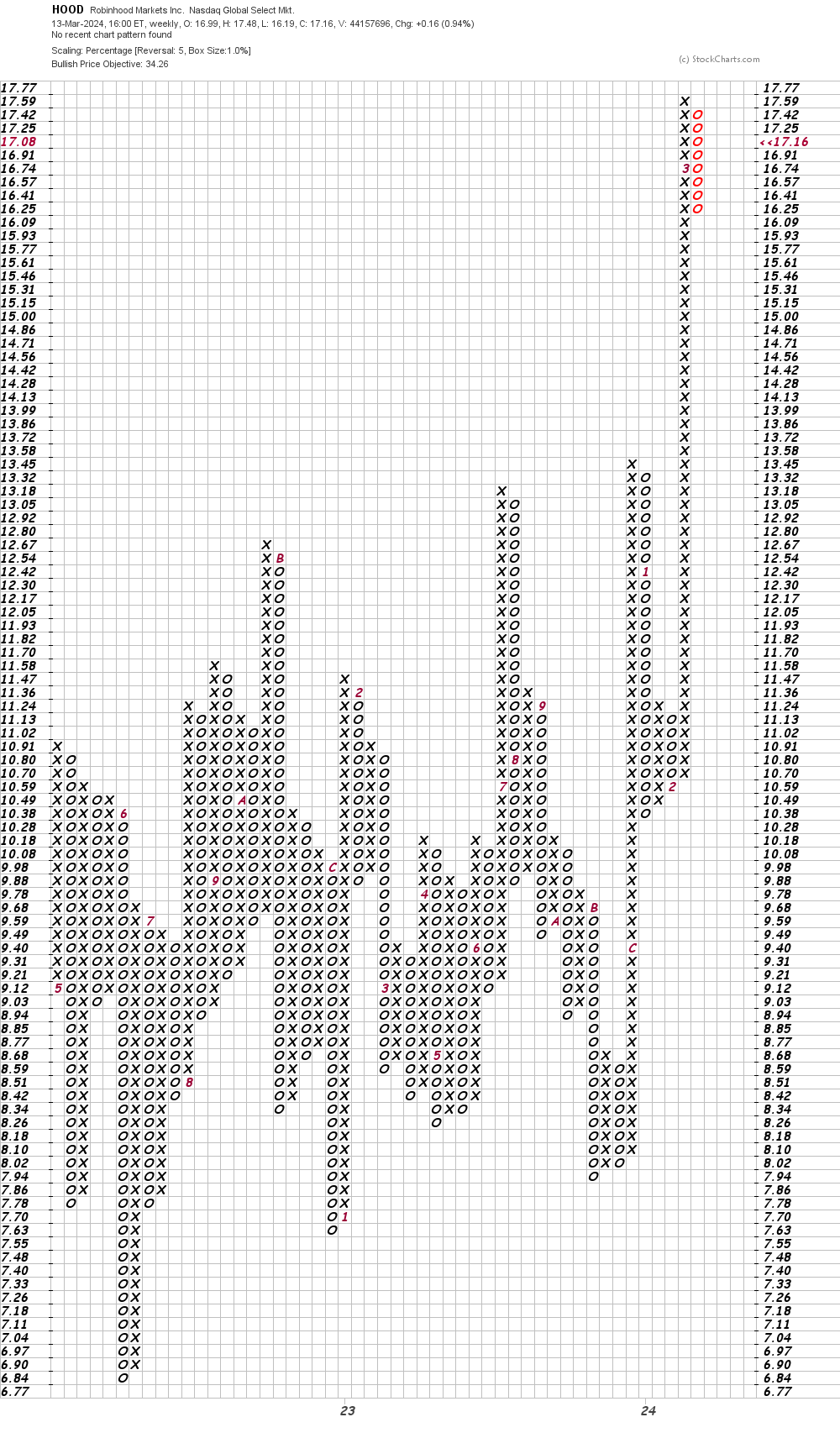
In this second Point and Figure chart of HOOD, below, I used weekly price data with a five-box reversal filter, which shows us a price target in the $34 area.
Bottom-line strategy: I am not in a rush to go long HOOD. I would stand aside for now.
Employees of TheStreet are prohibited from trading individual securities.