A Simple Sofi Strategy: Stay Away
The charts just don't look good.
You've reached your free article limit
You've read 0 of 1 free Pro articles.
Sofi Technology SOFI has continued to work lower on the charts and the indicators support the idea of further declines in the weeks ahead. In my June 4 update I recommended avoiding the long side of SOFI.
Has anything changed for the better? Let's check.
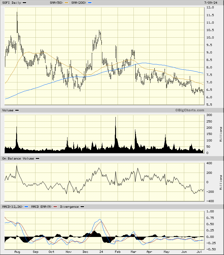
In this daily bar chart of SOFI, below, I can see that prices have weakened since early June. Prices trade below the declining 50-day moving average line and below the declining 200-day moving average line. The On-Balance-Volume (OBV) line shows us a choppy decline since late December. Traders are more aggressive sellers than buyers. The trend-following Moving Average Convergence Divergence (MACD) oscillator remains below the zero-line where it has taken up residence since the middle of January.
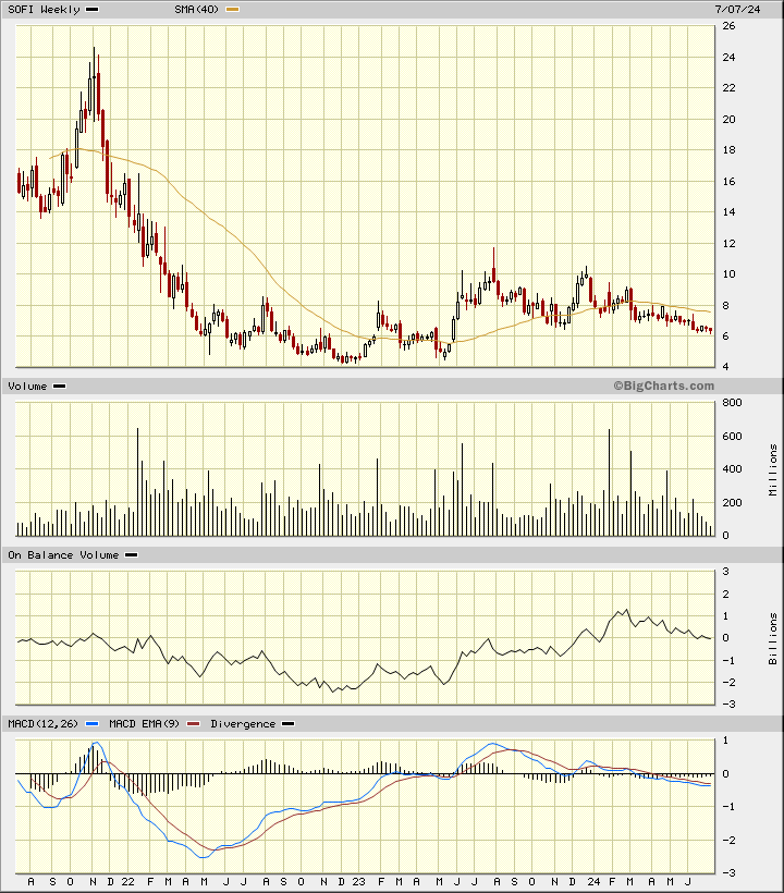
In this weekly Japanese candlestick chart of SOFI, below, I can see a weak picture. Prices trade below the declining 40-week moving average line. The weekly OBV line has been in a downtrend the past five months and tells me that sellers are more aggressive than buyers of SOFI. The MACD oscillator is below the zero-line and has been weak for the past 12 months.
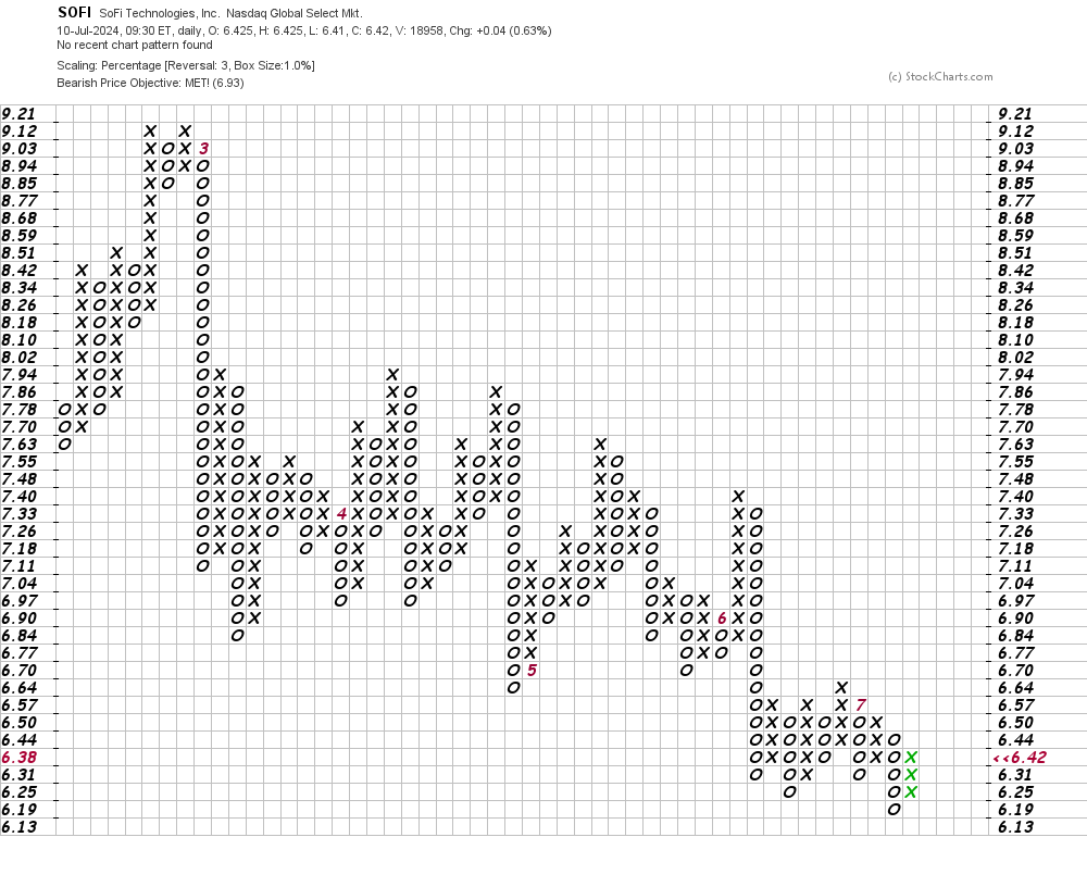
In this daily Point and Figure chart of SOFI, below, I can see that prices have reached and exceeded a downside price target in the $7 area.
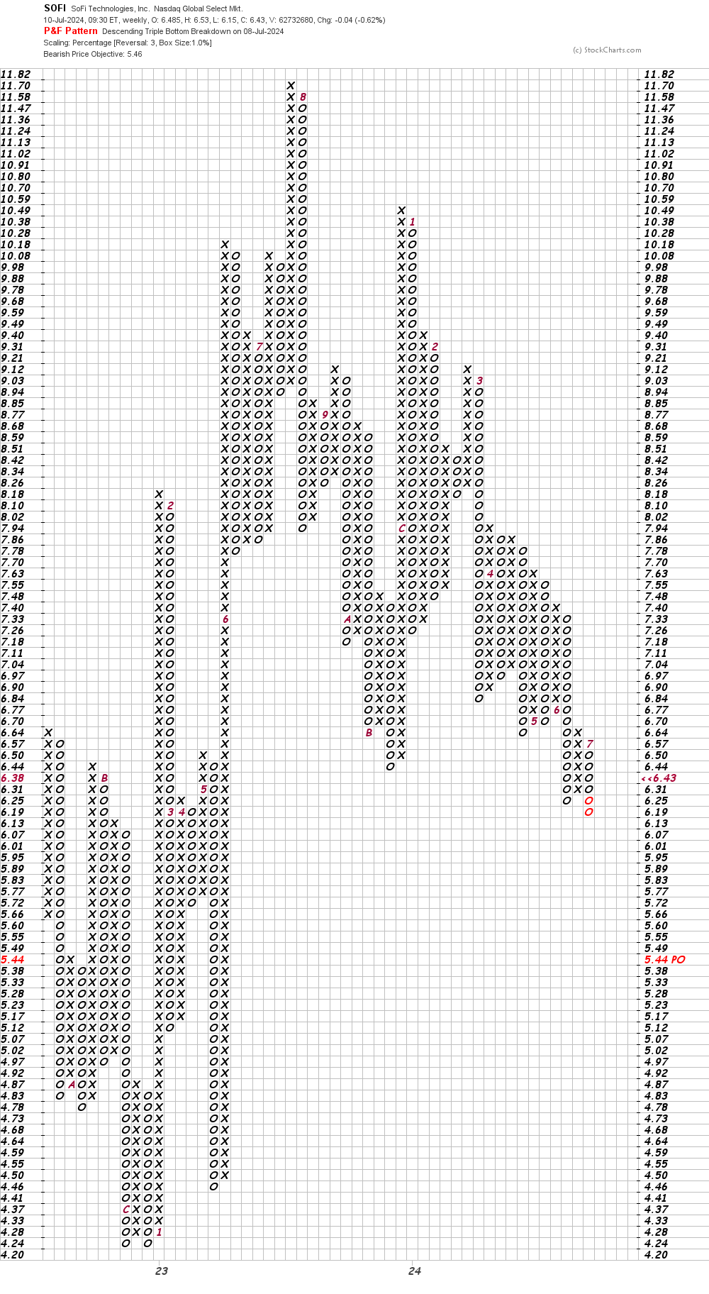
In this weekly Point and Figure chart of SOFI, below, I can see a price target in the low $5 area.
Bottom line strategy: As long as the downtrend persists, the strategy is simple - avoid the long side of SOFI as further declines are likely in the weeks ahead.
Employees of TheStreet are prohibited from trading individual securities.