Let's Map Out the Economy in Seven Charts
Here's what we’re watching for the chances of a soft landing, Fed rate cut potential and more.
You've reached your free article limit
You've read 0 of 1 free Pro articles.
Just where is the economy right now? It can be hard to tell when in the weeds of data we keep getting. So, let's step back and look at seven charts that help us map out a picture for gross domestic product, rail car loadings, manufacturing and services and other sectors and even data surprises.
Note that we will soon get the September Flash PMI report from S&P Global that will give us the latest insights on the speed of the manufacturing and services economy, job creation, and inflation. These insights will come ahead of the September data we will start to get next week, which will be some of the last factors for third-quarter 2024 gross domestic product. So, let’s consider these charts as we get ready for the new data -- just as a dozen Fed speakers are on tap for this week, including Fed Chair Powell on Thursday.
GDP Growth
A look at the chart below suggests the economy has been growing nicely over the last several quarters, and per the Atlanta Fed’s rolling GDP forecast is on track to do the same. Because the Atlanta Fed’s GDPNow is a rolling forecast it only reflects the data published thus far. Unlike other GDP figures that include forecast expectations, the GDPNow model is updated as new data is published and on a somewhat frequent basis. The next update will be on Friday, Sept. 27, and will reflect this week’s data, including the August Personal Income & Spending data.
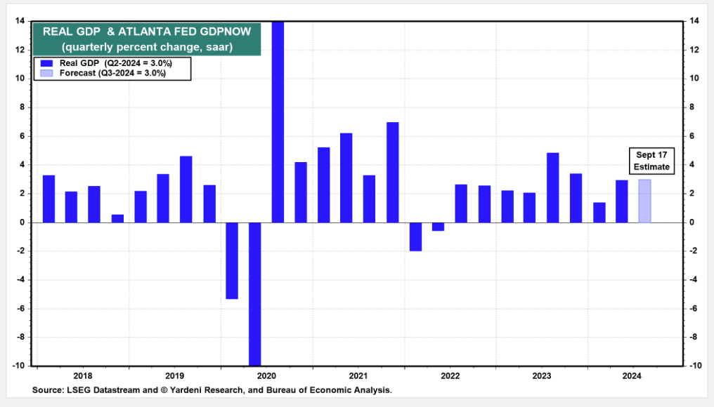
Unless we see a dramatic decline in the coming data for September, the soft landing narrative remains the likely scenario, especially with the Fed looking to support the economy.
Citibank Economic Surprise
The Citibank Economic Surprise Index, better known as the “CESI” tracks the degree to which economic data comes in better than expected or if it misses expectations. In the graph below, we can see how some folks started to become nervous about the speed of the economy as incoming data was softer than expected.
But if we compare the GDP chart above with the one for the CESI below, it reminds us that just because data is coming in softer than expected doesn’t mean the economy is on the verge of stalling.
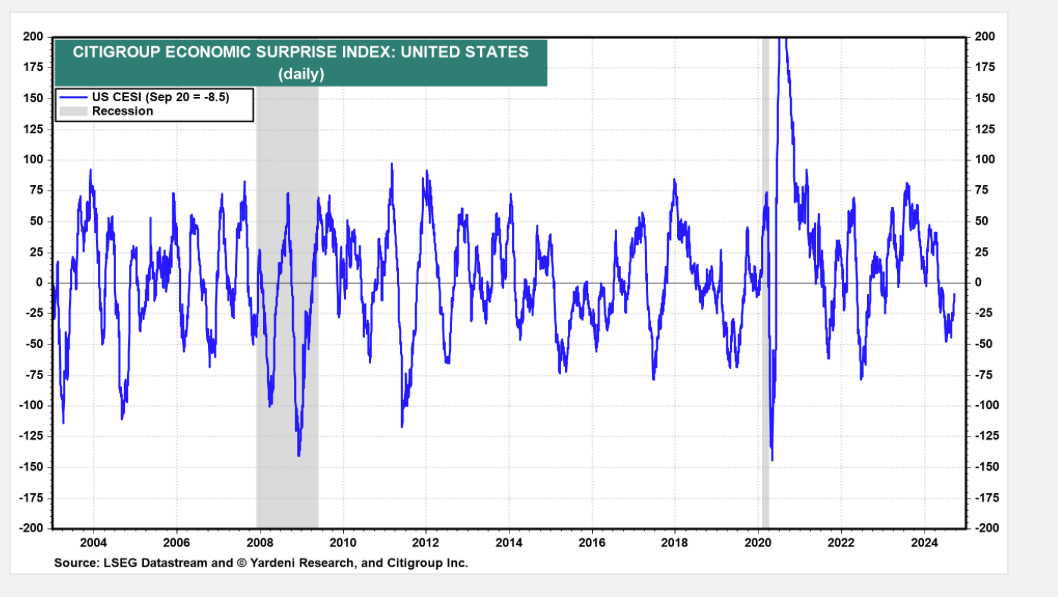
You’ll also notice the more recent data has the CESI, while still below zero, it has turned up. This means more recent data is improving. One of the signals that we’ve been tracking and discussing with you is weekly rail car traffic, which turned up considerably in August, and that strength has continued into September.
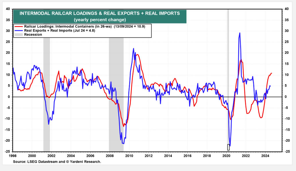
We do want to be careful in reading through on that rail car data, given the potential for a longshoreman strike that could hobble east and Gulf Coast ports starting in early October. If it comes to pass it could bring another bout of supply chain issues and could stoke some inflationary pressures ahead of the holiday shopping season. That concern and efforts to limit the impact of the strike may explain some of the recent strength in the rail car data.
Manufacturing, Services, and Other Sectors
We’ve discussed the monthly manufacturing and services PMIs with you, but let's look at the service sector, which has been carrying the overall economy as the manufacturing one has been contracting over the last several months.
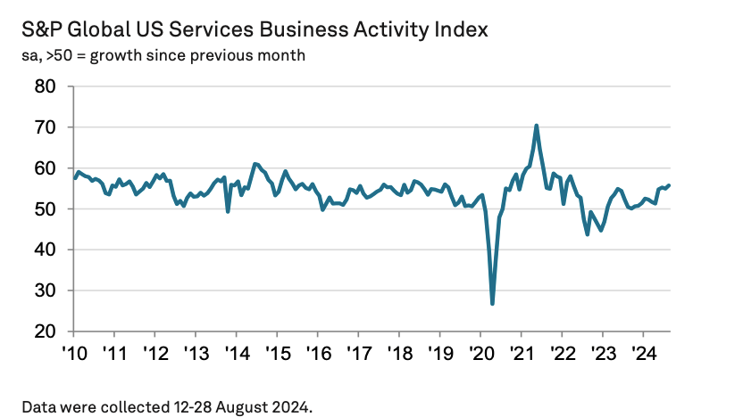
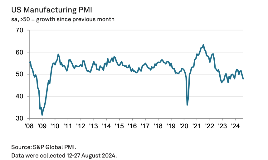
These two charts set the stage for today’s Flash September PMI reports and the final September ones we’ll get early next week. When we get the Flash report we’ll be putting it through its usual paces for new order growth, job creation, and expectations. The overall picture we’re looking for from the Flash report is whether the economy’s performance in September has it still tracking for a soft landing. We’ll also be looking for any comments about pulling forward materials and such ahead of the potential longshoreman strike.
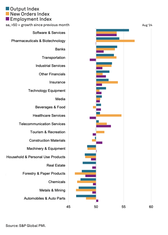
And because we like to get more granular, here’s a snapshot of where the underlying strength for the economy was from a sector perspective in August. While the data is positive for our holdings in Microsoft MSFT, ServiceNow NOW, Bank of America BAC, Morgan Stanley MS, Nvidia (NVDA), Marvell MRVL, Eaton ETN, Trade Desk TTD, Labcorp LH, and others, let’s remember it takes more than one month to draw a line. That said, it builds on other recent data as well as September investor conference comments.
Job Growth
With the Fed more balanced between its two mandates of stable prices and maximum employment, we will be watching the pace of job creation even more carefully. In what would fall into the camp of “bad news is good news” should the job market weaken compared to some of the lower levels captured in the chart below, we could see the market’s excitement for the Fed to do more than its latest set of economic projections calls for. Those projections, which are not hard forecasts and are subject to change based on incoming data, show the potential for another half-percentage point of rate cuts this year and an additional full percentage-point next year.
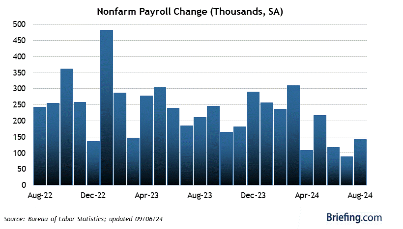
While there are many factors to track when it comes to the economy, the Fed has made it clear the ones it's watching, and that means we will as well.
At the time of publication, Pro Portfolio was long MSFT, NOW, BAC, MS, NVDA, MRVL, ETN, TTD, LH.