Charting the Markets: It's Been a Steady Ride in 2024
With all the sharp swings and volatility moves, the markets performed quite well. What can we learn from it all?
You've reached your free article limit
You've read 0 of 1 free Pro articles.
We are now at the end of 2024 and with just a day or so left of trading let's take an isolated look at this past year to see if we can learn something from it.
No question the market was bullish the entire year, picking up from the very strong 2023 to post a a slightly better gain (we'll know exactly how much more at the end of trading Tuesday).
As we always preach, price is king. Looking at the top pane of the S&P 500 weekly chart, below, we see the candles were dominantly blue, sprinkled with a bit of teal on those handful of pullbacks. Blue candles represent a bullish condition in the GoNoGo composite of indicators, while teal represents cautiously bullish.
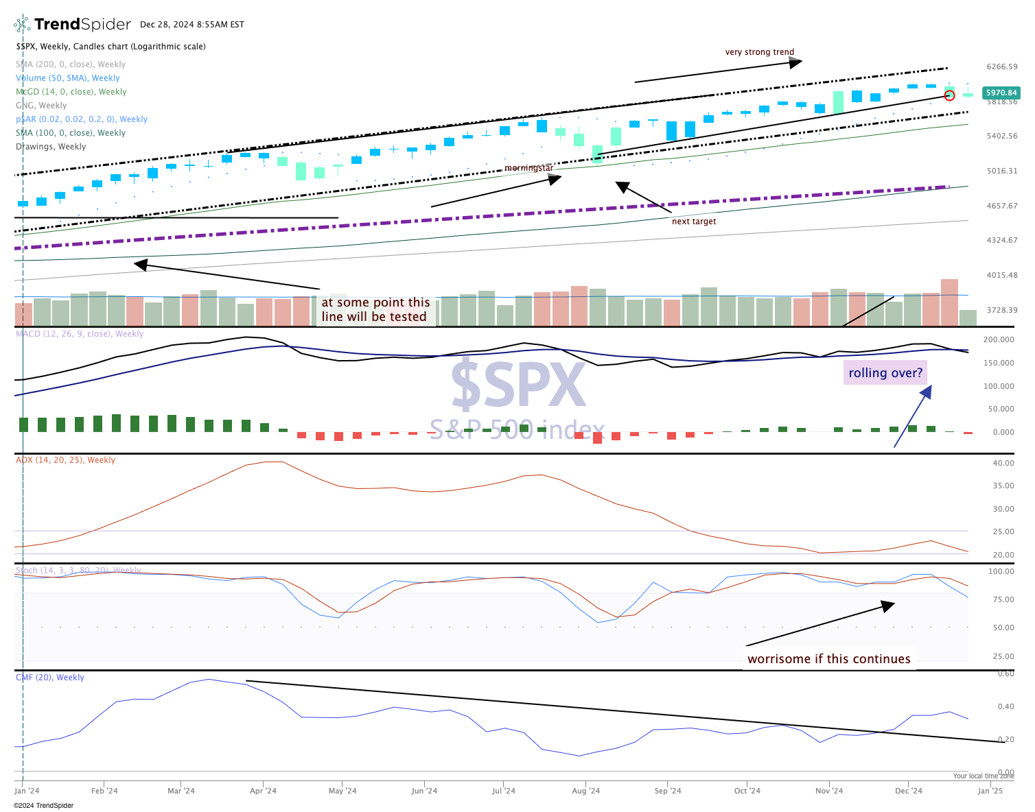
Could we have known a year ago how this would play out? Of course not, we don't use a crystal ball, but if we follow trends and patterns then we know the odds were heavily favoring an up year.
The MACD (moving average convergence/divergence) was strong all year; only a few times did it dip to a bearish signal before correcting itself to align with the bullish trend. Momentum (stochastics) were quite strong all year long too, indicating that dips were being bought on the pullbacks in order to keep the trend going.
We are not making any predictions for 2025. However, based on historical trends and patterns we should simply go with the flow and manage our risk appropriately. Nothing different than at any point of the year.
We'll continue to make adjustments to the chart with trendlines and to identify weaknesses that can be exploited.
