The Scariest Chart on Wall Street Is Also the Most Dishonest
Wall Street is lying to you to keep you fully invested.
You've reached your free article limit
You've read 0 of 1 free Pro articles.

I recently wrote that the primary goal of Wall Street and the money management business is to gather assets and hold them, not to grow them. Assets Under Management (AUM) is what gives Wall Street its power and its profits.
One way the industry holds on to your assets is by making sure you stay fully invested and don’t hold high levels of cash that can be easily moved. They have a vested interest in making sure you are always heavily long.
A common form of persuasion is this chart:
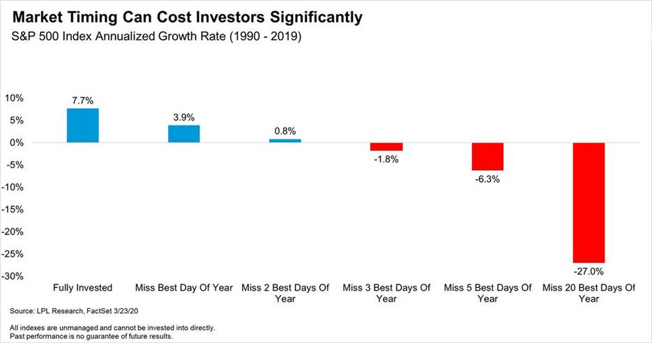
You have probably seen it. Every brokerage and fund company keeps a version, and it is displayed whenever the market turns ugly and clients start asking about cash. You are told that if you stay fully invested in the S&P 500 for 30 years, you will produce a compounded return of nearly 8% a year. However, if you miss the 10 best days, your return is cut roughly in half. Miss 20 or 30 of them and you make almost nothing over three decades.
The point comes across with condescending certainty. The big days come without warning. Nobody can predict them, so the only safe course is to stay fully invested at all times.
I have been trading and writing about markets for more than 25 years and I have seen versions of this chart and this argument hundreds of times. It may be one of the most effective marketing pieces Wall Street has ever produced.
It is also wildly deceptive and misleading.
The Best Days Happen in the Worst Markets
The first question to ask is when those best days actually occurred. The two largest daily gains in the history of the S&P 500 came on October 13 and October 28 of 2008, up 11.6% and 10.8%, in the middle of a market collapse that eventually cut the index in half.
In 1987, the S&P 500 jumped more than 9% two days after the crash of October 19. In March 2020 it fell 9.5% on a Thursday, rose 9.3% the next day, fell 12% the following Monday, then rose 9.4% eight days after that. The tariff panic of April 2025 produced a 9.5% rally within a week of the waterfall selling that made it necessary.
The best days do not show up in strong trending markets. A healthy uptrend grinds higher in small increments. The monster up day is a symptom of a market in distress, a violent reflex inside a decline. Of the 20 largest daily gains on record, 14 came in years when the market finished down, and Hartford Funds reports that about three-quarters of the best days occurred during a bear market or in the early stages of a new bull.
The investors who miss the best days did not miss a bull market. They were most likely out of the market during its worst stretches. And if you were out during the worst stretches, you also missed the worst days. The chart they are scaring you with never mentions those.
Run the Arithmetic in Both Directions
Wells Fargo Investment Institute studied this issue using the 30-year period through mid-2025 and was honest enough to provide the complete story. If you stayed fully invested the entire time you earned 8.45% a year. If you missed the 10 best days that cut your return to 5.56%.
However, if you missed both the 10 best days and the 10 worst days you beat the buy-and-hold model and earned 8.72%. If you missed the 50 best and the 50 worst days then the return actually rises to 9.33%. Being out of the market for many days was a benefit, and there probably was much less stress as well. The famous chart only tells half the story because the full story kills the sales pitch.
The longer academic record is even more lopsided. From 1963 through 2004, a dollar left in the market grew to about $74. A dollar that avoided the 90 worst days grew to about $1,700. Down days hurt more than up days help, because a 12% loss needs more than a 12% gain to get back to even. That asymmetry is the entire reason risk management exists, and it is the thing the stay-invested argument is built to make you forget.
One widely circulated chart covering 1990 through 2019 claims that missing the five best days turned a 7.7% annual return into a loss of more than 6% a year. Wells Fargo, over a nearly identical 30-year stretch, found that missing the 50 best days barely pushed the return below zero. Both cannot describe the same market. Nobody checks, because the chart is not there to be checked. It is there to be felt.
Nobody Misses Only the Best Days
The investor in the chart does not exist. He is fully invested every day for 30 years except the exact 10 best days, which he sidesteps with supernatural precision while staying in for every crash. He is the unluckiest market timer imaginable, invented to make any reduction in exposure look ruinous.
Nobody trades that way. The real choice is not between holding everything at all times and jumping all the way out. It is between staying fully invested no matter what and managing exposure as conditions change, trimming as a market breaks down and rebuilding piece by piece as the selling exhausts itself. The chart pretends that second option is the same as missing every good day for a generation, and it is not close.
Why the Chart Never Dies
Follow the incentives. Most of the industry is paid a percentage of assets, and the fee is only collected on money that stays invested. A client who raises cash might move it, or might notice he can hold cash without paying for help. So the industry produced a chart proving that selling anything, ever, is catastrophic, and it brings the chart out at the exact moments clients most want to sell.
One comment you hear often in the money management business is “Time in the market beats timing the market.” That sounds astute, but it is one of those sayings that has no real evidence behind it and can never be proven wrong. It is not analysis. It is a retention tool for Wall Street, and it works because the fear it produces is real even though the math behind it is rigged.
I’m not making an argument for constantly jumping in and out of the market. That is the false choice the chart depends on. My approach at HammerHead Financial Strategies has always been incremental. Cut exposure as a market deteriorates, keep cash ready, and put it back to work in pieces when the selling dries up. Do that and the giant up days take care of themselves, because the environment in which you are rebuilding positions is the same environment that produces them.
The next time someone shows you this chart, ask one question. What happens if I miss the worst days too? They know the answer. It is the reason that bar is never on the chart.
More Investing and Trading From Rev Shark:
- You Were Told ‘Buy Low, Sell High.’ You Were Told Wrong
- How to Buy a Stock on the Way Down Without Getting Crushed
- The Backward Thinking That’s Hurting Your Portfolio’s Performance
At the time of publication, Rev Shark had no positions in any securities mentioned.