Robinhood Could Encounter a 'Sheriff of Nottingham' on the Charts
Here's why the investing play could retreat from its recent highs.
You've reached your free article limit
You've read 0 of 1 free Pro articles.
Investing app Robinhood Markets HOOD may be poised for a retreat from its recent highs.
Let's check out the charts and indicators.
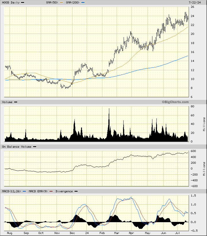
In this daily bar chart of HOOD, below, I see a mixed picture. Prices are in an upward trend and trade above the rising 50-day moving average line and above the rising 200-day line. Trading volume has increased since December. The On-Balance-Volume (OBV) line has moved higher since November. The 12-day price momentum study shows lower highs since December and tells me that the pace of the advance has been slowing. Weakening price momentum can sometimes foreshadow weaker prices ahead.
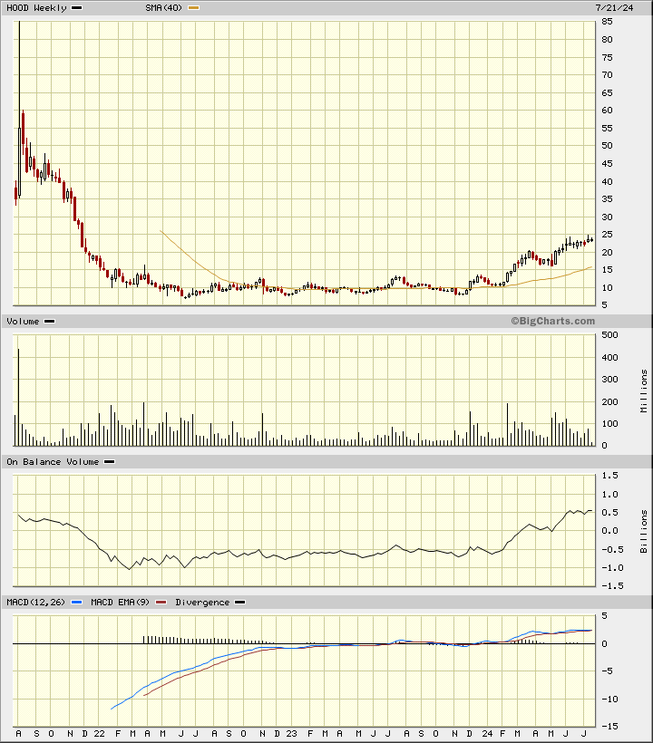
In this weekly Japanese candlestick chart of HOOD, below, I can see some risk of a declining market. Prices are trading above the 40-week moving average line but the most recent candle pattern shows an upper shadow as traders have rejected the highs. Trading volume has weakened on the advance instead of increasing. The weekly OBV line has been stalled since early June. The moving average convergence divergence oscillator is above the zero-line but the two moving averages that comprise the indicator are on top of each other. A downside crossover could happen fairly easily.
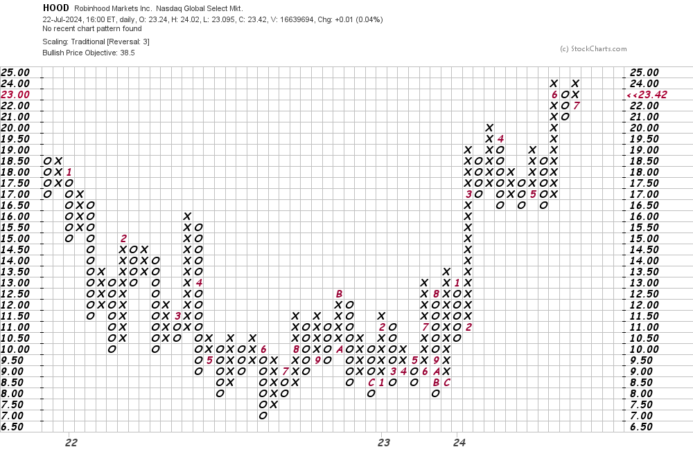
In this daily Point and Figure chart of HOOD, below, I can see an upside price target in the $39 area. A trade at $20 will weaken this chart.
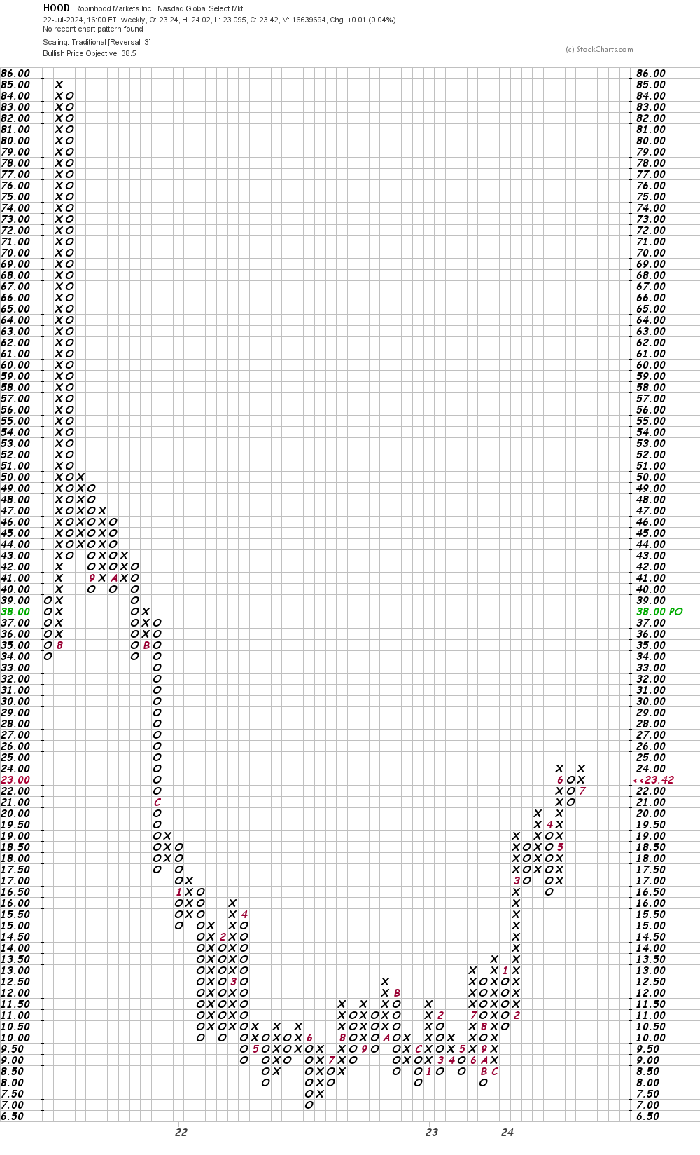
In this weekly Point and Figure chart of HOOD, below, I can see the same $39 price target as the daily chart above.
Bottom line strategy: I tend to be late at bottoms and early at tops. Can't explain it. Maybe I am early on turning bearish on HOOD, but I would rather be early than late.
Employees of TheStreet are prohibited from trading individual securities.