Is Pfizer Finally Seeing Light at the End of the Tunnel?
Let's check out the charts and indicators.
You've reached your free article limit
You've read 0 of 1 free Pro articles.
Pharmaceutical giant Pfizer PFE has been a weak performer in the stock market. However, the worst price action may be behind us now.
Let's check out the charts and indicators.
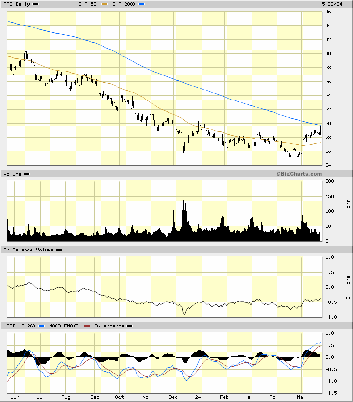
In the daily bar chart of PFE, below, I can see that the shares have been finding buying interest (support) in the $26 area the past six months. The shares are trading above the rising 50-day moving average line and testing the underside of the declining 200-day moving average line.
The On-Balance-Volume (OBV) line shows some improvement from a low made in December. The Moving Average Convergence Divergence (MACD) oscillator is above the zero line.
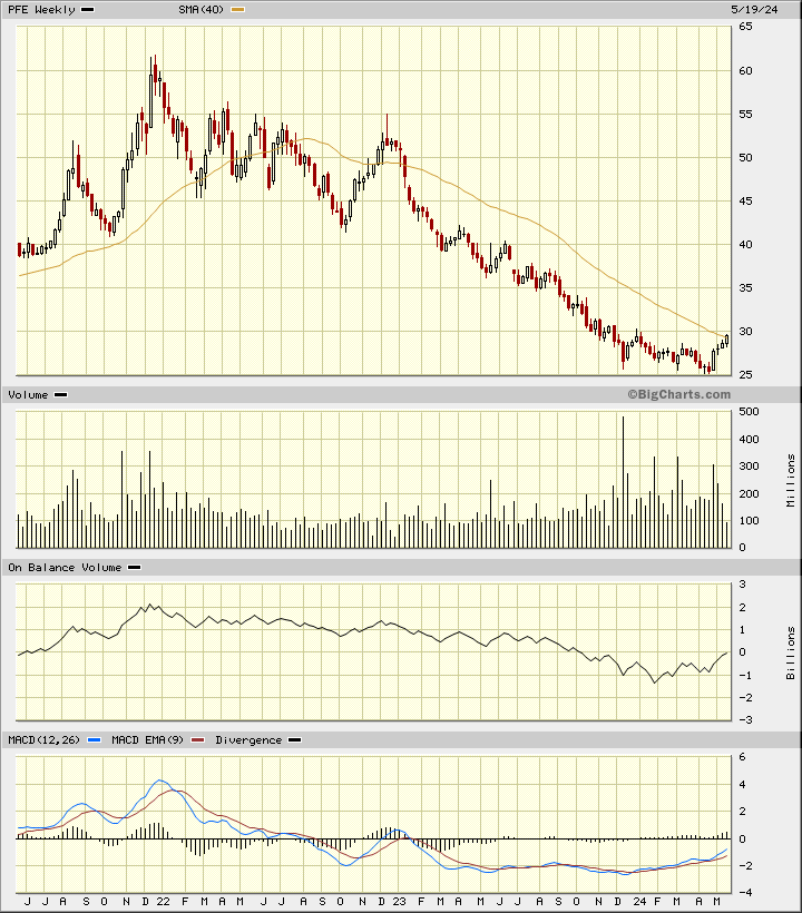
In the weekly Japanese candlestick chart of PFE, below, I can see that the shares are testing the declining 40-week moving average line after a long decline.
The weekly volume histogram shows more activity the past five months. The weekly OBV line has improved the past four months. The MACD oscillator has been improving but still remains below the zero line.
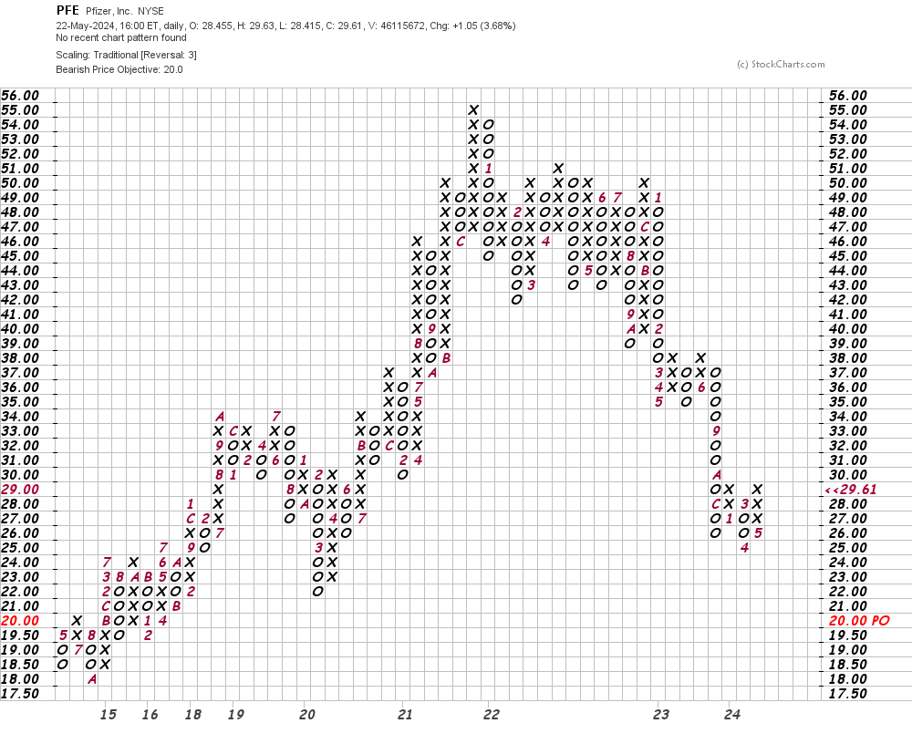
In this daily Point and Figure chart of PFE, below, I can see a potential downside price target in the $20 area.
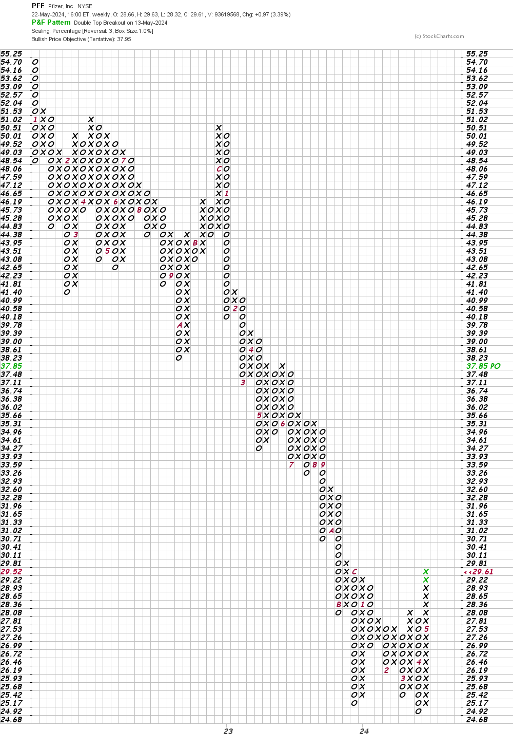
In this weekly Point and Figure chart of PFE, below, I can see a price target in the $38 area.
Bottom-line strategy: The technical setup of PFE has definitely improved in recent months. Is it ready to launch a sustained uptrend? Maybe not just yet. A broader base pattern would give more confidence.
More Technical Analysis Education
- Overcoming the Pitfalls in Real-World Technical Analysis
- Moving Averages Don't Lie. Here's How to Use Them
- How to Use Price Momentum to Spot Turning Points
Employees of TheStreet are prohibited from trading individual securities.