Charting the S&P 500: Index Is in a World of Hurt
The pain recently distributed by the sellers and bears may be just the beginning.
You've reached your free article limit
You've read 0 of 1 free Pro articles.
 Looking down
We are starting to become concerned about that long-term trend line we have in the top chart, the broken purple line which goes back a few years. That was put in place to show where the markets had very strong support. Just about a year ago that line was tested successfully as the bulls bought the massive dip (Liberation Day) and pushed stocks higher to the 7000 mark.
That push was epic, and while there is still a good chance to reach those levels again it does not appear it will happen before another test of that support line. Of course, that line is moving upward slowly. A year ago it was just under 5000 and today we see it around 5400, or nearly 1100 points lower from current levels... I don't make the rules.
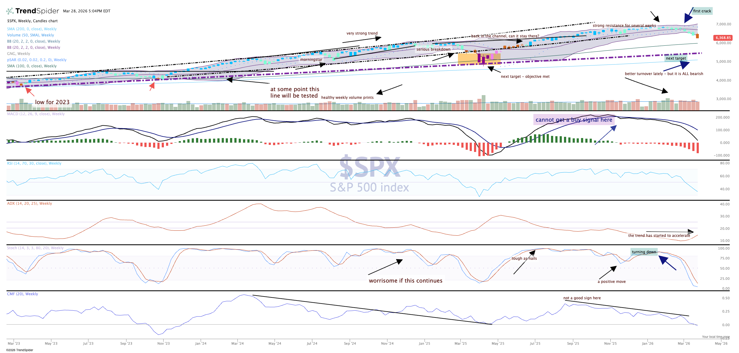
That may seem unrealistic given the huge drawdown we have experienced over the last several weeks but support lines and moving averages are like magnets, they attract price when they stray to far away. The magnetic pull is quite strong and with momentum heading down and not quite an oversold reading yet on the markets, the direction is clear.
The price candle on the weekly turned amber, or neutral, for the first time since May 2025. That is significant. MACD (moving average convergence divergence) remains on a sell signal and money flow is now negative for the first time since November 2023.
Related: The Only Way to Know if We're There Yet is to Look at the Indicators
