It's a Stock Picker's Paradise and an Indexer's Nightmare
After all the selling, how can my Oscillator not be oversold? Easy. Let me explain. Plus, here's how the VIX is starting to get that 'look.'
You've reached your free article limit
You've read 0 of 1 free Pro articles.
The expression live by the sword, die by the sword keeps coming to mind. Those index movers are great when they go up but not so great when they go down. Not for the indexers.
For the stock pickers though, it’s paradise.
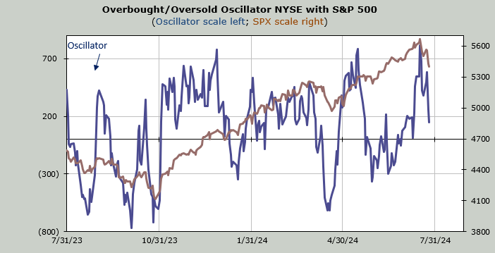
Today I want to address two questions I have received in the last few days. The first is in regard to the Overbought/Oversold Oscillator chart. Folks want to know how the heck can it not be oversold. Easy. This chart is not calculated using the price of the index but rather the breadth and breadth has been mostly choppy. Notice, below, that even though breadth was mildly positive on Thursday, the Oscillator has fallen. When you replace net breadth of +2,025 with +900 it falls.
So when will this short-term oscillator get back to an oversold condition? My expectation is early to midweek next week. But I will say this in advance: Unless the market gets clocked hard and breadth is quite negative in the next 3-4 days the oversold condition will be short lived. That’s the math.
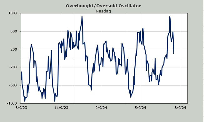
When I use the Nasdaq Momentum Indicator, where price is the input, I get a short-term oversold condition also early next week. But I haven’t shown it to you because as of now, it also doesn’t last very long. Depending on what the market does on Friday I will check back in on it over the weekend to see if it offers up a different view.
And then there is the question about the VIX. Isn’t it jumpy already? Or asked differently, what does it need to do to get jumpy?
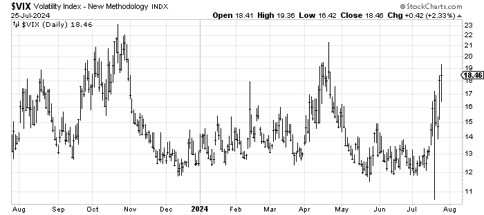
Long-time readers know that for me it‘s something the VIX does that makes it look jumpy to me. Something that is hard to explain. But basically, it should look as though it is breaking out. It should look as if it were a stock, you’d want to buy the breakout.
Look at October. Early October had a higher high, then it pulled back and rallied to a marginal higher high, but it sure looked like it was breaking out. That’s what jumpy looks like. It was not quite the same in April but it was similar.
It is starting to get that look right now. I would love to see it dip next week and then have one more push upward in August to complete the "look."
Finally let’s talk about sentiment. We saw the first shifting in the surveys on Thursday. The American Association of Individual Investors (AAII) bulls dropped 9.5 points to 43.2% and the bears jumped about seven points to 31.7%. That’s what we want to see, a shift in sentiment.
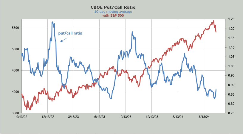
Earlier this week I discussed the ISE equity call/put ratio and noted how it had fallen to the lowest level in nearly two months. The next day we saw the CBOE’s put/call ratio scoot up over 1.0, also something it hadn’t done in approximately two months. Folks were getting antsy enough to finally buy some puts.
That has continued these last few days, although there is nothing extreme. However, we can finally see the turn up in the 10-day moving average of the put/call ratio on the chart. I suspect we will see more of that in the coming weeks.