Thanks for a fun day and a chance to flex my analytical muscles.
I'll leave you with one last thing. I wrote an article for TheStreet last year, based on a presentation I've given to the CMT Association and at CU Boulder.
It summarizes the lessons that we investors can learn from the greatest drive of all time: Stirling Moss' win of the 1955 Mille Miglia.
I like to zoom out and look at the big picture to get perspective. As I said before with the Fear & Greed analysis, this isn't a low-risk time to invest. So, consider this more of an analysis than any kind of trading advice.
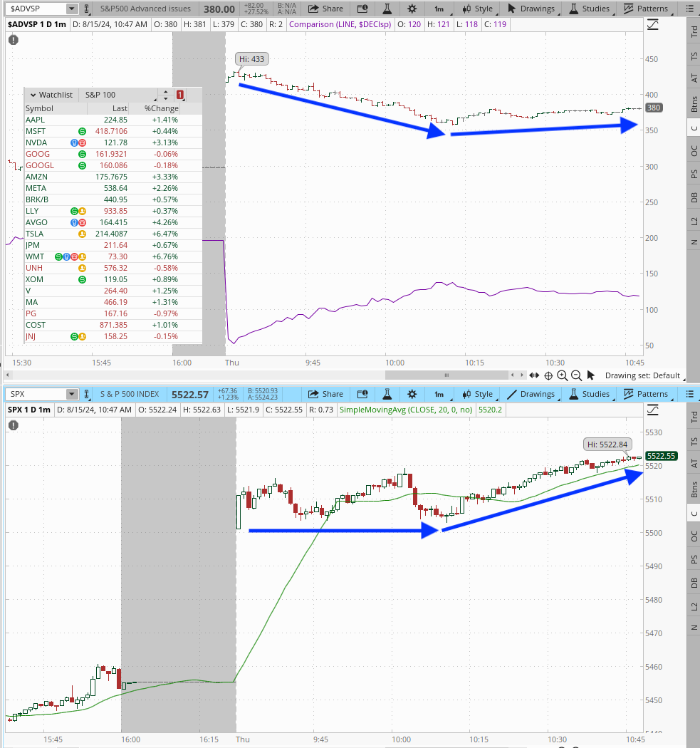
But zooming out and looking at the sector performance is like watching a more aggregated version of market breadth.
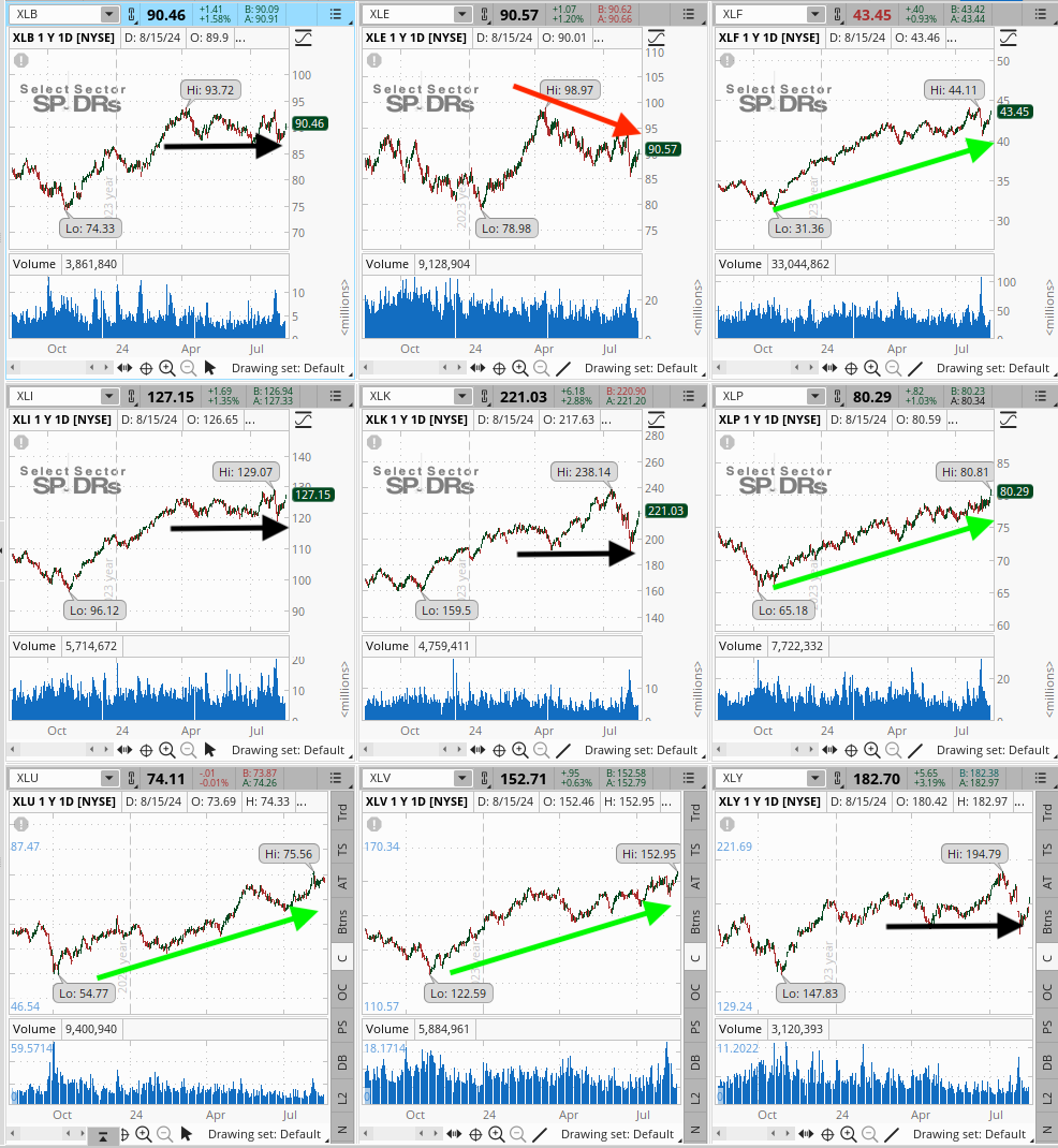
In the chart below, I've got 9 of the Select Sector SPDRs, representing most of the main US equity sectors.
ThinkOrSwim
Using the arrow indicator, we can see that about half of the sectors, Financials, Staples, Utes, and Healthcare remain in uptrends. Energy has been trending lower, while Materials, Industrials, Tech, and Cyclicals are pretty much sideways.
So, how's the breadth? Kinda even.
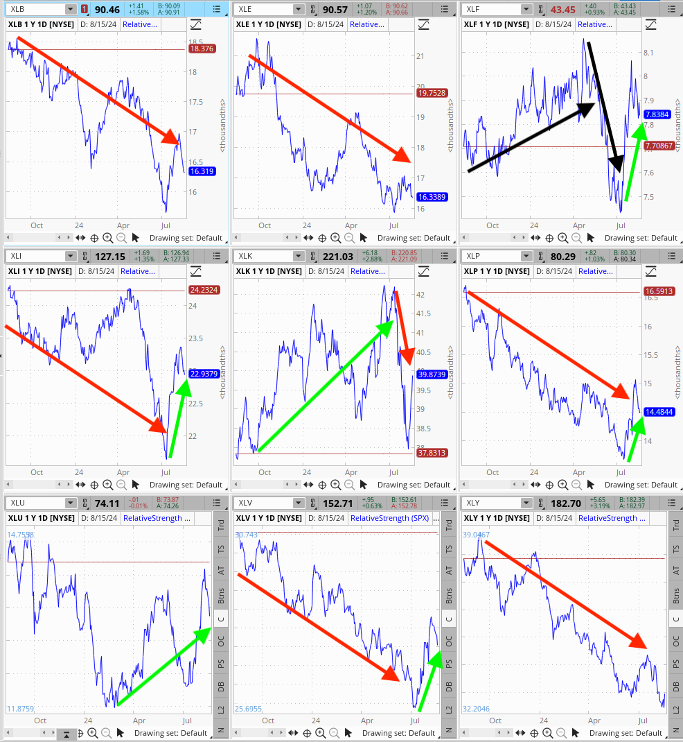
Here's another view that I like. Same ETFs displayed as Relative Strength charts. In other words, the price of each ETF divided by the S&P 500. If the line is going up, that means that the sector is beating the S&P 500.
ThinkOrSwim
Why is this chart important? There are two ways to beat the S&P 500.
1. Own the things that are beating the S&P 500
2. Don't own the things that are lagging the S&P 500
Then, what's beating the S&P 500?
Up until recently, it was Tech. But now, there's life in Financials, Staples, Utes, and Healthcare.
Today's Chart Quiz is a chart of an alternative asset class. And one that's going to be in the news this week. Why? Because it's Car Week! Lots of my friends are on the Monterey Peninsula right now for the historic race at Laguna Seca and the classic car shows and new car reveals. This is my attempt to be closer to the action.
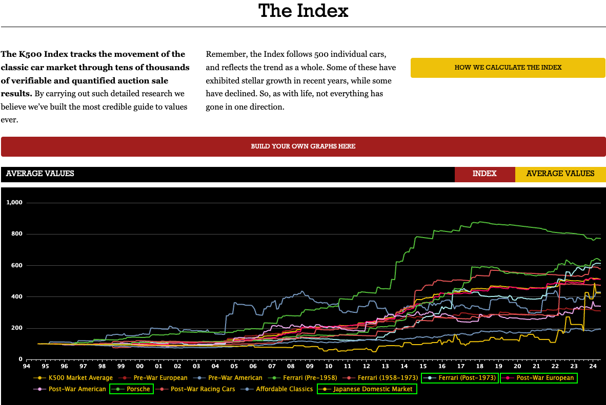
This is a chart of the K500, an index of collector car values.
It's not easy to read, so I've highlighted in green the car classes that are in bull markets.
https://k500.com/the-index
There are a couple of things I find interesting.
First, the blue chip early Ferraris, like the ones that starred in the Ferrari movie last December, are losing value. Why? Well, it's a saturated market and the demographic is getting older. So, if you have one and are bored of it, my garage is warm and dry.
Second, Porsche. I'm a Porsche nut. I drove my 32 yo 911 across country last year. It's reliable and the most comfortable way to get to California from Colorado. Prices flatlined a bit from 2017 to 2021 but have started moving higher again. Aircooled 911s (pre-1998) are expensive, but try replicating the experience in anything newer.
Third, Japanese Domestic Market cars are the hottest things out there. Every hipster in Boulder has a right hand drive, 4wd overlander. And the sports cars are gaining a following from the younger collectors who first experienced a Nissan GTR in video games. That market will continue to grow.
Last, post-1973 Ferrari. I'm not sure what to think of these, but I believe that some of the prices are driven by the same people buying the Japanese cars. In other words, younger buyers purchasing the cars the drove online, as well as people buying the supercars. A 2003 Enzo was bid to $4m last night, but was a no sale, since the owner thinks it's worth even more.
Why share this? Well, it's fun. But I also think it's an interesting look at what's happening at the high end of the market. It's sentiment.
I thought about titling this post "The Bonds that Break" because, well, CNN's data is bad. However, the analysis is usually reasonable. Let's look.
https://www.cnn.com/markets/fear-and-greed
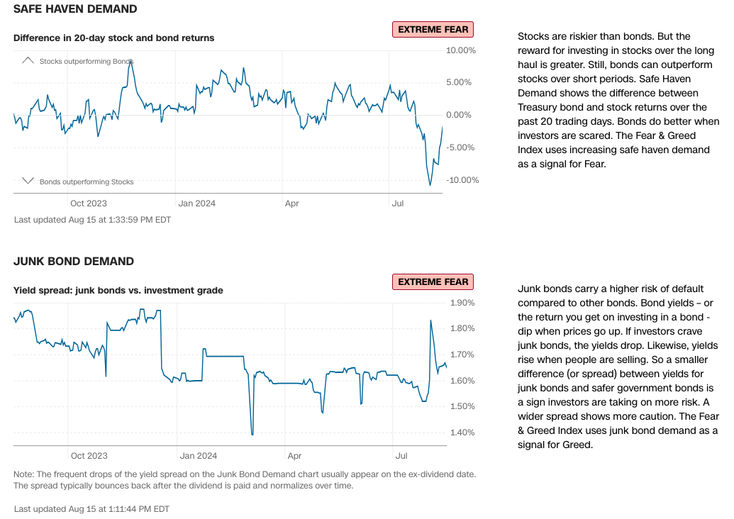
Safe Haven Demand still works, I think. It compares total returns from TLT to SPY. The question is, are investors buying stocks or buying bonds? Earlier this month, the answer was bonds. Now, they're buying stocks again. We know that already. And we know which stocks they're buying. This one is probably very close to hitting Fear and then going Neutral.
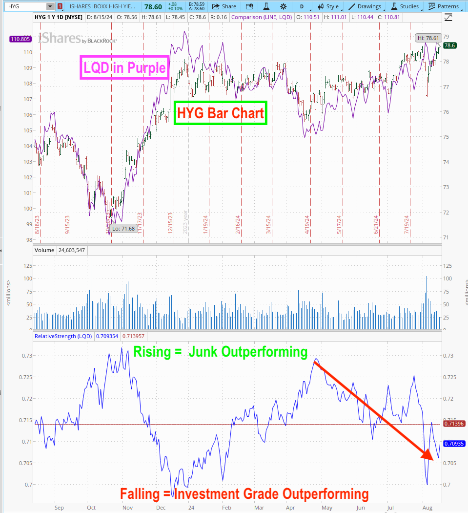
Junk Bond Demand is a mess. It compares the yield on a junk bond ETF to an investment grade ETF to see if investors are buying or selling speculative junk. It's HYG and LQD. See those spikes? Those are related to distributions that CNN isn't accounting for correctly. When I ran the database for Fear & Greed, we had solved for this issue.
But that doesn't mean the indicator is worthless. I usually compare it to a Relative Strength chart to see if the performance of the two ETFs agrees with CNN's chart.
Source: ThinkOrSwim
So, yeah, investors are, generally, pulling back on riskier bonds. Since last week's spike low, though, they've been buying the risky stuff. I agree with CNN's Extreme Fear rating, but it's probably not far from going neutral.
Then what do the two bond components say about market sentiment?
Second part of today's analysis is the options market.
https://www.cnn.com/markets/fear-and-greed
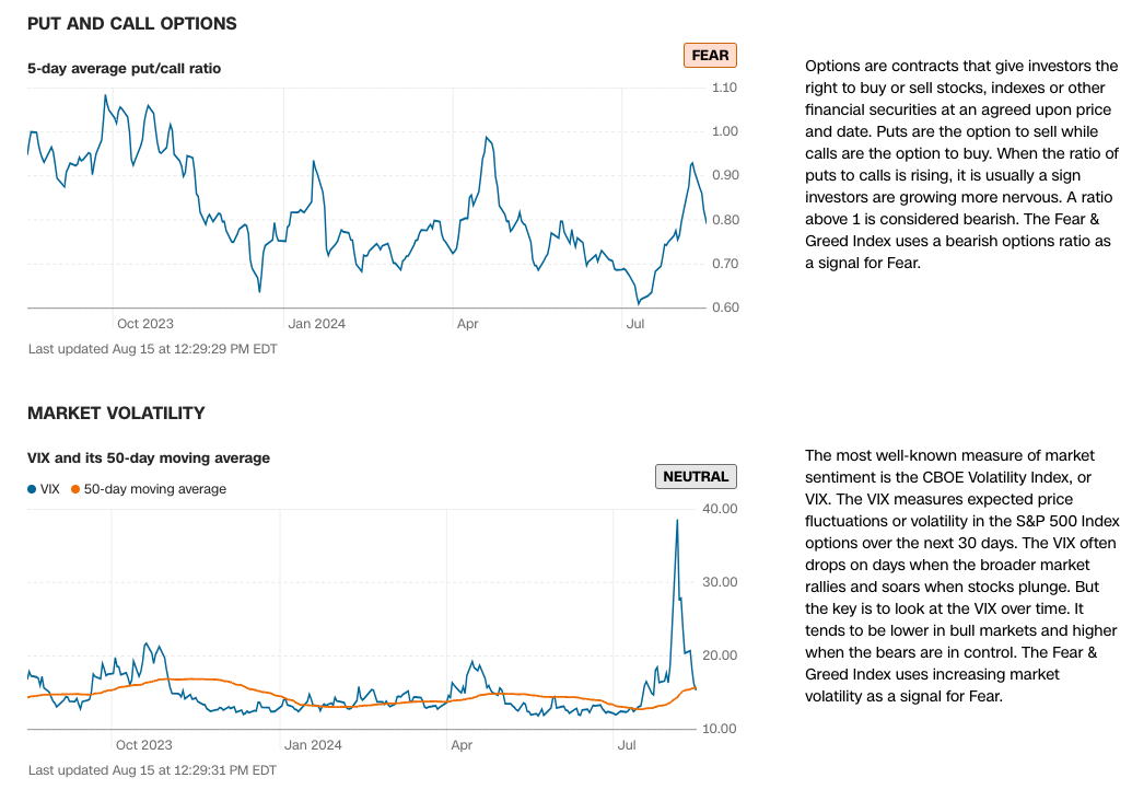
Put and Call Options is based on the CBOE Put/Call Ratio. Honestly, I haven't looked at the construction of it in years, but the thing to remember with this one is that it includes all options traded. So, a calls on an inverse ETF (or the VIX) will increase when puts on long indexes increase. I guess that makes the results muted overall. If I had the data, I'd have gone with S&P 500 index options or constituent options of some sort. But CNN had a limited budget.
We also use 5-day smoothing, to remove some of the noise. Again, we use a 125-day Z-Score on that for the analysis.
Since the July top, when the PC ratio showed a high level of speculation, this indicator has spiked to Extreme Fear and now Fear. Its decline indicates that investors may be at risk of becoming complacent again.
Market Volatility is the VIX and it's used in a very different way. Generally, the VIX is asymmetric. It is most useful when it spikes. And spikes tend to be short term. So, we drop the VIX from the calculation whenever it's not spiking or is below 20. Like today.
That said, I just grabbed some data and did a little test on the VIX. When the VIX spikes 1.5 Standard Deviations above its 50-day Average (this is how we use it in F&G), 1-month later the S&P 500 is higher 60% of the time for a 10.5% annualized gain.
This table includes the 1.5 standard deviation test plus a 5 standard deviation test to give context to last week's move.
VIX 1.5 SD Above Average
VIX 5 SD Above Average
Average 1m Forward Return
0.83% (10.5% annualized)
2.06% (28% annualized)
Median 1m Forward Return
1.16%
2.05%
Max Gain
13.85%
7.07%
Max Loss
-16.32%
-4.40%
Win %
60.32%
88.89%
Average Gain
3.75%
2.86%
Average Loss
-3.61%
-4.40%
Number of Obs (since 2004)
63
9
1-Month Fwd Returns on S&P When VIX Spikes
Moves like last week's are much better! And much rarer. It pays to be greedy when others are VERY fearful.
So, what is the options market saying now? Well, the S&P 500 has gained 8% since last Monday's low. That's way above expectations. So, let's leave this in the neutral camp.
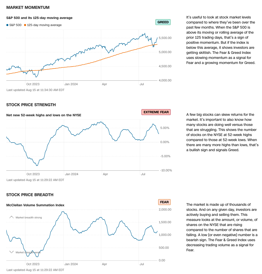
There are really three sections to the Fear & Greed Indicators. Let's talk stocks.
https://www.cnn.com/markets/fear-and-greed
Market Momentum is simply the S&P 500 vs it's 125-day average. Actually, it's based on the Z-Score (number of standard deviations above or below the average). Greed means that it's farther above the average than is normal. Basically, that momentum is strong. The average is upwards-sloping, so that's good, too. It's a bull market!
But is it a bull market for all stocks?
Stock Price Strength and Breadth help us to answer that question. And the answer is, not really. While the S&P 500 has been trending upwards, breadth has been flat to lower. Of course, we all knew that.
Calculation for both of these, like the Market Momentum, is based on a 125-day Z-score.
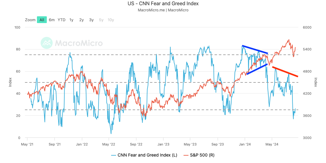
So, what does it mean? One of the things I love about Helene Meisler's work is the context she provides. She looks back in time as well as simulating "what if" analyses. Similarly, people who look at only the headline number for Fear & Greed are missing the best parts!
I like to start with the history. This chart is from MacroMicro.me but CNN has a similar one, without the S&P overlay that you can access by clicking Timeline.
Last winter, I shared here that I was watching the narrowing pattern, shown in blue and that it was concerning because of the lack of breadth. The market briefly broke down until the Mag 7 roared back to life. The problem then was breadth. Breadth has improved a little but it's still not strong.
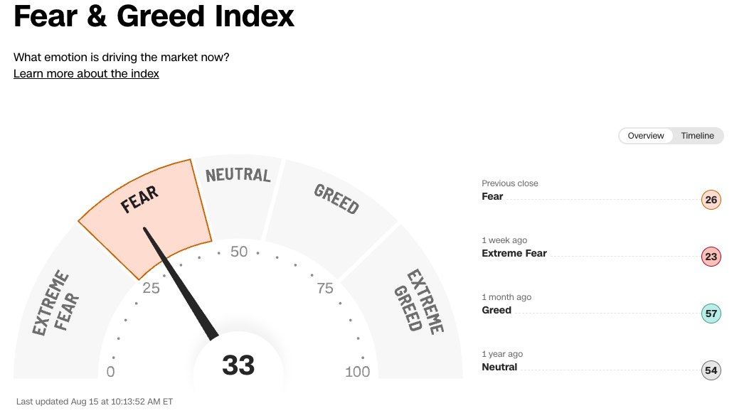
Today, we're in the Fear zone, rising from Extreme Fear. So, that's good?
Not really... yet.
Spike lows in Fear & Greed are relatively rare. More likely, we get several retests of the low.
What I would love to see is a lower S&P low but a higher Fear & Greed low. A divergence.
I'll post more later. Please leave comments below and I'll do my best to answer.
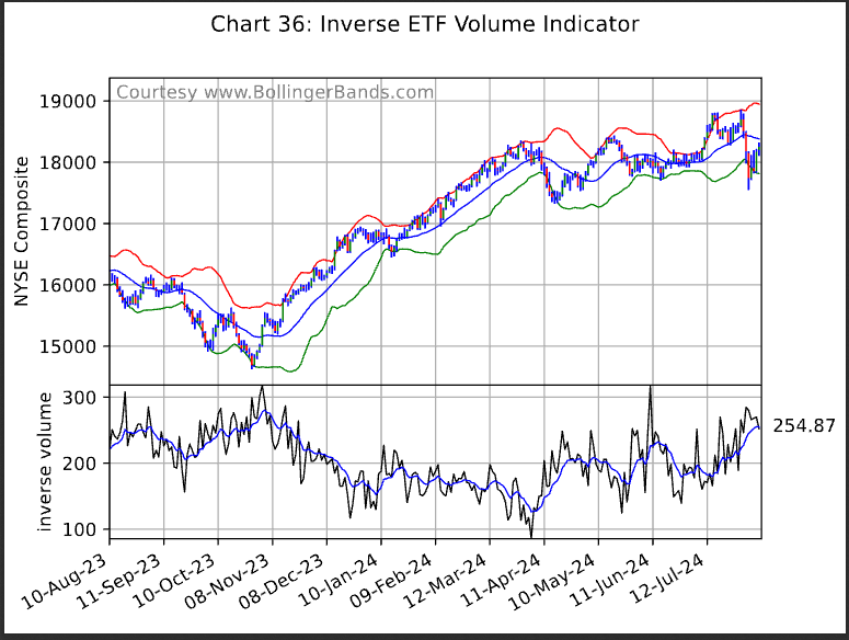
One of my interests is trading volume. I developed an indicator I call Normalized Relative Volume. Very simply, it's a ratio of a security's volume today to the market's volume divided by the average of that ratio. It's sort of like "interesting volume" but can be calculated from the first trade of the day, or over a longer period, like a week or a month.
The paper can be found on page 69, in the 2020 Journal of Technical Analysis: https://cmtassociation.org/wp-content/uploads/2020/03/JOTA-2020-Web-Version.pdf
I've messed around with it in different ways, one being to use it as a sentiment indicator on inverse ETFs. The idea being that extreme high volume in short ETFs is bullish and extreme low volume is bearish.
John Bollinger added a version of it to his weekly chart pack. It's a free subscription and I find it to be a nice summary of what's going on technically.
For those who don’t know who I am, I’m more than just that annoying guy who hangs out in the forum here. I’m also the Managing Editor of TheStreet Pro. I’m not trading anymore, but I spent a decade on Wall Street as a market maker and equity trader, and then the next 19 in fintech before coming to TheStreet in 2022. As most of you probably know, my claim to no fame is building the Fear & Greed Index for CNN, so we’ll definitely discuss that and what I think it says.
I’ll also share some interesting charts and data I see in the market right now, plus some of my favorite articles from across Pro.