What JPMorgan Investors Should Watch as the Stock Declines
Recent gains for the shares have been harder to achieve even before Friday's earnings.
You've reached your free article limit
You've read 0 of 1 free Pro articles.
JPMorgan Chase JPM reported a top and bottom line beat Friday morning but the shares are selling off.
Let's check out the charts and indicators to see where this decline might be headed.
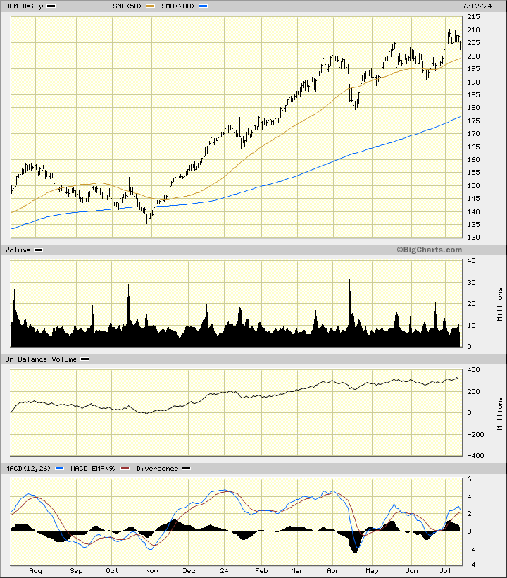
In the daily bar chart of JPM, below, I can see that prices stalled their advance in July and are pulling back for a test of the rising 50-day moving average line. The slope of the 200-day line is still very positive and is well below the market.
The On-Balance-Volume (OBV) line has risen the past 12 months but it looks like its recent gains have been harder to achieve. The Moving Average Convergence Divergence (MACD) oscillator has been making lower highs since January and that is a large bearish divergence when compared to the price action making higher highs.
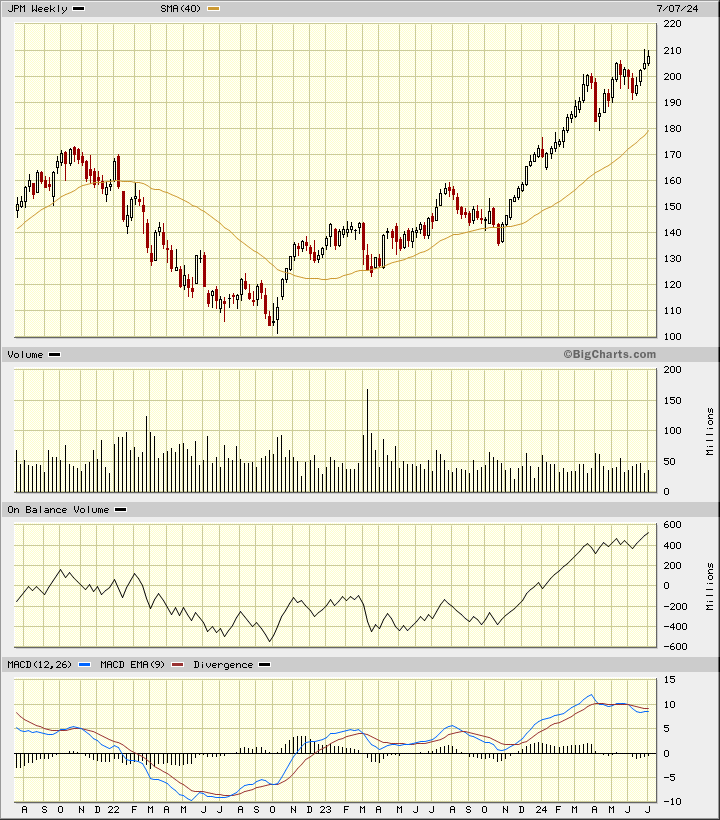
In the weekly Japanese candlestick chart of JPM, below, I can see that prices have doubled in the past two years. The two most recent candlesticks show us upper shadows near $210 and that is a sign that traders are rejecting the highs.
Trading volume did not expand in the direction of the trend the past two years but the OBV line did rise. The MACD oscillator has been correcting lower for a few months.
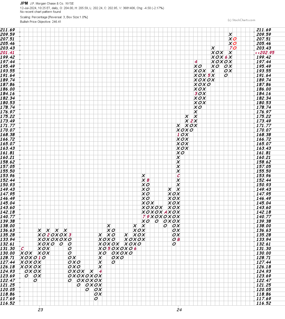
In this daily Point and Figure chart of JPM, below, I can see that the software is projecting an upside price target in the $246 area.
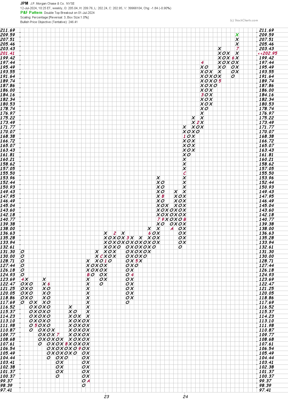
In this weekly Point and Figure chart of JPM, below, I can see the same $246 price target.
Bottom-line strategy: Is JPM in trouble on the charts? Not really but a close below $190 — the June low — would be a definite bearish signal.
Employees of TheStreet are prohibited from trading individual securities.