NIO's Charts Stall Despite Q2 Deliveries Boost
Automaker surges on deliveries, but the technicals need some repairs.
You've reached your free article limit
You've read 0 of 1 free Pro articles.
Shares of NIO NIO are bouncing higher Monday after the company reported that June deliveries surged 98% and second-quarter deliveries accelerated to 144% year-over-year. This sounds like bullish news, but the charts and indicators don't look convinced.
Let's check.
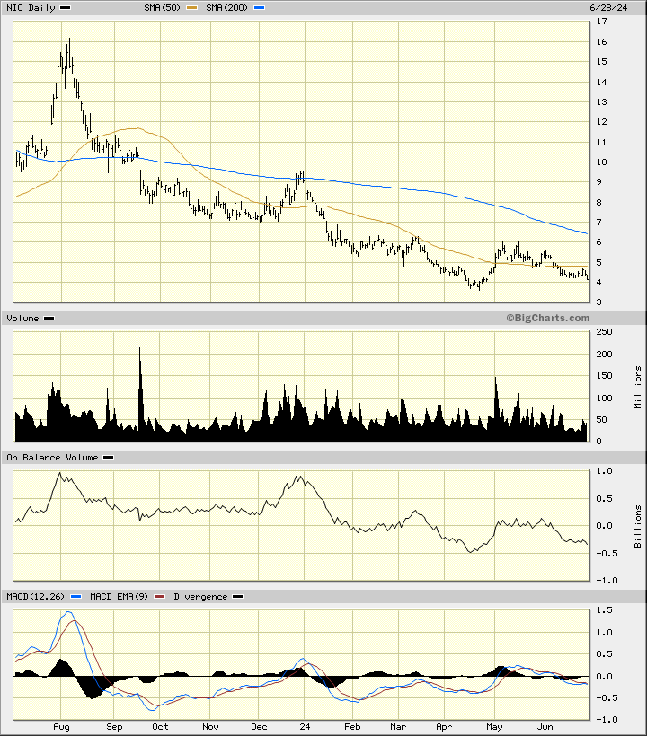
In this daily bar chart of NIO, below, I can see that prices have stayed in a downward path the last 12 months. NIO trades below the negatively sloped 50-day moving average line and below the declining 200-day moving average line. The On-Balance-Volume (OBV) line has followed prices lower the past year. The Moving Average Convergence Divergence (MACD) oscillator is in a bearish alignment below the zero- line.
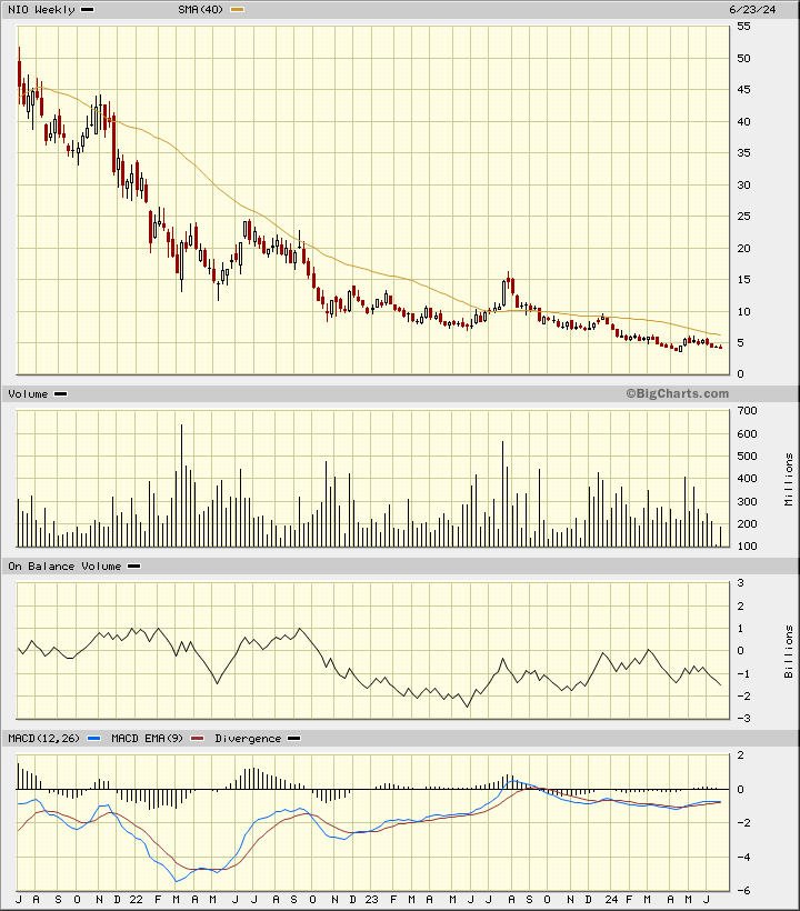
In this weekly Japanese candlestick chart of NIO, below, I see a bearish setup. Prices are in a longer-term decline and continue to trade below the negatively sloped 40-week moving average line. The movement of the weekly OBV line has been choppy but overall bearish. The moving average convergence/divergence oscillator has been below the zero-line for the past year.
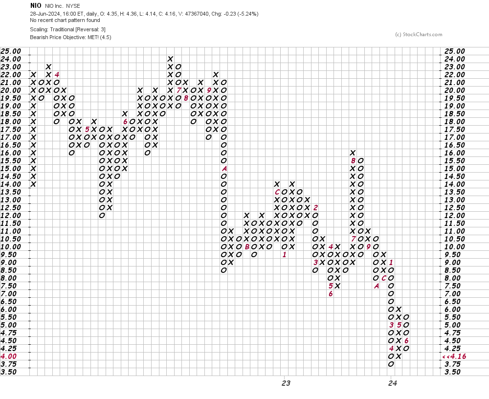
In this daily Point and Figure chart of NIO, below, I can see that prices have reached a downside price target in the $4.50 area.
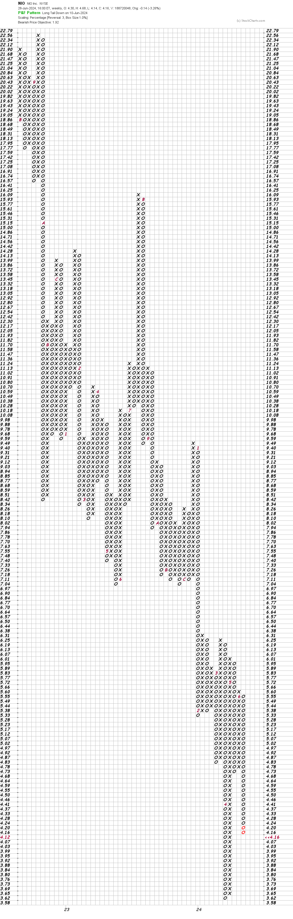
In this weekly Point and Figure chart of NIO, below, I can see a potential downside price target in the $2.00 area.
Bottom line strategy: NIO may or may not break its April low, but that doesn't do much for the charts. The charts need a long "repair process" before they become attractive.
Employees of TheStreet are prohibited from trading individual securities.