Chart of the Day: What Comparing the S&P 500 to the Nasdaq Reveals
Let's see if one or the other is outperforming and where money is flowing.
You've reached your free article limit
You've read 0 of 1 free Pro articles.
The Nasdaq (COMPQ) and S&P 500 (SPX) are strongly correlated, as one would expect. Both indexes are market cap-weighted, which means the biggest names at the top have the most influence. Think not only Magnificent Seven names but several others that move these indexes up and down.
Hence, when we look at the comparison chart below we say the correlation is a rather "tight fit," or these the S&P (red line) and Nasdaq (black line) are nearly in alignment and moving together. However, the Nasdaq often moves in a more exaggerated fashion, and that is not because it is priced higher than the S&P 500.
This chart is a log scale chart so it compresses large values and expands small values to help us visualize the relationship between values.
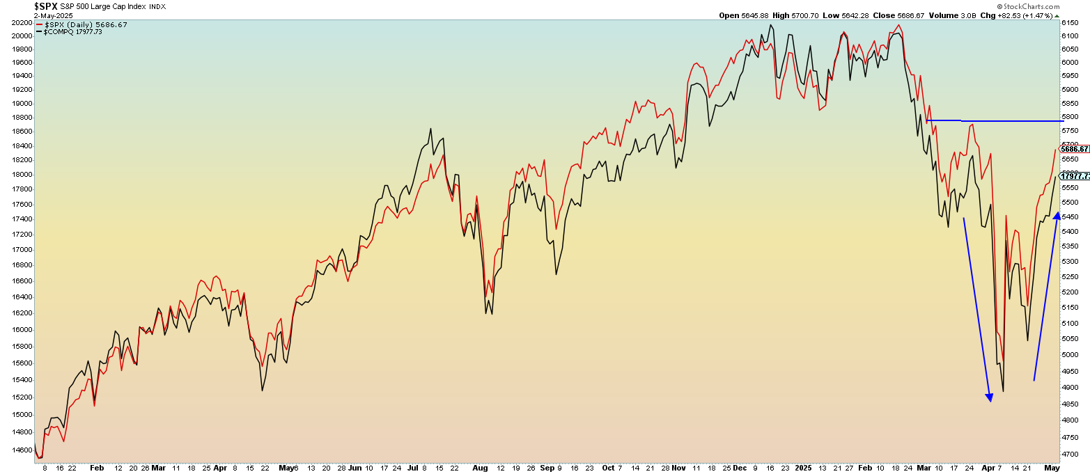
The recent moves in both indexes are wide and deep, likely due to the strength in volatility. Realized volatility (actual movement) was recently as high as 50% while implied volatility (expected) was quite bit lower, in the 20% range. That means actual moves are larger than expected moves, which is often quite rare. We can see the exaggerated moves in both indexes as they traveled much lower and then bounced right back up again in near V-shaped fashion.
But just returning to the "scene of the crime" is not impressive if the indexes fail to advance. Rather it indicates the next move could be significantly lower. For now, the indexes are sporting a nice move here together as the recent down move is washed away.
