All Things Being 'Equal' Is This Index ETF Now a Screaming Buy?
Let's address a chart making the rounds — and whether a theory behind it holds water. Plus, what do we call Friday's late-day day flurry? I've got some thoughts, including a key takeaway.
You've reached your free article limit
You've read 0 of 1 free Pro articles.
Should we call that an oversold bounce? I’m not sure what to call Friday’s late-day run up except nothing short of spectacular.
Oh sure, the Nasdaq didn’t go green, nor did the beloved semis, but they gave it the old college try, didn’t they?
Was it end-of-the-month shenanigans or was it the rebalancing of some indexes? Who knows? We need not rationalize the bounce that was due, especially in the DJIA, which bounced right off support and was extremely oversold. What we do need to observe is the fact that for the majority of the day the Russell 2000 was the leader but once that rally came to life it was the laggard.
The Russell made its high first thing in the morning. The afternoon rally didn’t even get all the way back there while the S&P 500 flew up a full 25 points higher than the morning. I think it shows us that once the mega-caps come to life there is very little oxygen left for anything else. One rallies at the other’s expense.
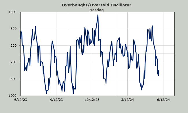
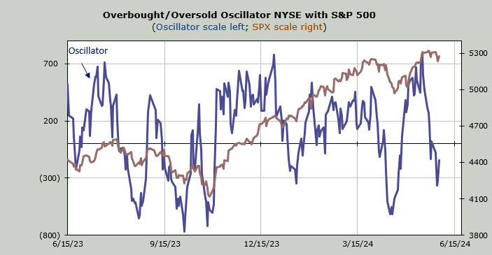
Can we still call the market oversold? Not really, but we can’t call it overbought either. My guess is we see some more upside this coming week but after that the best we can do is chop.
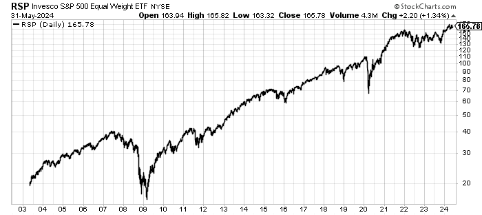
Today I want to address a chart that has been making the rounds. It’s the ratio of the equal weight S&P 500 to the S&P 500. Last week it got down to levels not seen since 2008 and many are saying that it means the Invesco S&P 500 Equal Weight ETF RSP is a screaming buy.
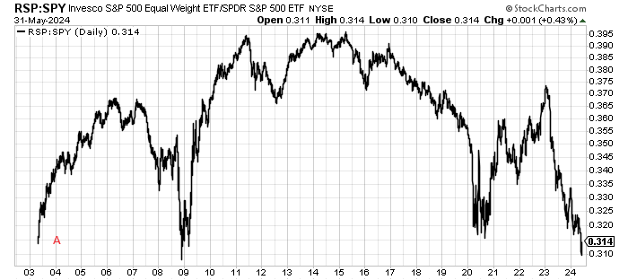
Since the RSP only came into being in 2003 we can’t look at what it did in the years prior so I’m not certain that was the low, but let’s stop and consider that we were ending a three-year bear market as that sort of extreme showed up (A on the chart above).
Then there is the 2008 low. Yes, squint really hard and you will see the low on that chart was in 2008, not 2009. March of 2009 had a higher low than 2008. That too was the end of a bear market (March 2009).
From the low in 2008 the RSP rallied 22% to early January (as did the entire market rally). And then we had a huge downward move of 27% until the March low. It looks great in hindsight but how many do you think stayed bullish throughout that 27% downdraft? I can tell you, very few. Sentiment was extremely bearish in March 2009.
Now take a look at the 2020 low and study it. How long did it stay down there as a ratio? About nine months. It doesn’t mean the RSP didn’t rally (they did) but did they outperform? Nope.
This may very well turn out to be the low area for the ratio but ask yourself if the market itself, with S&P mere points off the highs, resembles any of those three markets. I know my answer is no, it does not.
I would like nothing more than to see the broader market do well vs. a narrow market but it’s hard for me to line up the indicators, especially the sentiment indicators, with where the market was at those prior spots vs. where it is now.
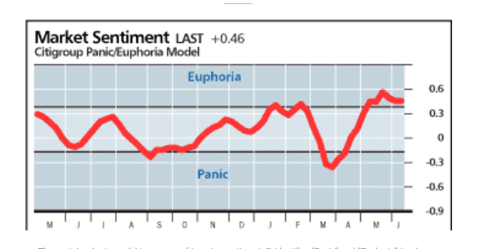
Just using the 2020 low, look where the Citi Panic/Euphoria Model was in March 2020 vs. where it is now (well into Euphoria).