Your Bond Slice Just Got Interesting
The 30-year Treasury just hit a 20-year high of 5%. That resets the math on the bond part most portfolios ignore. Here’s how to check yours.
You've reached your free article limit
You've read 0 of 1 free Pro articles.

I spent the past week on a ladder with a roller, painting over some kind of peachy-ish color, replacing it with Sherwin-Williams pure white. Think gallery walls, good for showing off the art.
Even the bright New Mexico sun couldn’t fix the peach problem. It was on nearly every wall when we moved in last week, and it simply was not going to work.
There are walls like that in just about every client retirement portfolio that I review. It’s the bond slice. It’s functional, but maybe doesn’t quite fit with the rest of the portfolio, and has been ignored while stocks get all the attention.
This month, that bond slice got its first coat of bright new paint in almost 20 years, as the U.S. Treasury sold 30-years paying 5%. That’s a rate the long bond hasn’t paid since before the 2008 crash, back when the iPhone was new and most people still typed on a phone with buttons. (Remember the BlackBerry?)
The Wall Nobody Notices
So in between coats, I stopped to talk to a client, and took a look at his quarterly statement.
He holds a good assortment of stock ETFs, nothing too risky or expensive, and all proportional to his financial goals.
And that’s the thing: The stocks are what get noticed. Techs, energy and consumer staples are leading the S&P 500. No big surprises there. Oil prices are also boosting commodity ETFs. Emerging market stocks have also been ticking higher, despite a pullback over the past few weeks.
But suddenly, the bond portion is getting a lot of attention, due to the yields at new highs. Still, it’s that peachy colored thing that nobody really wants to think much about.
So when I was talking to my client and reviewing his investments, I suggested he take a closer look at the bond slice, something he (like most investors) isn’t inclined to do very often.
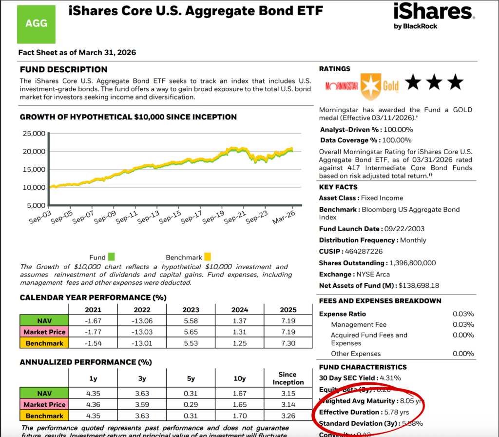
A “bond fund” can be lots of things. If you have a bond ETF or mutual fund, crack open the fact sheet and find two numbers: Average duration and average credit quality.
For example, on the fact sheet for the iShares Core Aggregate Bond ETF (AGG), you’ll find an effective duration of 5.78 years as of March 31.
Read the Label Before You Buy
The effective duration tells you how sensitive a bond is to interest-rate movements, and how long until it pays back your principal. A duration of 5.78 means a bond or fund loses about 5.78% of its price if interest rates rise one percentage point, and gains the same if they fall.
Bonds behave very differently depending on whether you own the bond itself or a fund that holds bonds, and that distinction decides whether falling prices are a temporary number on a statement or a permanent dent in your money.
Knowing even the basics, your bond’s maturity date, its yield, and whether you own the actual security or a fund, is the difference between a planned income stream and a surprise.
The Job of Bonds
For a retiree, the bond slice isn’t about beating the market. That won’t happen, unless stocks have a truly bad year.
Look at the year 2018 on this chart from the J.P. Morgan Guide to the Markets. You’ll see that fixed income was one of the leading asset classes.
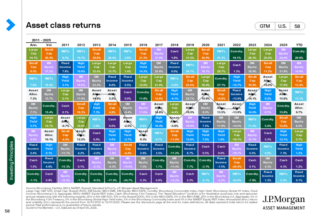
That’s what bonds do (most of the time, anyway). They provide income and a cushion against stocks’ declines.
Someone still working can wait out a bad year for stocks. A retiree drawing income can’t, because selling shares during a 30% drop to cover living expenses locks in losses when there’s little or no time to recover.
Here’s another chart from J.P. Morgan that illustrates that problem in a different way.
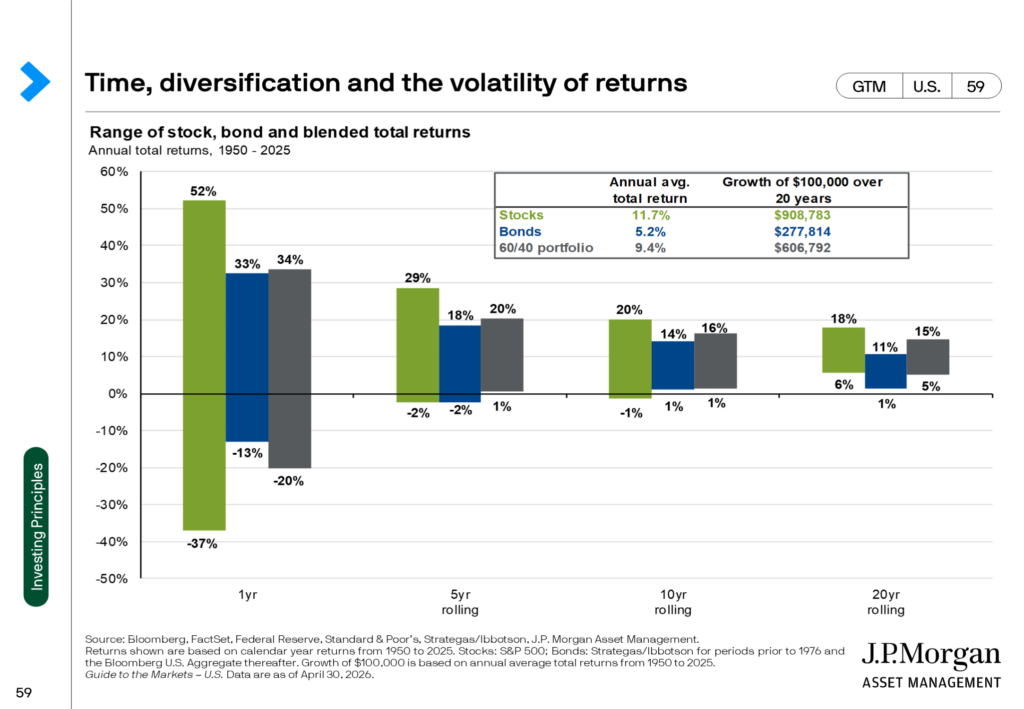
From 1950 through April 2026, the best year for the S&P 500 was up 52%, the worst was down 37%.
A classic 60/40 portfolio, meaning 60% stocks and 40% bonds, cut that worst year almost in half, to a 20% loss. Hold the same 60/40 blend for any five-year stretch in those 75 years and it has never finished negative.
Right there is the value of holding fixed income, even if you consider yourself to have a “high” risk tolerance. (Which isn’t some great badge of honor when it comes to retirement investing.)
Sure, there’s a tradeoff to allocating into an asset class that is certain to lag stocks over time.
That trade-off shows up in the averages: 11.7% a year for stocks alone, 9.4% for the blend. About 2.3 points a year, in exchange for never having to sell at the bottom of a market to keep the bills paid.
What Color Goes on the Wall?
That cushion just got repriced. The global bond selloff that pushed the 30-year Treasury to 5% knocked down prices on existing long-duration bond funds, and plenty of retirees opened a statement and winced.
But the same selloff reset the income side of the equation. New money going into bonds today locks in the most generous yields the market has offered since before the 2008 crash.
That means the bond slice finally has a chance to do both of its jobs well at the same time: pay real income, and be there as ballast the next time stocks have a bad year.
So before deciding the bond piece looks outdated, check what it actually owns. Three things decide how your bond slice behaves:
- Duration: How much prices move when rates change
- Credit quality: How safe the income is
- Whether you hold the bond itself or a fund: Which decides whether a price drop is temporary or permanent
The slice that has been sitting on the wall for years, looking dull next to stocks, may just be ready for a fresh coat of paint.
