Could These 3 Exchanges Be Foreshadowing a Decline in the Markets?
Let's see if the charts of the Cboe, CME and Intercontinental Exchanges are meaningful Indicators.
You've reached your free article limit
You've read 0 of 1 free Pro articles.
A Real Money Pro subscriber asked in the commentary section of a bitcoin story about the charts of the Cboe Global Markets CBOE. I thought about answering this subscriber in that forum but then I thought about what the exchanges themselves actually represent.
For the longest time the stock exchanges and the commodity exchanges were private clubs. I started out in "the business" in the commodity markets in 1973 and in the early 1980's worked for a large professional trader in the sugar market.
Do you remember the movie Trading Places? It was filmed on the floor of 4 World Trade Center before 9/11. I would not call the movie version of the Orange Juice market accurate. but there were many "colorful" traders and lots of war stories back in the day. The purchase price for a seat and the lease price of a seat was an indicator that some technicians followed.
Today the exchanges are publicly held companies and I can ask the rhetorical question whether the share price of the exchanges are a meaningful indicator.
Let's check.
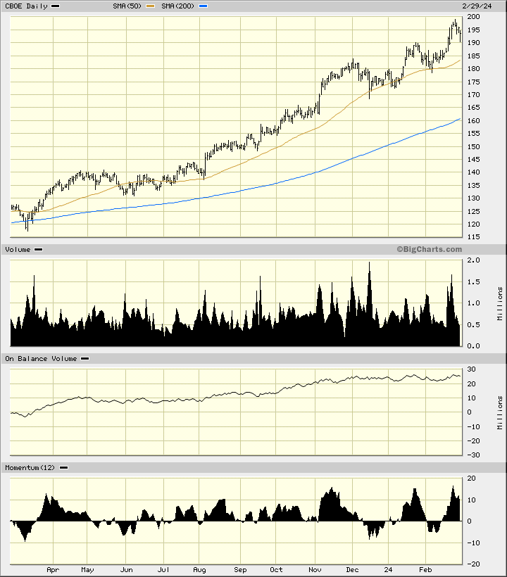
In this daily bar chart of the CBOE, below, I can see a rally playing out. Prices trade above the rising 50-day moving average line and above the rising 200-day line. The trading volume has been more active the past four months.
The On-Balance-Volume (OBV) line has been stalled the past four months and has diverged from the price action. This is a bearish divergence as the OBV line has not confirmed the price action.
In the lower panel is the 12-day price momentum study and here we can see equal highs in momentum from November to January to February. This is a bearish divergence when compared to the price action and could foreshadow weaker prices ahead.
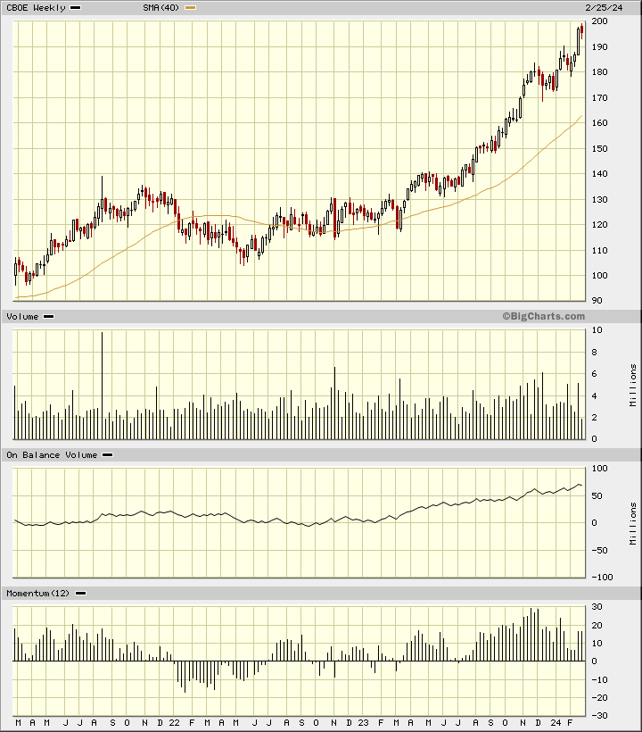
In this weekly Japanese candlestick chart of CBOE, below, I see a mixed picture. Prices are in a curvilinear rally above the rising 40-week moving average line. Trading volume has declined in the past three months while the weekly OBV line remains pointed higher. The 12-week momentum readings have been declining and that tells me that the pace of the advance has been slowing.
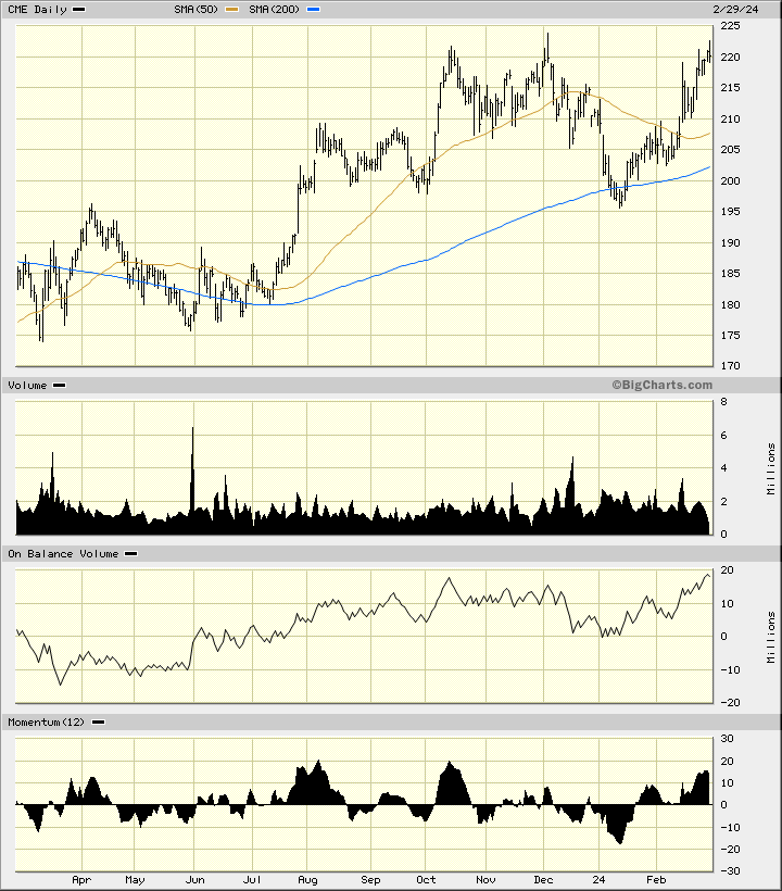
In this daily bar chart of the CME Group CME, below, I can see that prices have stalled in the $220-$225 area several times in the past five months. The weekly OBV line has not led prices with a new high of its own. The price momentum in February is weaker than the reading in October even though prices are at the same level. A bearish divergence.
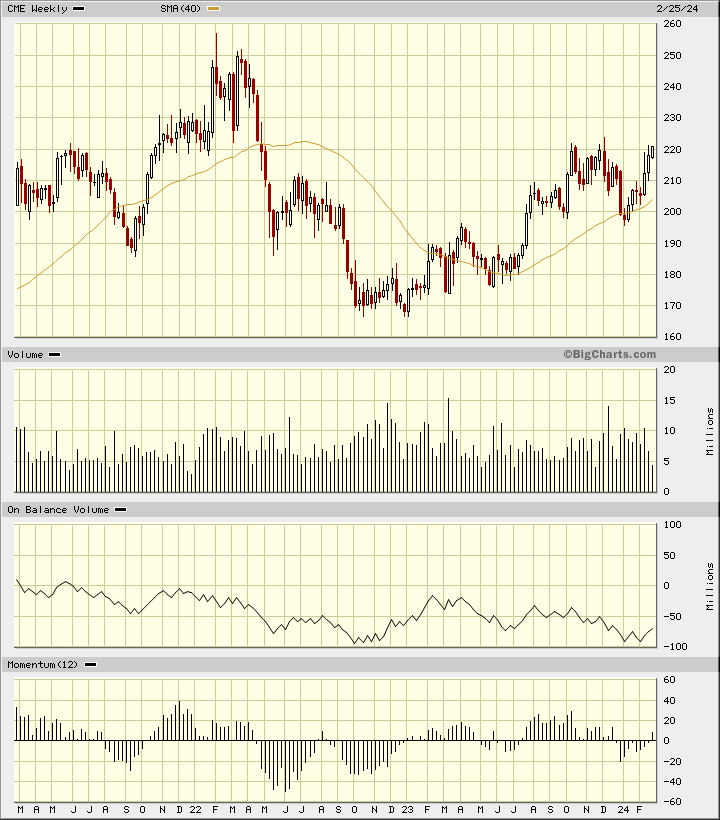
In this weekly Japanese candlestick chart of the CME, below, I see a bearish setup. Prices are trading above the rising 40-week moving average line but the $220 area is proving to be an area of resistance. The weekly OBV has been trending lower the past three years. The 12-week price momentum study shows a weakening pattern since August.
In this daily bar chart of the Intercontinental Exchange ICE, below, I can see another bearish divergence. ICE has been making higher highs but the 12-day price momentum study has made a lower high from December to February. Sound familiar?

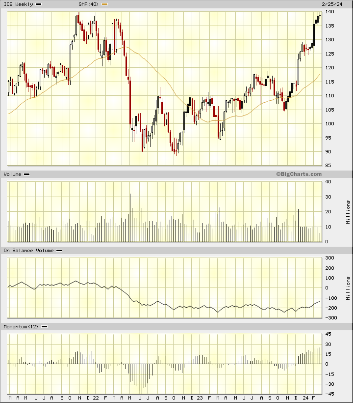
In this weekly Japanese candlestick chart of ICE, below, I can see that prices are back to the highs seen in early 2022. Trading volume has not increased in the direction of the trend. The weekly OBV line has not really confirmed the price action. Price momentum has been increasing but a peak in momentum is probably at hand.
Bottom line strategy: Could these three exchanges be foreshadowing a decline in the markets? I think so. What's your opinion?
Employees of TheStreet are prohibited from trading individual securities.